Francke!
One of Germany’s oldest institutions for social education, the Francke Foundations in Halle are an umbrella organization for a diverse range of educational programs and projects. Our approach to the redesign of Francke’s corporate identity seamlessly blends the foundations’ rich history with their progressive aspirations.
Francke Foundations
Francke!
2017

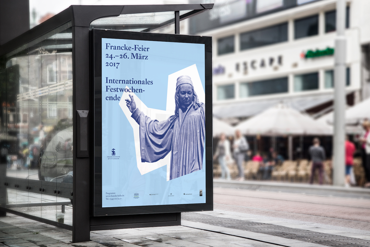
Founded by August Hermann Francke in 1698 as a way of helping people help themselves, the Francke Foundations still occupy their original home, a complex of historic timber-framed buildings in the heart of Halle an der Saale that recall the city’s traditional role as an educational center for neighboring regions. Today, the foundations function as a modern »educational cosmos«, actively perpetuating the legacy and principles of their founder.


To reflect this balancing act between past and present, we created a logo that picks up on the foundation’s deep historic roots, while also using elegant typography, generous amounts of white space and a reader-friendly layout to locate the design firmly in the now.


Redesigning the Francke Foundations’ visual identity was an exciting and challenging task. Their new corporate design needed to be applicable to a broad range of content and able to speak to diverse target audiences – from parents dropping their children off at day care to scholars and private citizens doing research in the foundations’ historical collections of written documents.

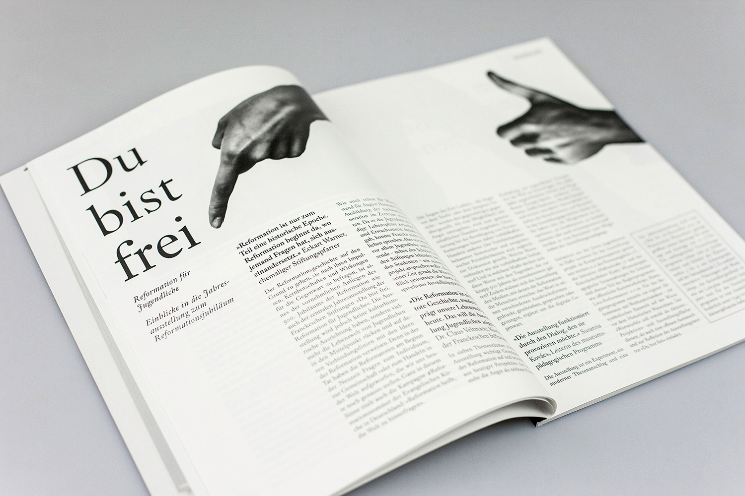
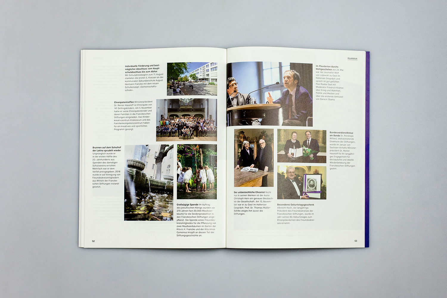
Intensive work on positioning and planning gave us a clear understanding of how to proceed with the new visual identity, which had to communicate the foundations’ vibrant contemporary presence as well as their grounding in centuries of tradition. The new look was implemented across the board – from the Francke handbook, which profiles all the organizations that partner with the foundations or work on site, to the annual magazine, which reports on the year’s accomplishments, to a wide variety of flyers, event posters and other printed materials – and of course the website was redesigned as well.


