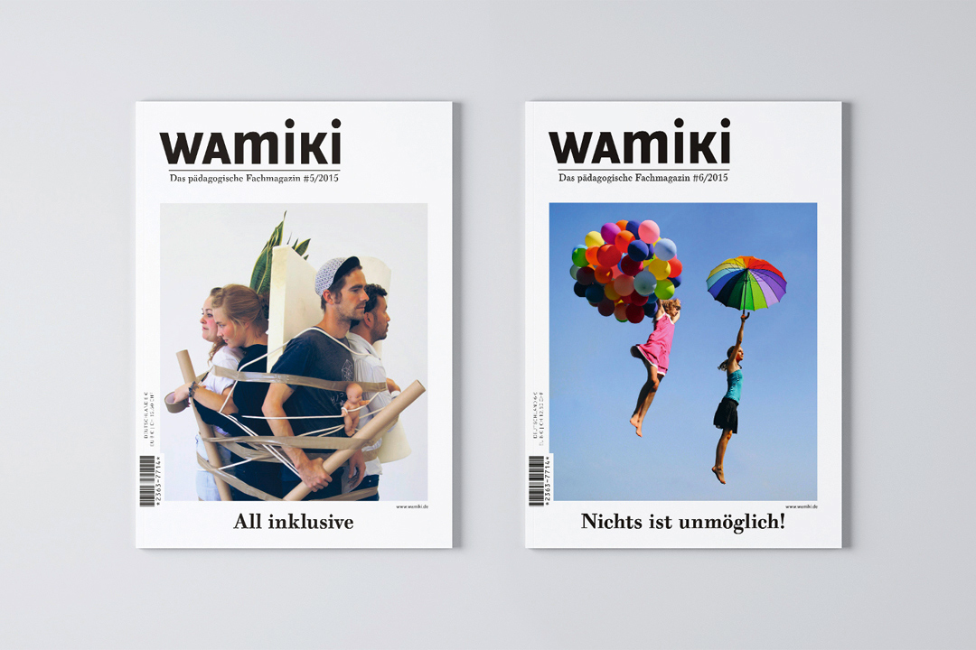
wamiki Magazine
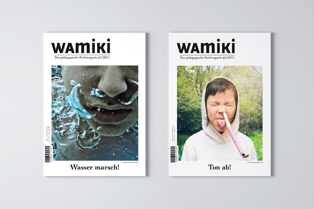
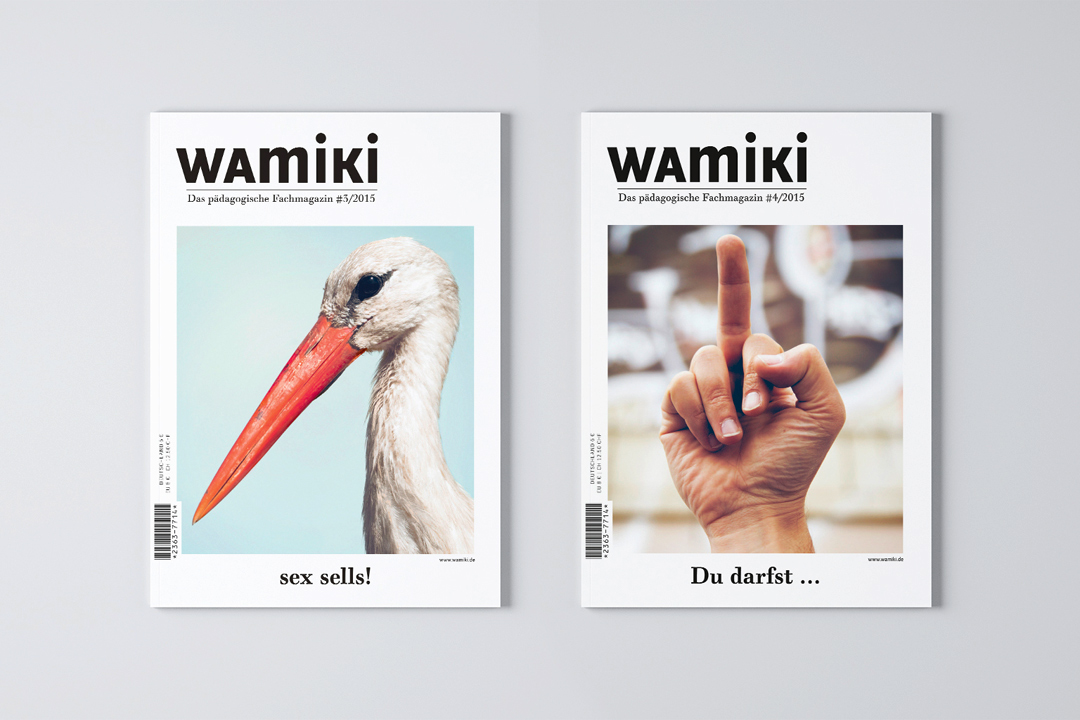
wamiki is a magazine for educators. Our first job for them was to create a wordmark that would draw both semantically and visually on the name of their parent company, Was mit Kindern (Something with Kids). In 2015, the Art Directors Club of Germany named our editorial design one of the year’s best magazine concepts.
Was mit Kindern Verlag wamiki Magazine 2015
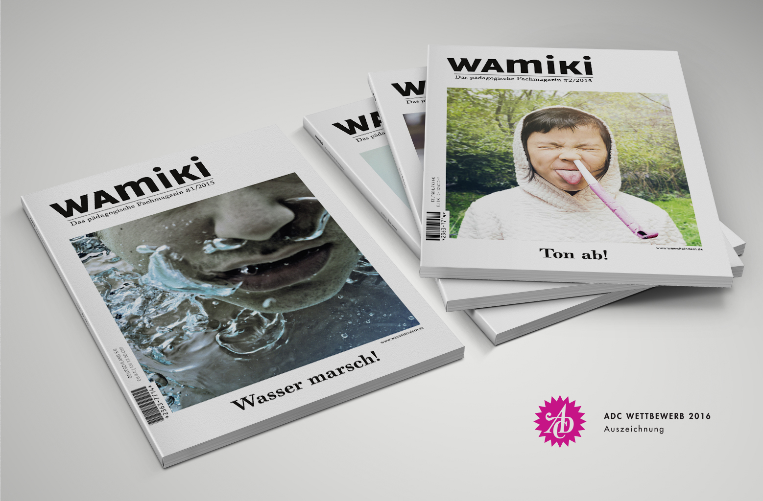
In fall 2014, Was mit Kindern was founded to provide a comprehensive selection of publications for working teachers, teachers in training and students of education. Their goal was to rise above the minutiae of pedagogical practice and get far away from the infantilizing nanny mindset common in the profession. They were in need of a joint vision, an analysis of their target audience and a detailed breakdown of their strengths and weaknesses.
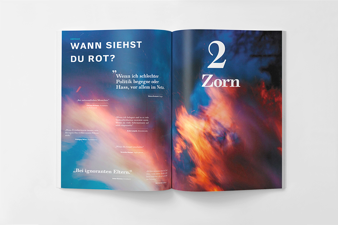
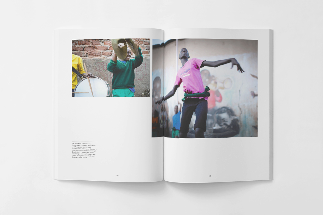
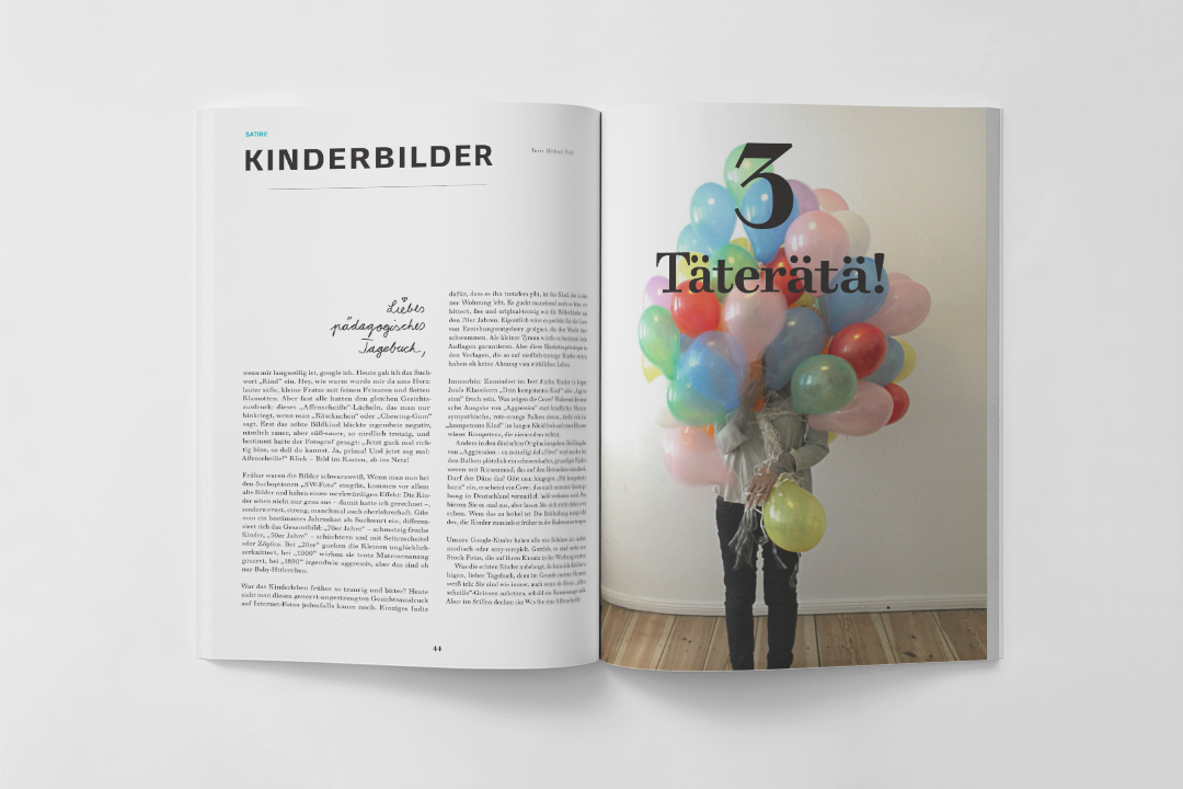
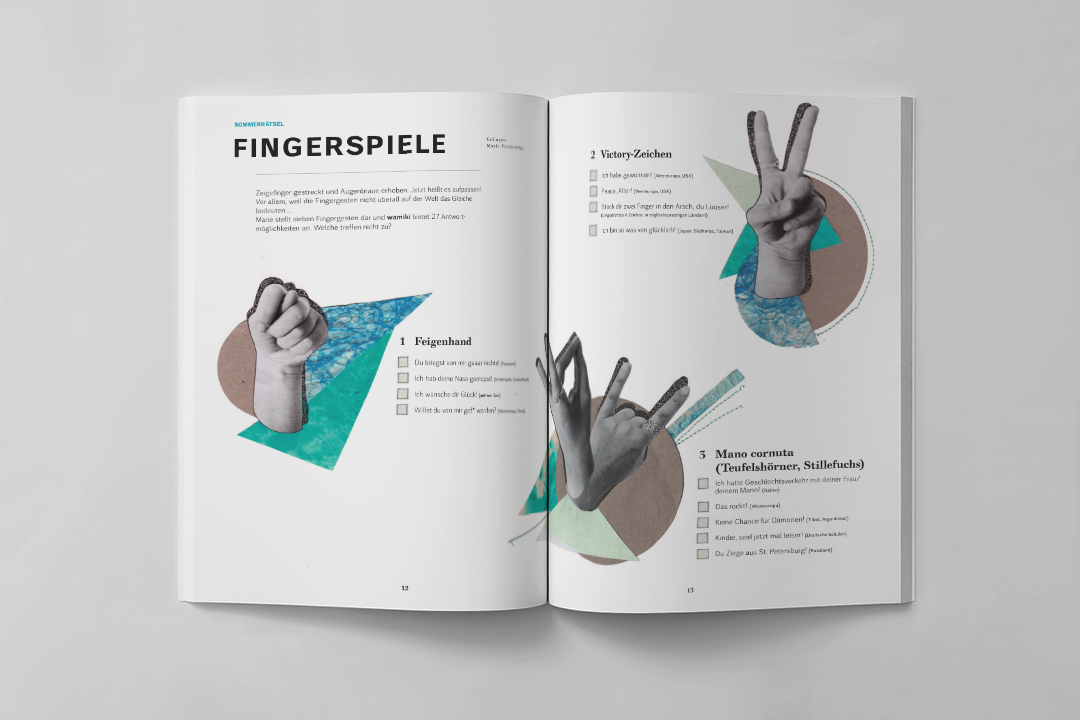
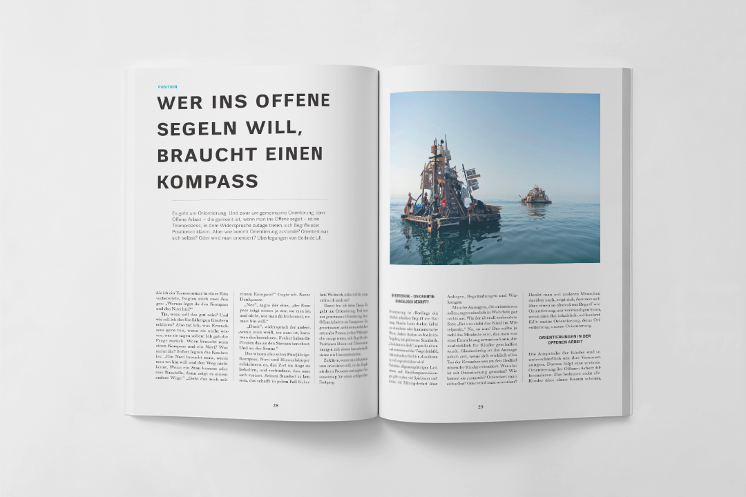
In designing the layout, our own objective was to find a visual language that would be striking but high-quality, sturdy and scalable for different editions of the magazine. So we combined a quiet layout grid with creatively unconventional imagery. To contrast with the overly colorful design style of most early-education publications, we kept the look relatively low-key, using typography rather than childish graphics to create visual interest. Typographic continuity comes from a combination of serif and sans-serif versions of the company’s chosen typeface, Walbaum.
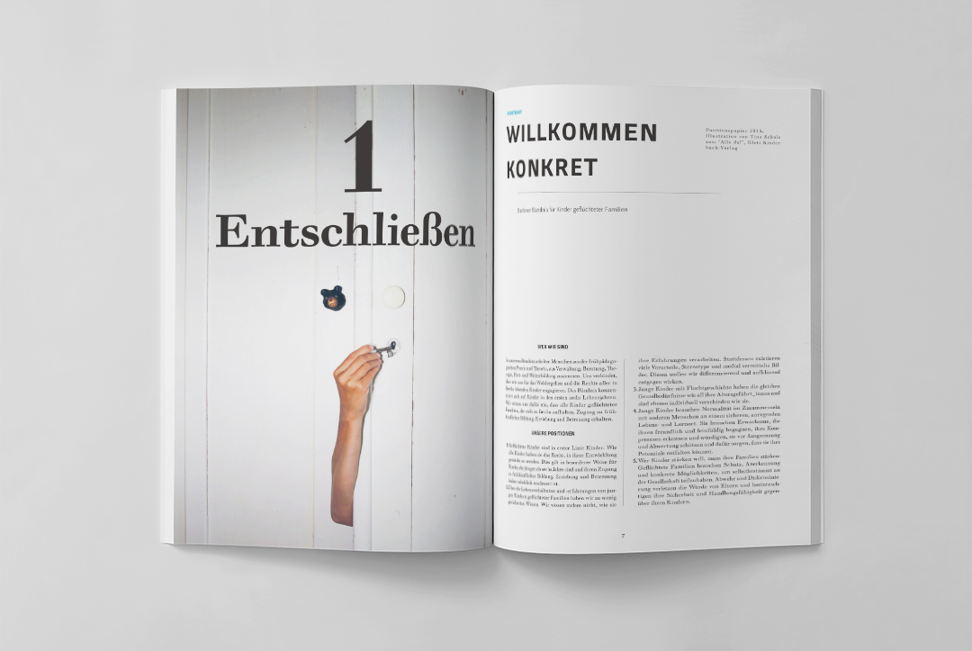
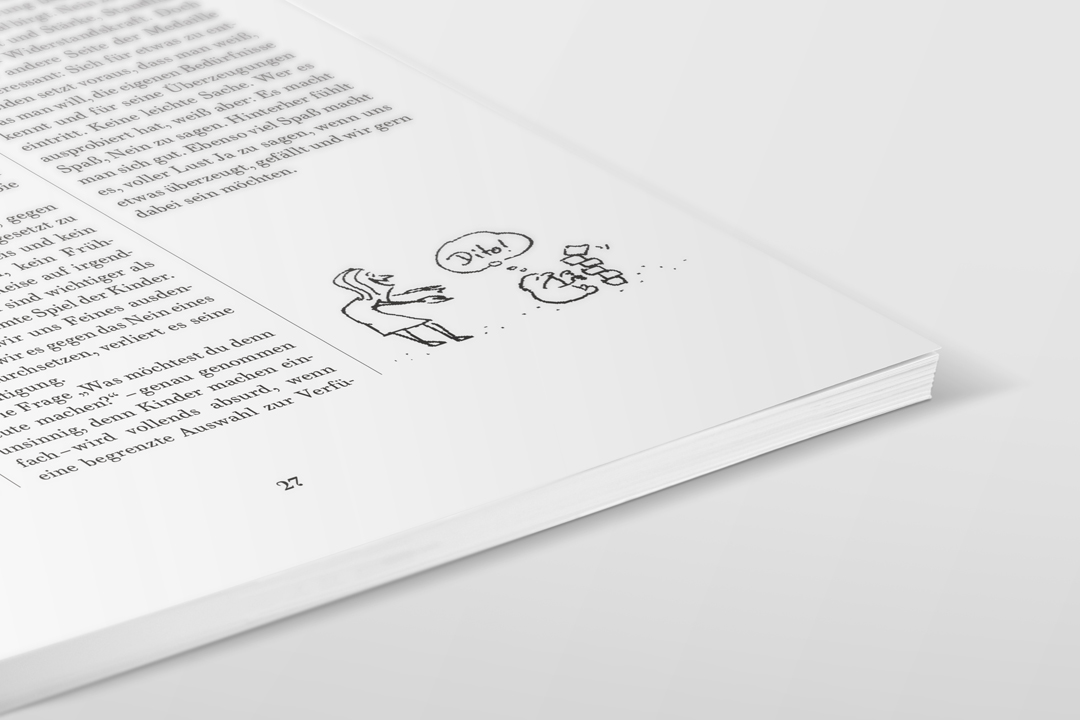
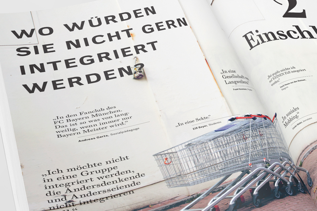
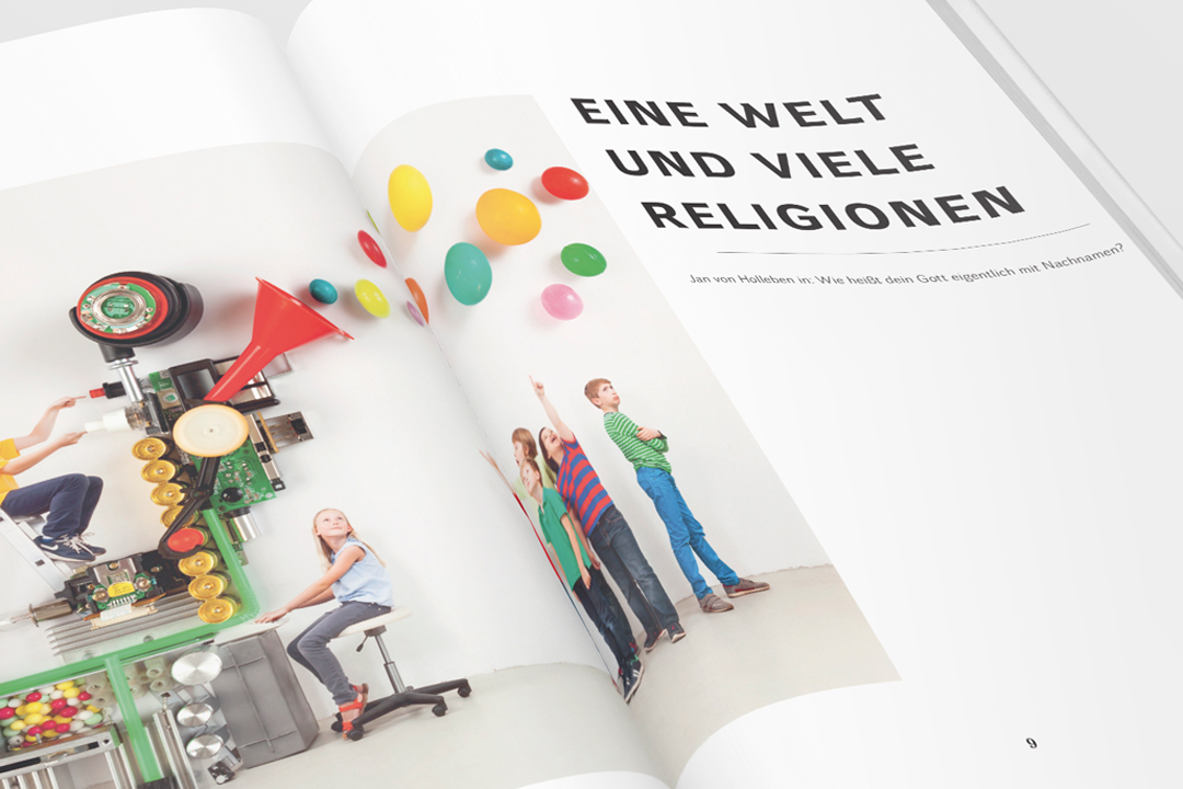
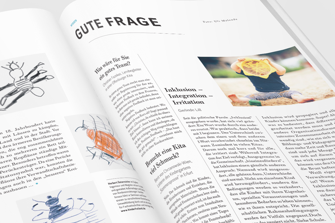
In addition to generous amounts of white space, turquoise highlights are used for emphasis throughout the magazine. On the tactile side, open-textured, uncoated paper adds another unusual dimension to the reading experience. We continue to work with Was mit Kindern on all their publications, both print and digital.
