Literature as open book
We were asked to give the Kleist-Museum in Frankfurt (Oder) a new brand positioning and corporate design. The Kleist-Museum invites you to experience his professional and scientific attitude in an entertaining way. Our design bridges this tension between science and public proximity. As Kleist did, text structures are playfully emphasized with colored markings. This leads straight to the heart of the museum: literature and the passion for text.
Kleist-Museum Literature as open book 2022
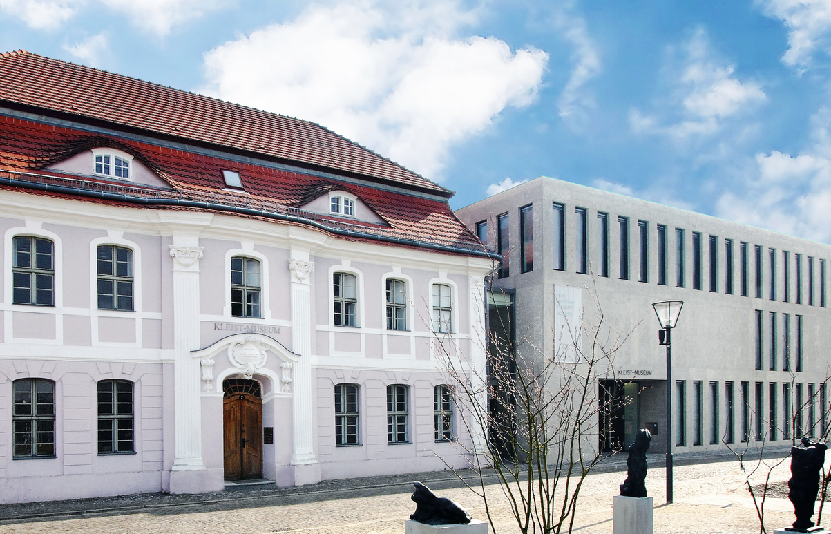
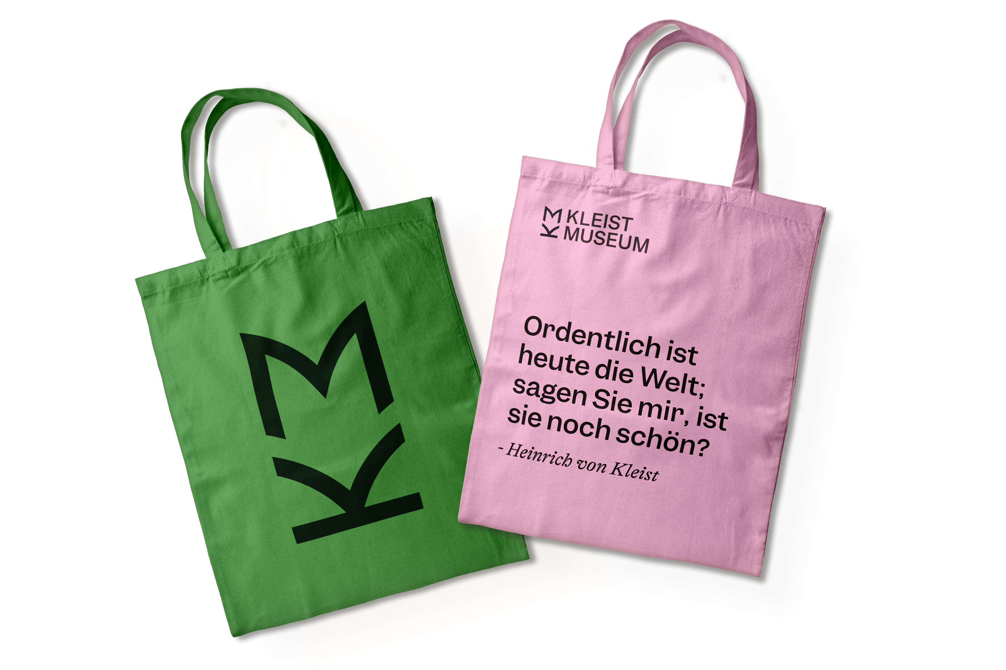
With its clear typography, the logo radiates seriousness and stability without appearing elitist. The modified initials “K” and “M” create the playful image of an open book. It invites You to join the passion for text.

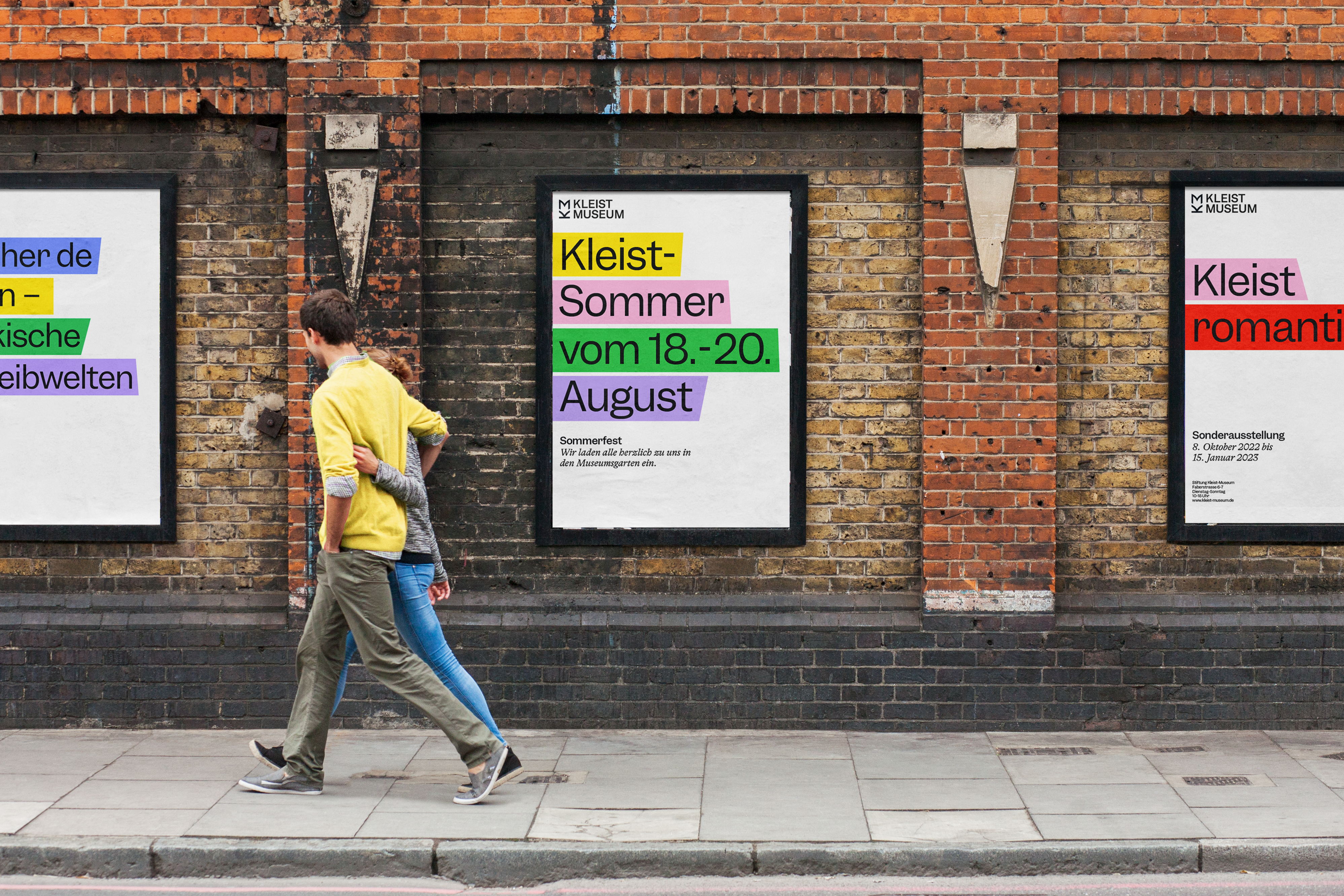
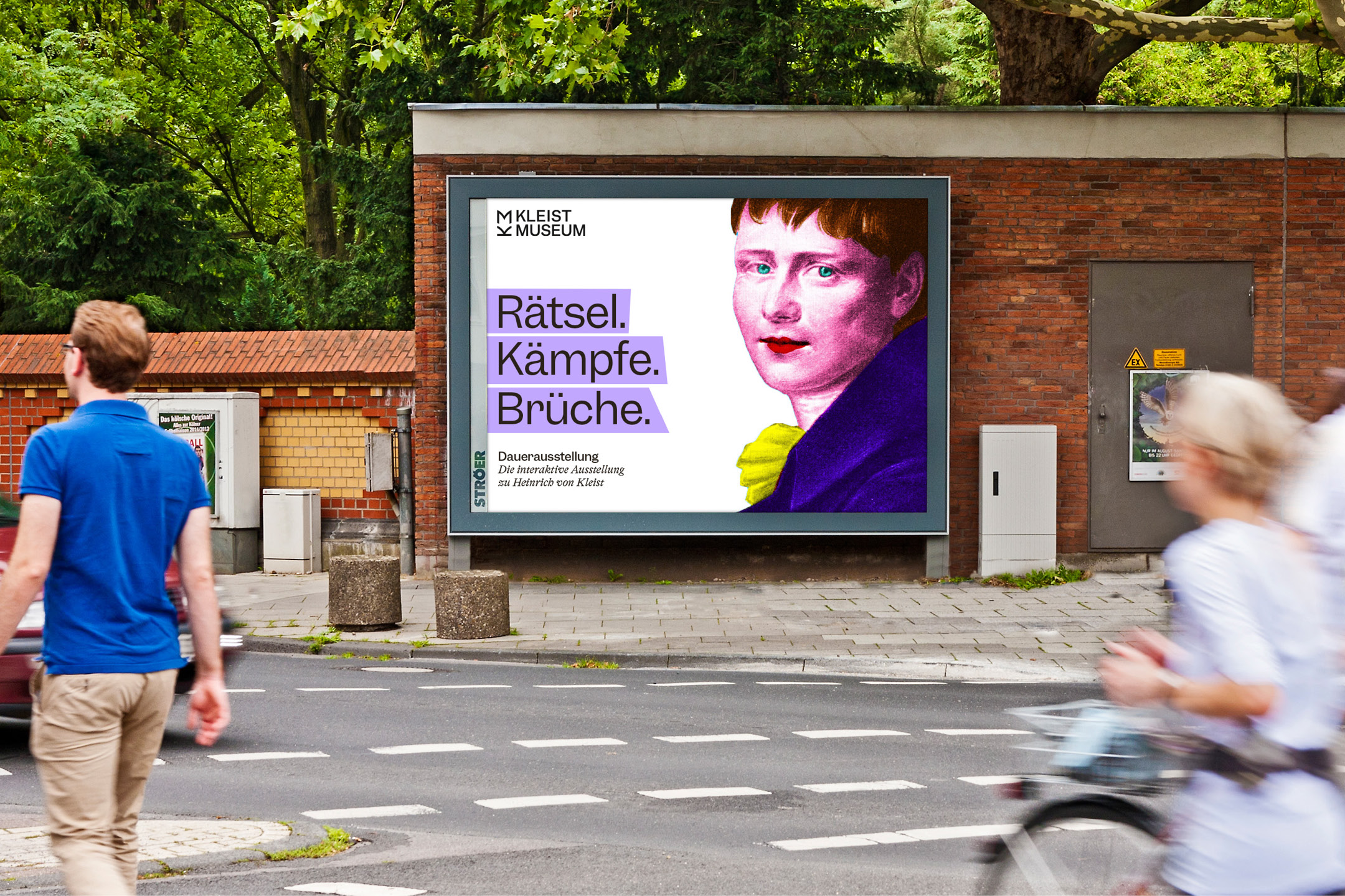
Emphasis is placed in a playful way to uncover text structures and draw attention to the content. Whether small or large, the typography is brought into focus everywhere with colorful markings. Intensive colors give the Kleist-Museum a modern and inviting look.
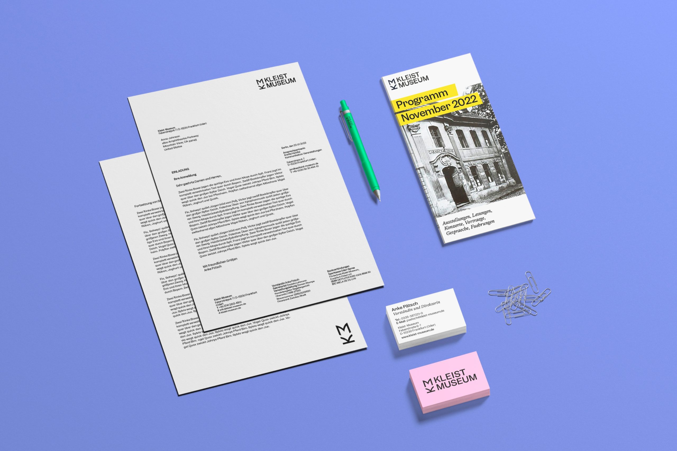
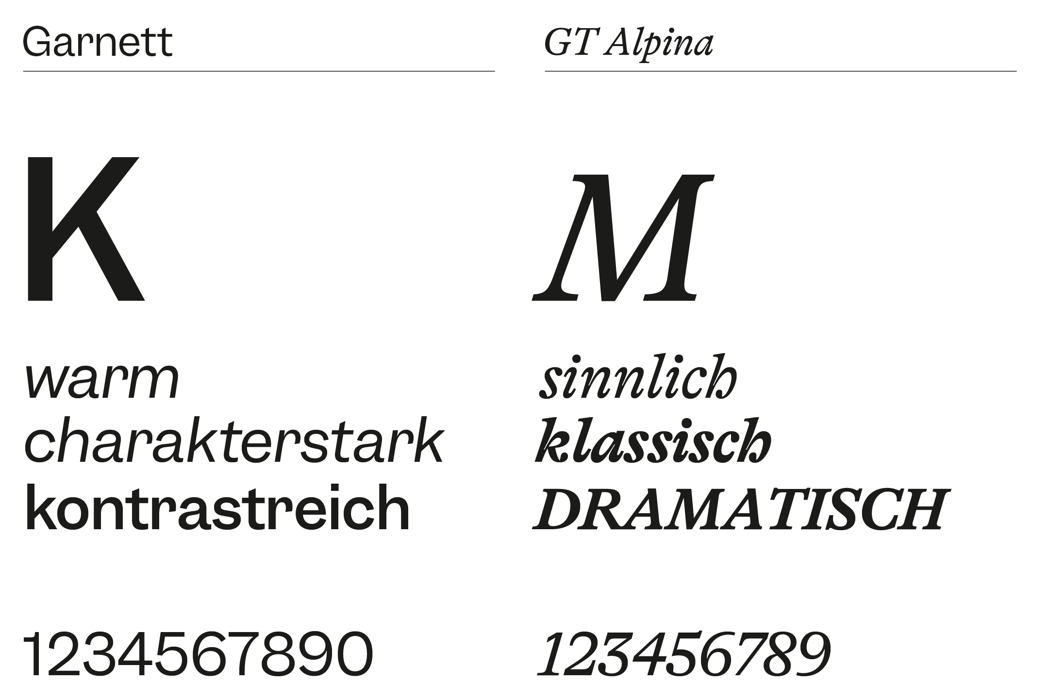
The Kleist-Museum finds itself in a field of tension full of contrasts; classic literature and professional research meet an inviting museum atmosphere. The typography also takes up this image. There is an interplay between the characteristic typeface Garnett and the playful serif GT Alpina.
Make a visit to the Kleist-Museum:
Or see another example of our work on museum transformations:


