School of Paris
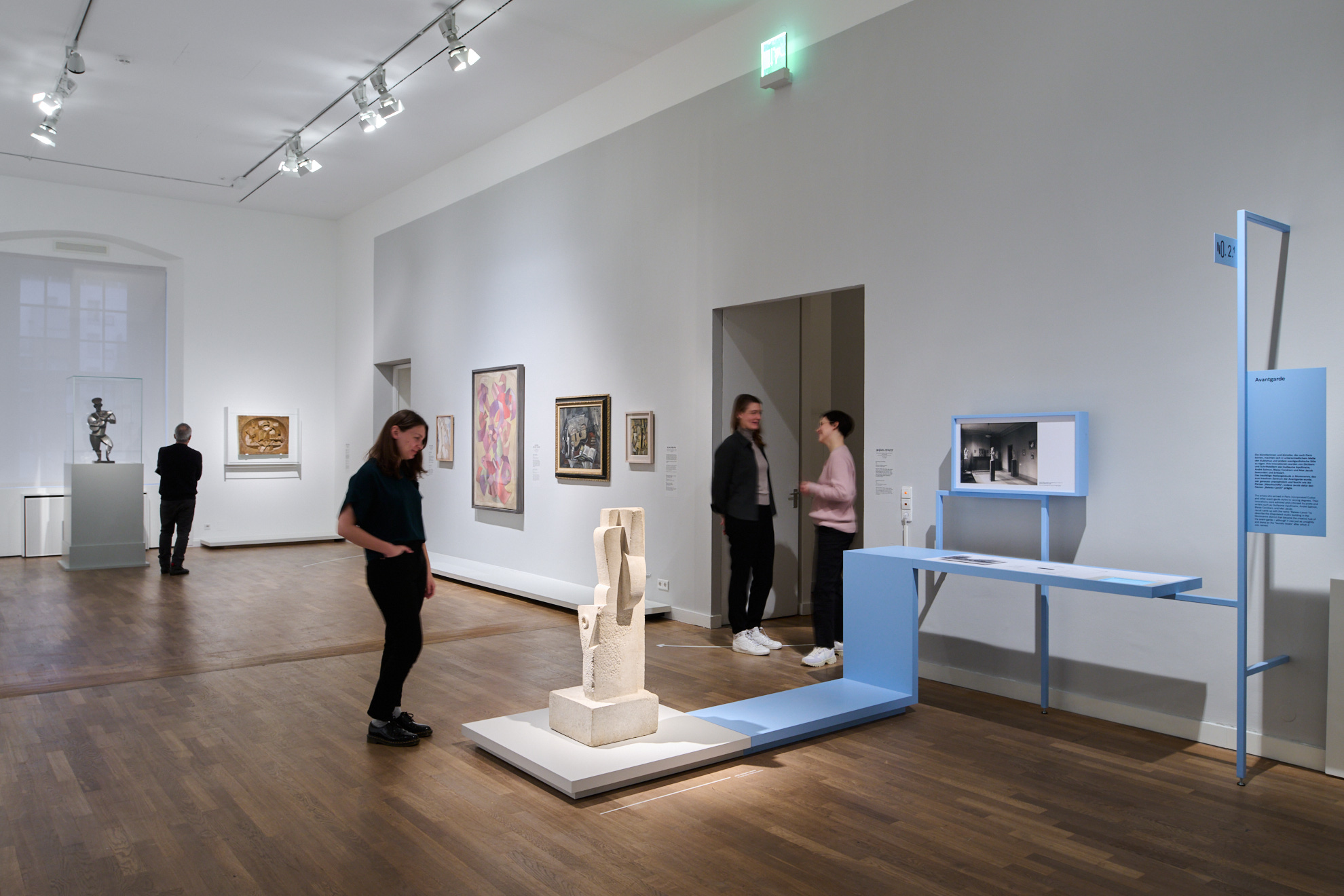
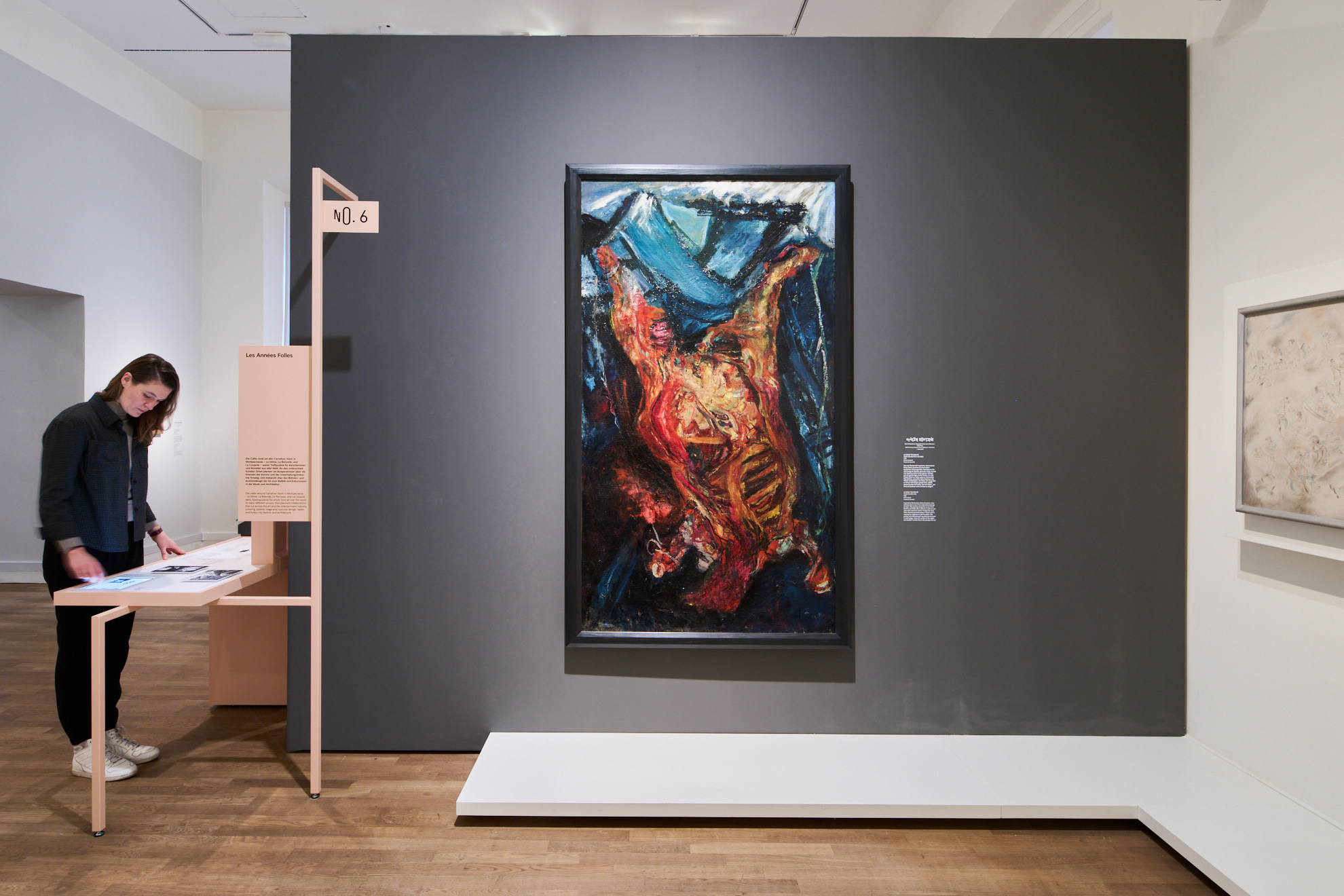
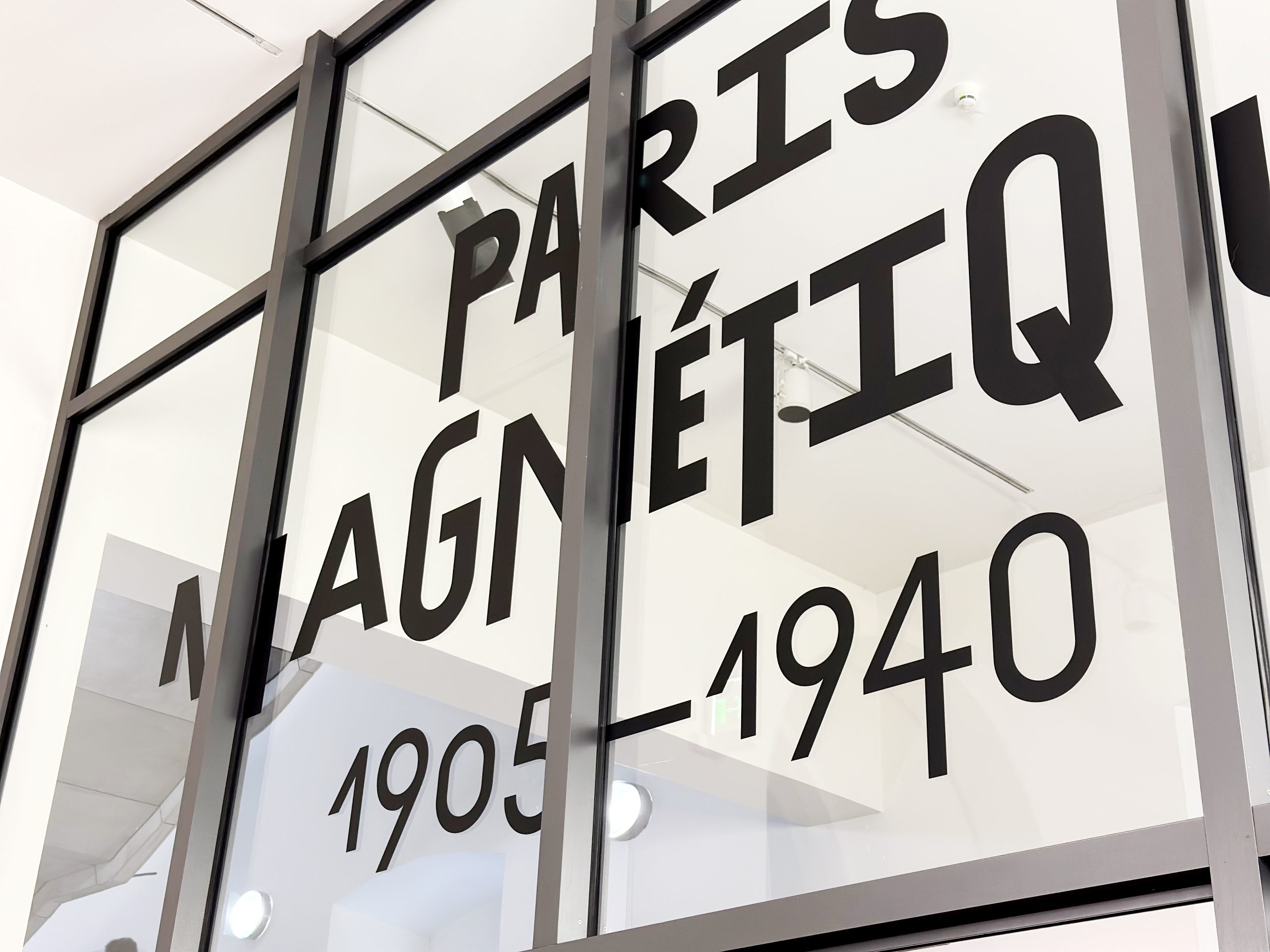
We designed the architecture and graphic design for the exhibition “Paris Magnetique 1905-1940” for the Jewish Museum Berlin. The Paris of the first half of the 20th century attracted artists from all over the world like a magnet, who communicated, worked, celebrated and, more precisely, lived there. In order to present this open system of information exchange, we have chosen the Parisian street culture in the form of kiosks as information hubs as a central design idea.
Jüdisches Museum Berlin School of Paris 2023
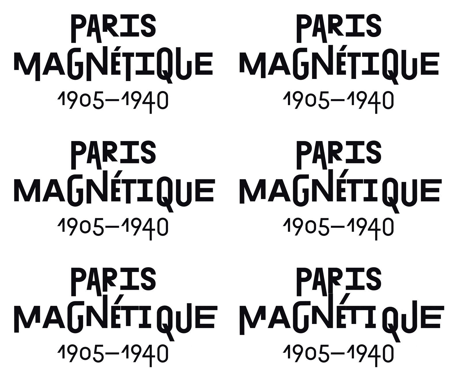
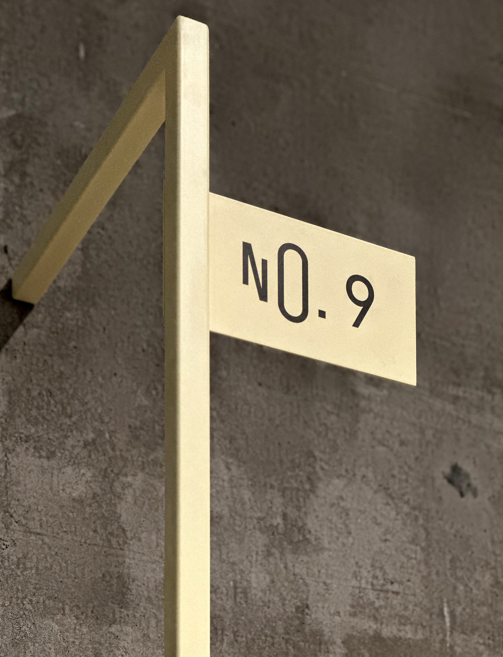
The typeface “Exposit” by Tighttype playfully translates the magnetism in the title to the visual appearance. Together with studio edgar kandratian, we developed a typographic system that combines both the corporate typeface of JMB and the vibe of early 20th century Paris. Without being historicizing or kitschy. The color black does not distract the eye from the colorful works and adds an urban accent to the bright lightness of the interior design.

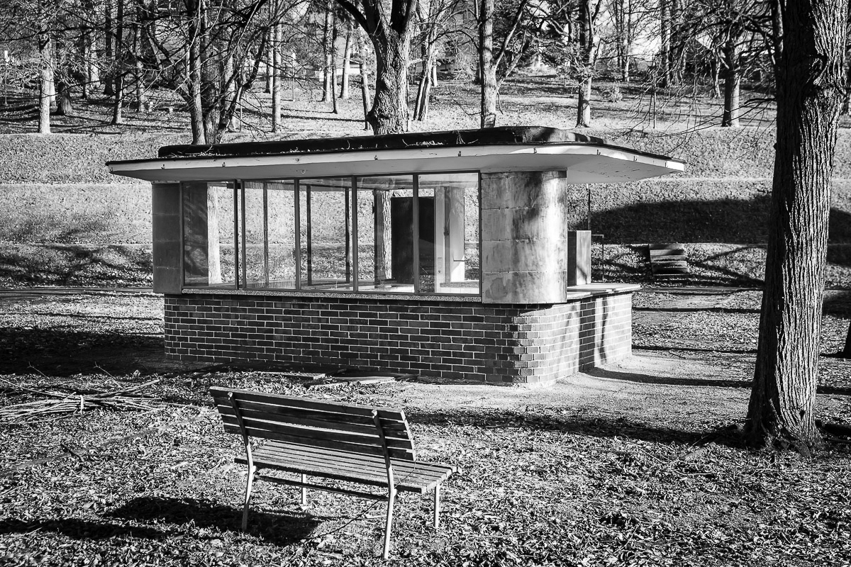
The inspiration for the design comes from the Parisian street of the 20th century. Cafes and “kiosques” (newsstands) were meeting places where artists of the so-called Parisian school hung out. Friendships were made, studio spaces were arranged, people fell in love. Documenting this level alongside the artworks was part of the central concept of curator Shelley Harten.
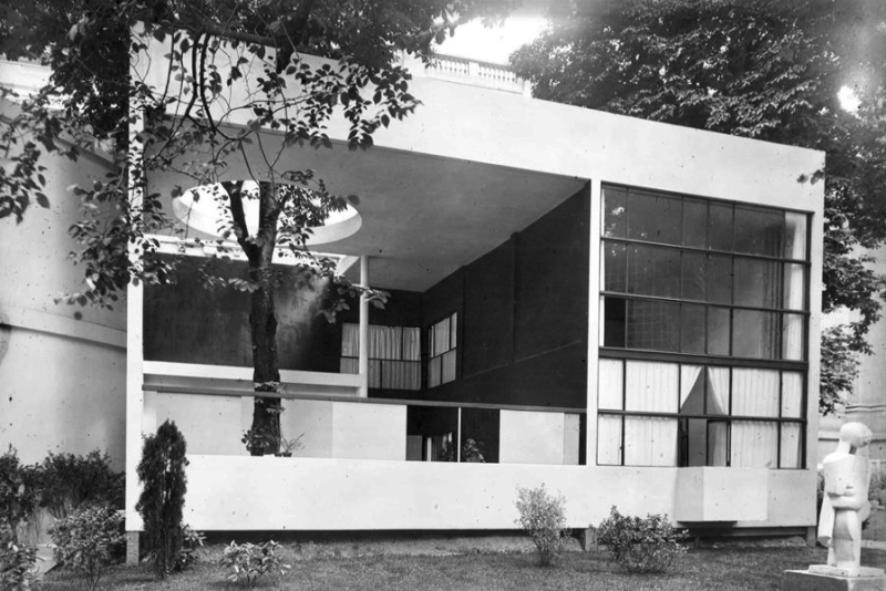
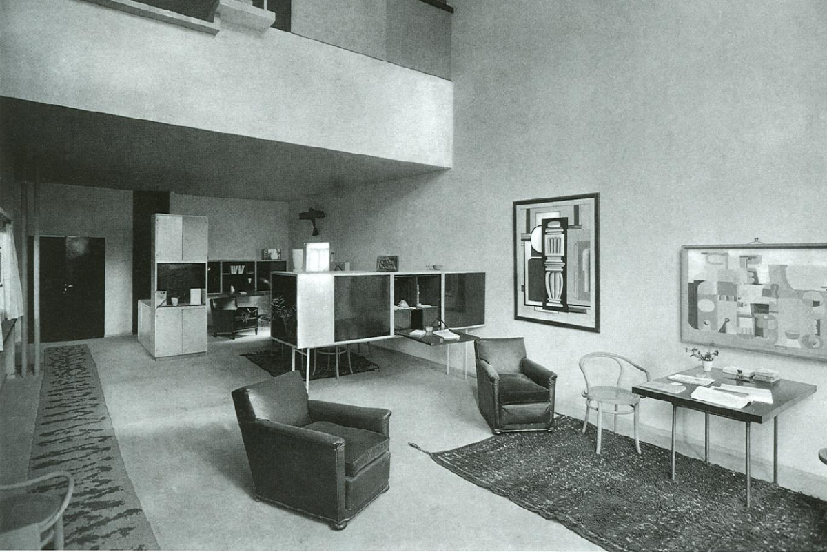
In order to find a suitable architecture for the documentation level of the exhibition, together with exhibition designer Thilo Albers, we chose the concept of LeCorbusier’s “La Maison d’Homme” and Alfredt Arndt’s “House of the People”. In the pavilion LeCorbusier we found the inspiration within a certain cupboard. Our concept separates the documentation level from the artworks. We planned the existing showcases of the Jewish Museum in such a way that they could be attached to our construction. This guaranteed a sustainable use of the museum inventory.
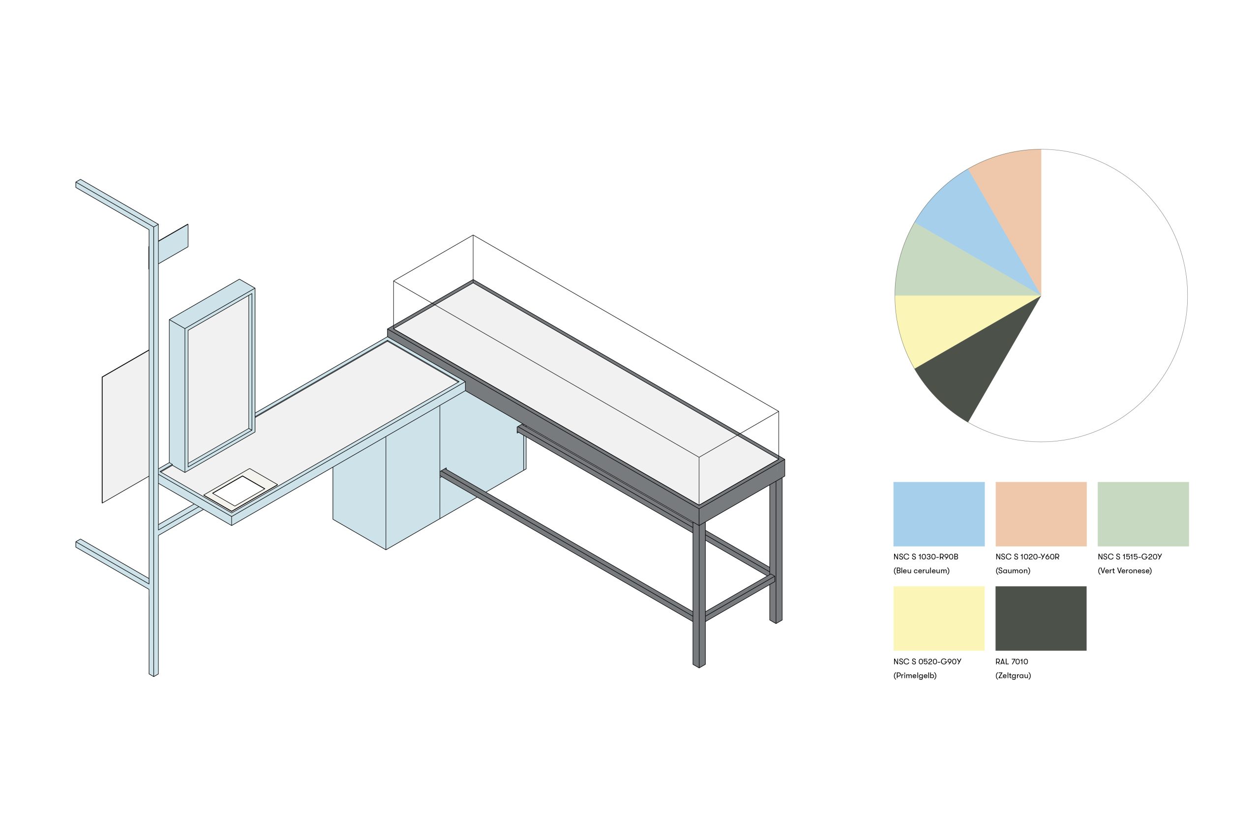
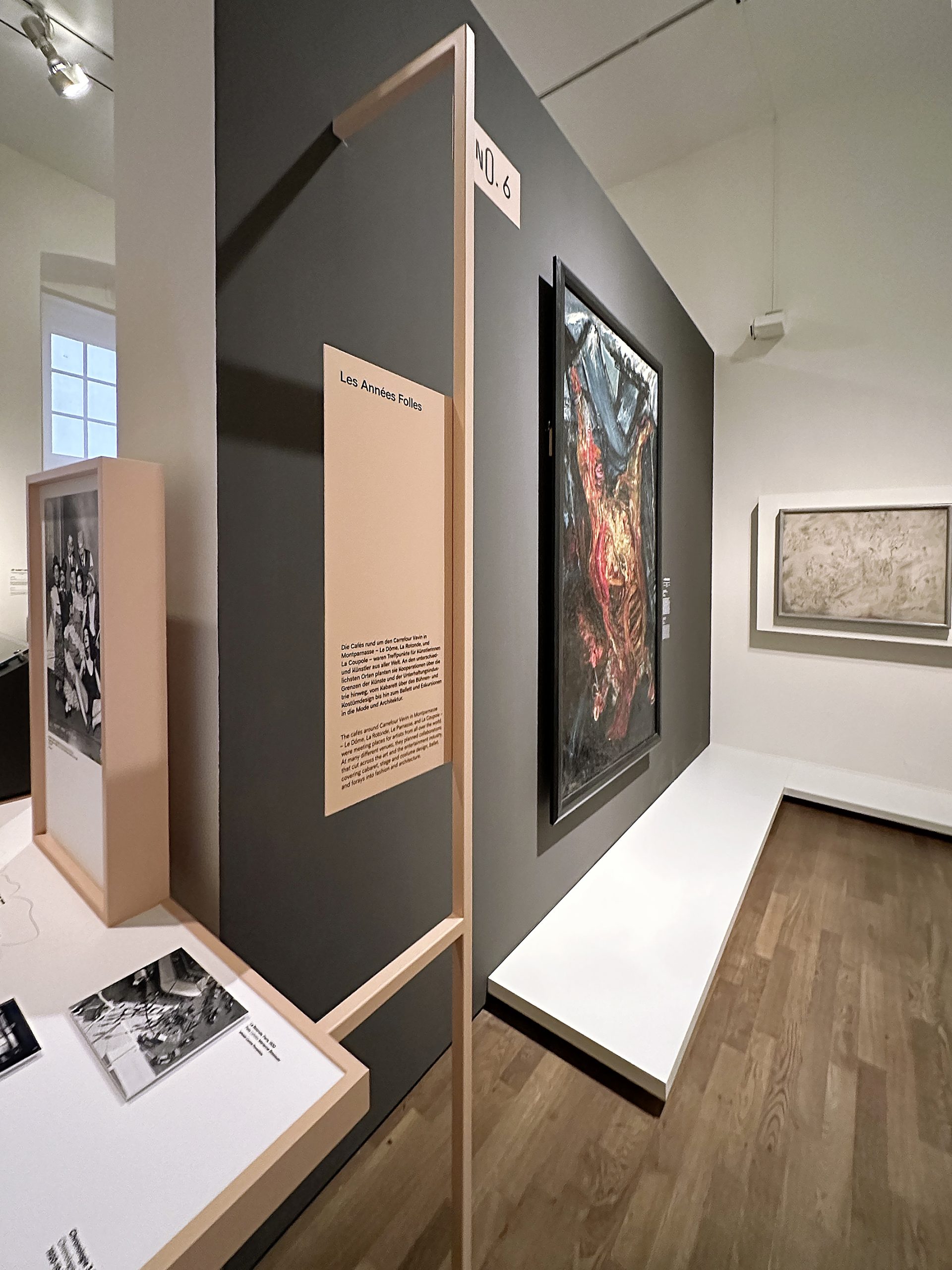
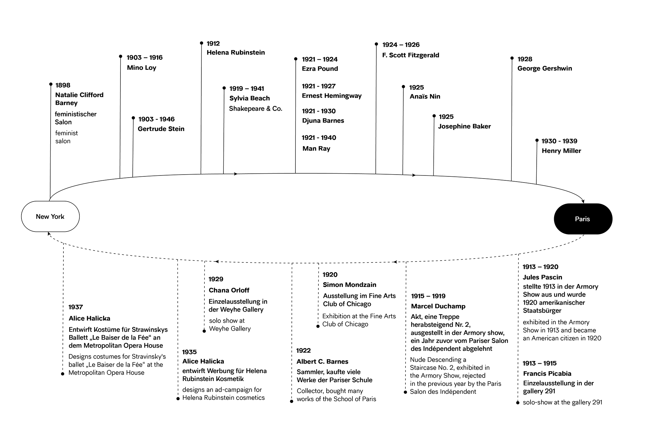
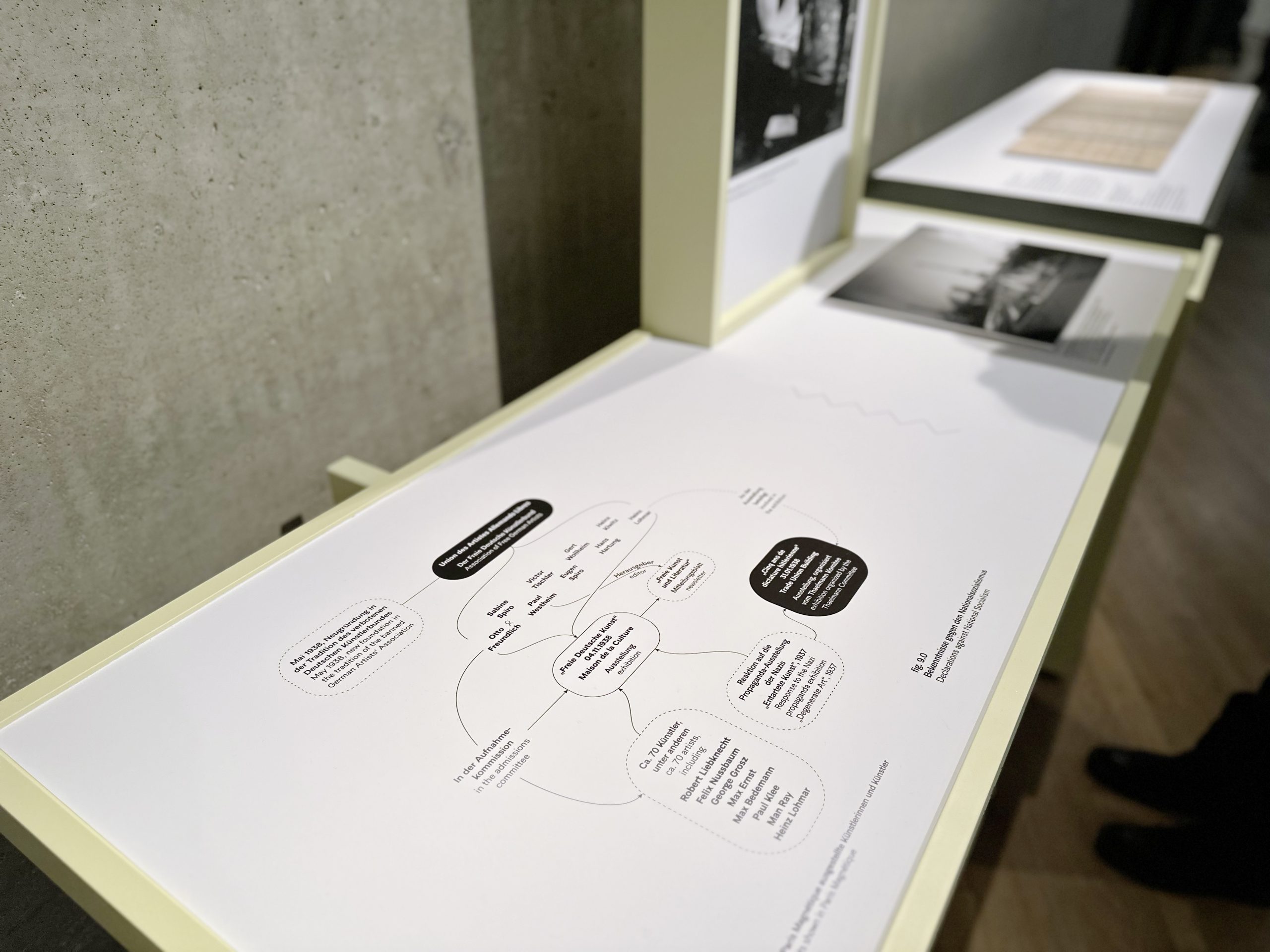
The artist scene in Paris at the time was strongly and multi-layeredly networked. Some supported each other, some became friends and some even got married. These social connections in different areas are represented by network graphics and emphasize the relationships between the artists.
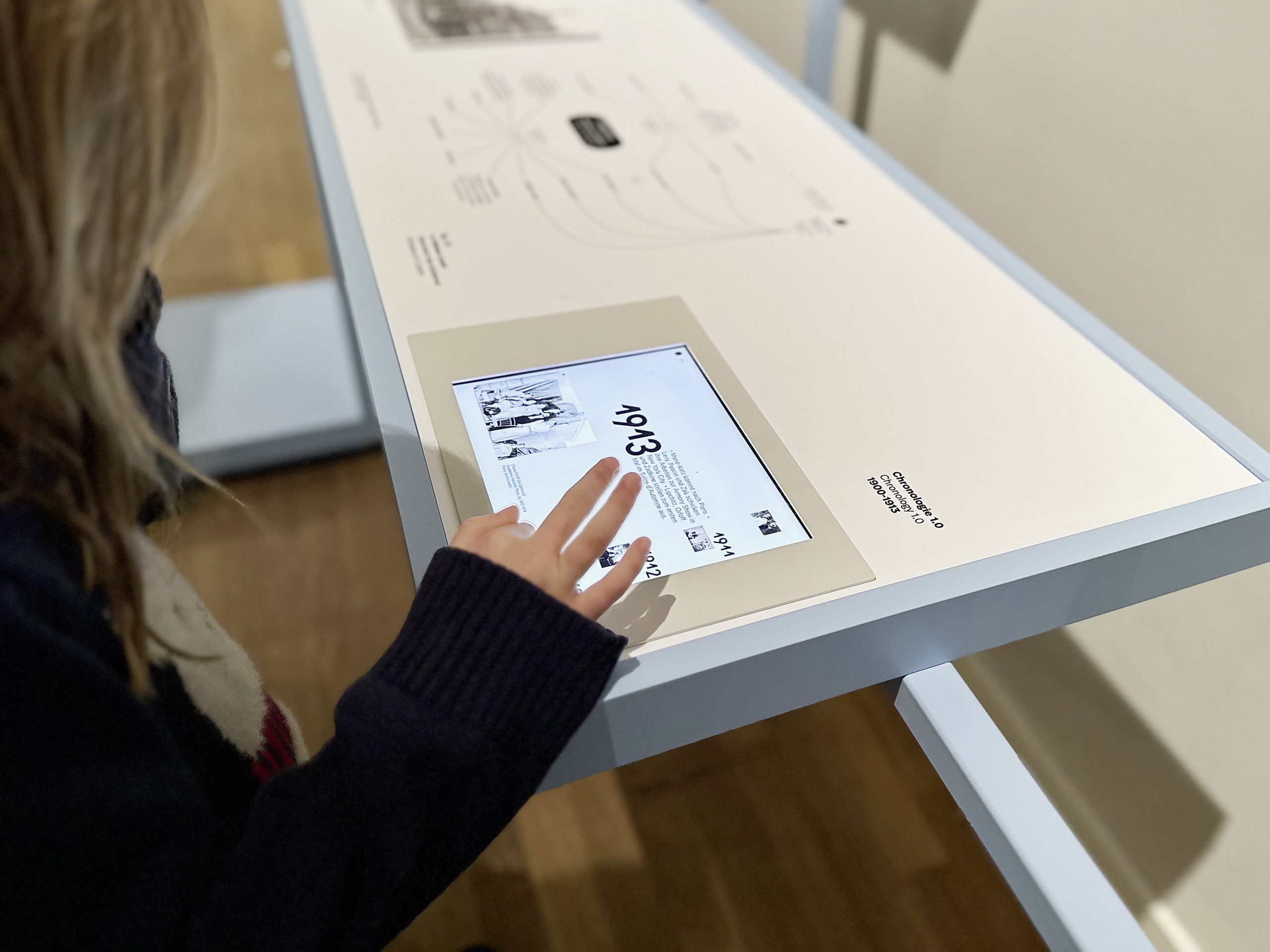
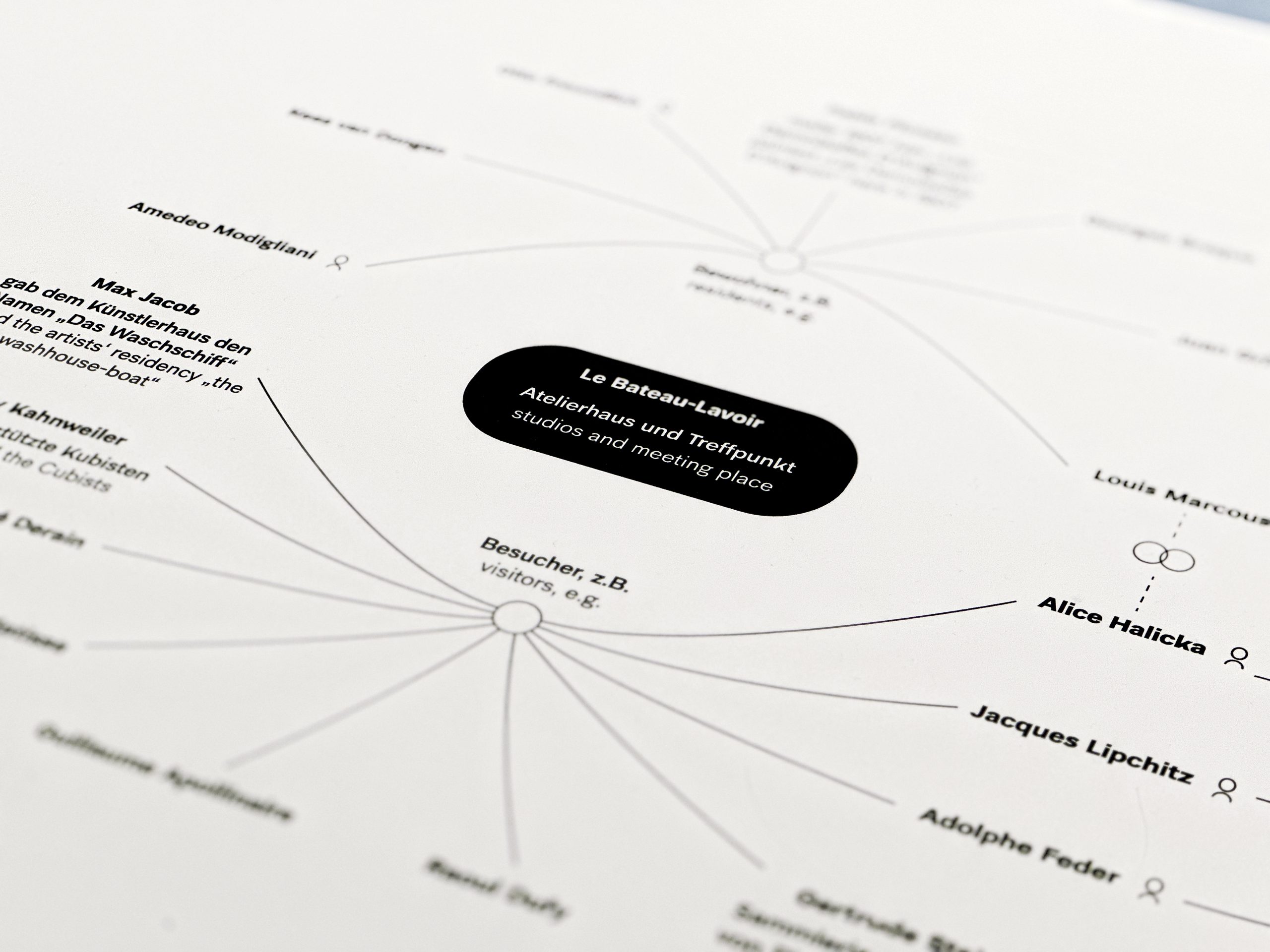
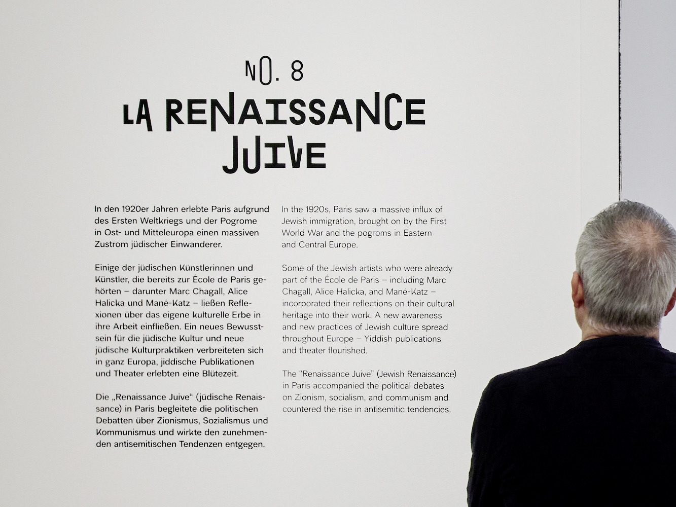
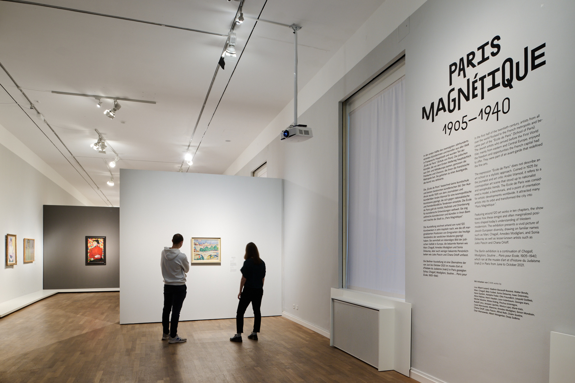
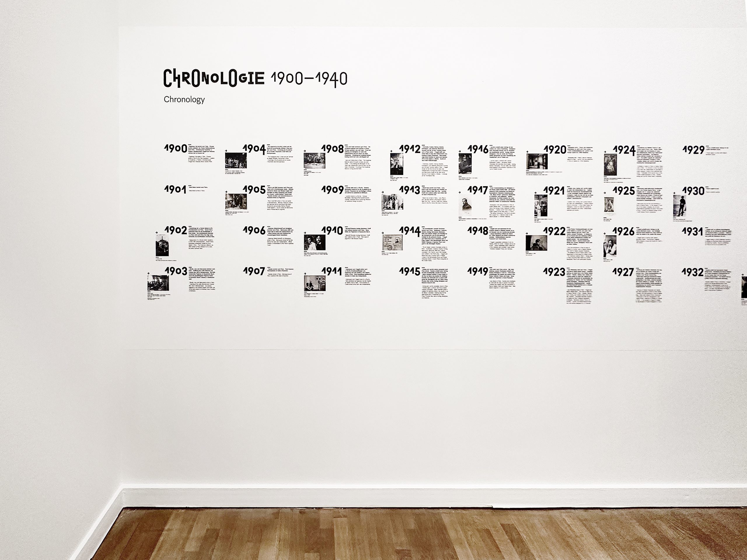
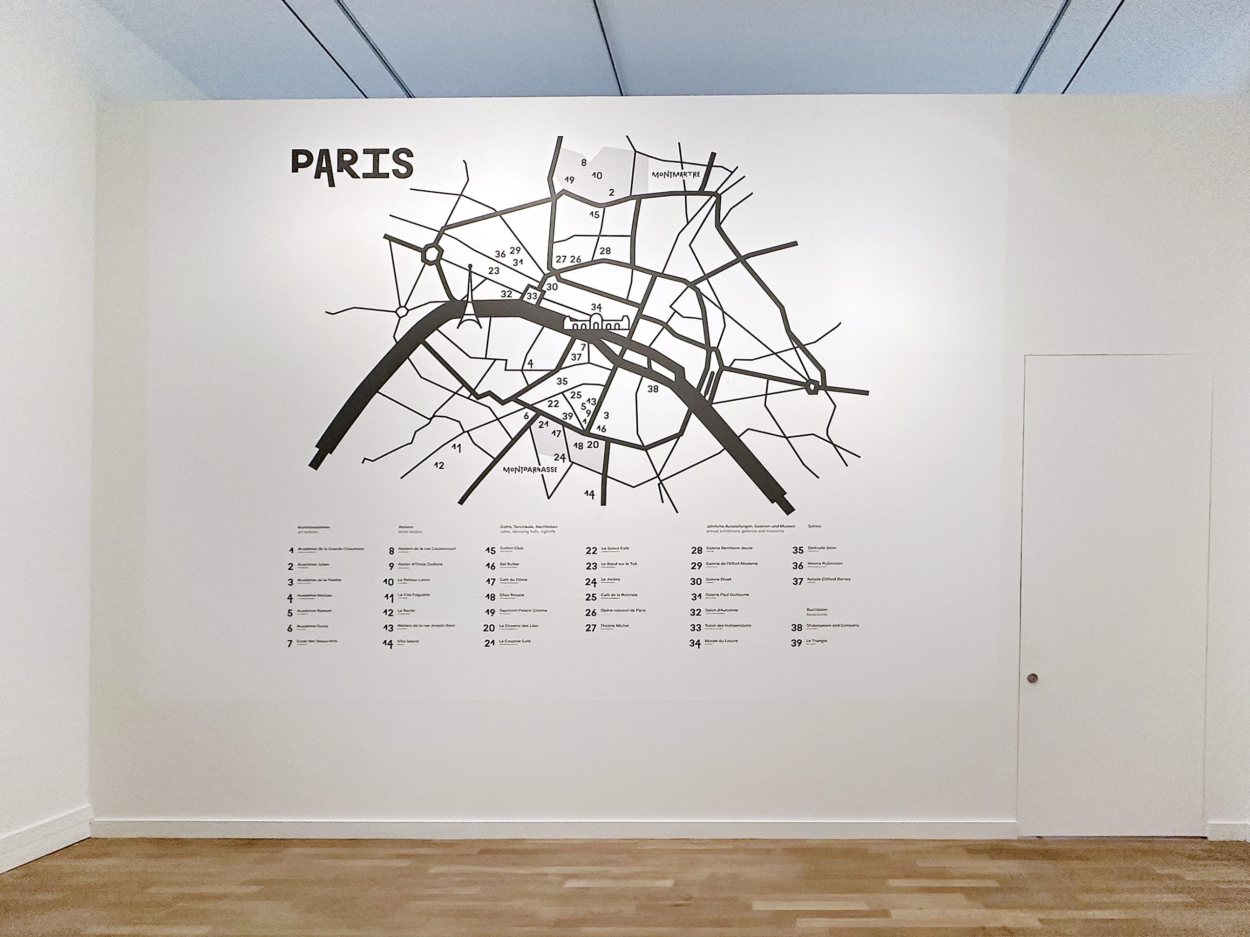
A large map of Paris Magnétique from the times of 1905–1940 provides an overview of all the important locations. The legend is divided into the different categories. The popular bohemian districts of Montparnasse and Montmartre are emphasized. Die chronology provides an overview of all important events during the time of the School of Paris. We developed an interactive infographic for the chronology for three media stations in the exhibition.

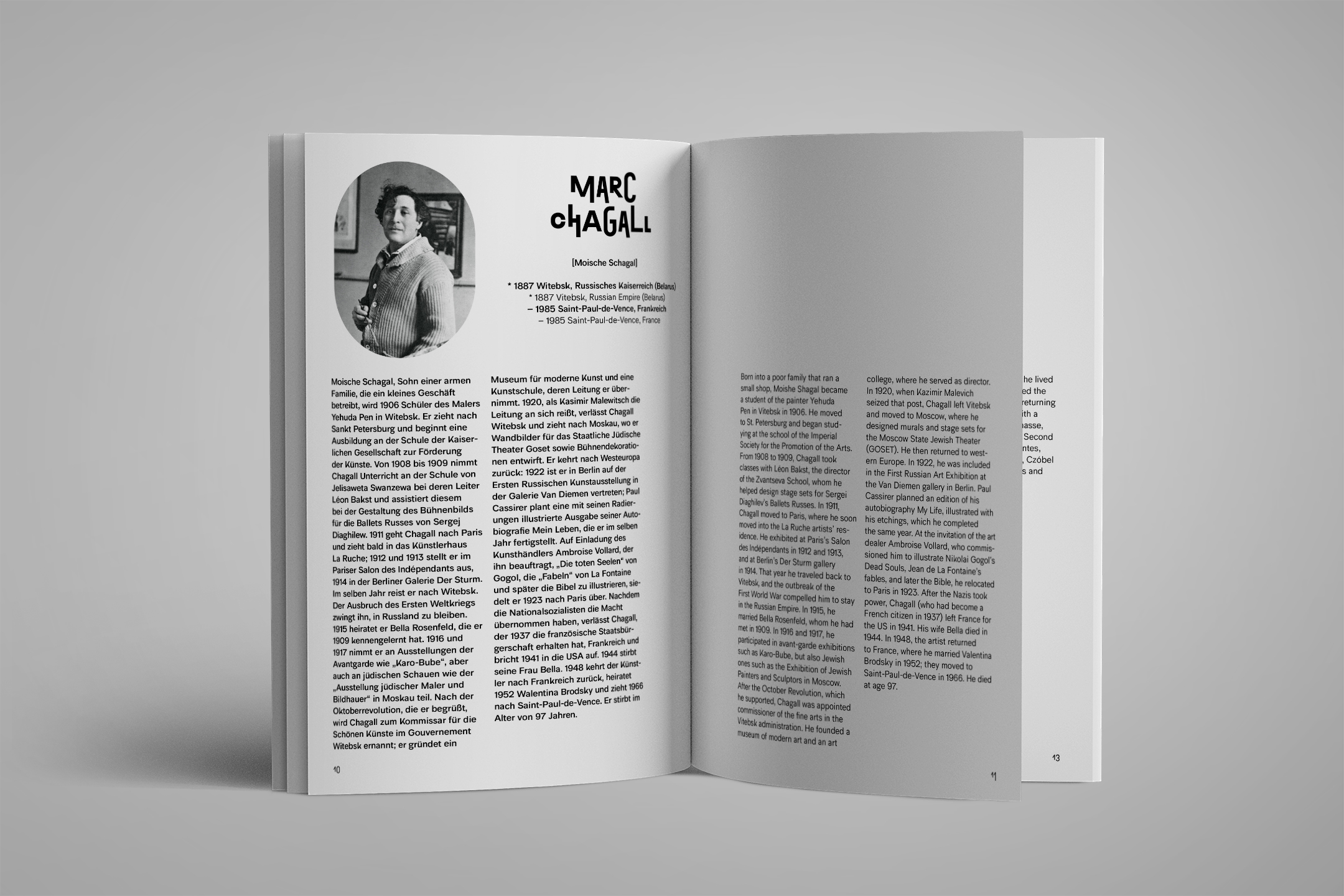
While the labels already offer the viewer small insights into the lives of the artists, a volume with biographies collects more detailed information about the creators behind the works in the exhibition. For everyone who wants to know how the artists came to their craft, where they came from or how the Second World War influenced them.
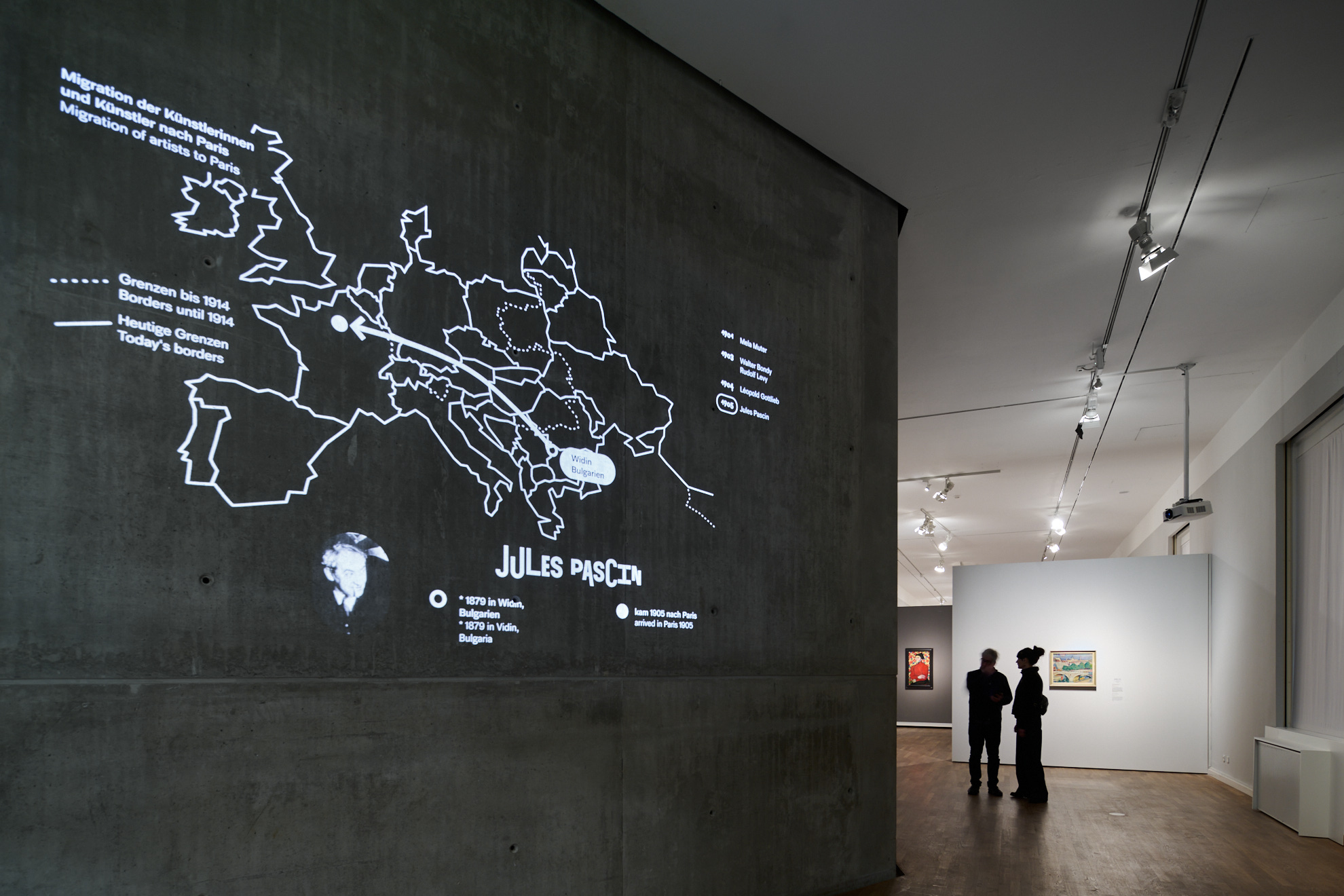
Artists from Eastern Europe in particular were drawn to Paris, attracted by the loud joie de vivre that spread after the First World War. The people came increasingly from the Russian Empire and Austria-Hungary, but also from the German Empire, Italy or Bulgaria. The projected animation visualizes this movement and provides an overview.
Just as the artists were drawn to Paris, so too should the visitors be drawn into the exhibition. In physics, arrows show the direction in which the forces of attraction between magnets act. The stairwell to the exhibition and the foyer are designed according to this model with long, curved arrows that point the way to the entrance for the guests.
Thanks to our partners!
The exhibition design was co-created with:
The exhibition graphic design was co-created with:
Exhibition views by:
Have a look at another project with Jüdisches Museum Berlin:
Historic references:
Café du Dôme, 1925, Paris, Foto André Kertész; Kiosk “Haus des Volkes“ by Alfred Arndt; Pavillon de l’Esprit Nouveau, Paris
© FLC/ADAGP, Pavillon de l’Esprit Nouveau, Paris 1925


