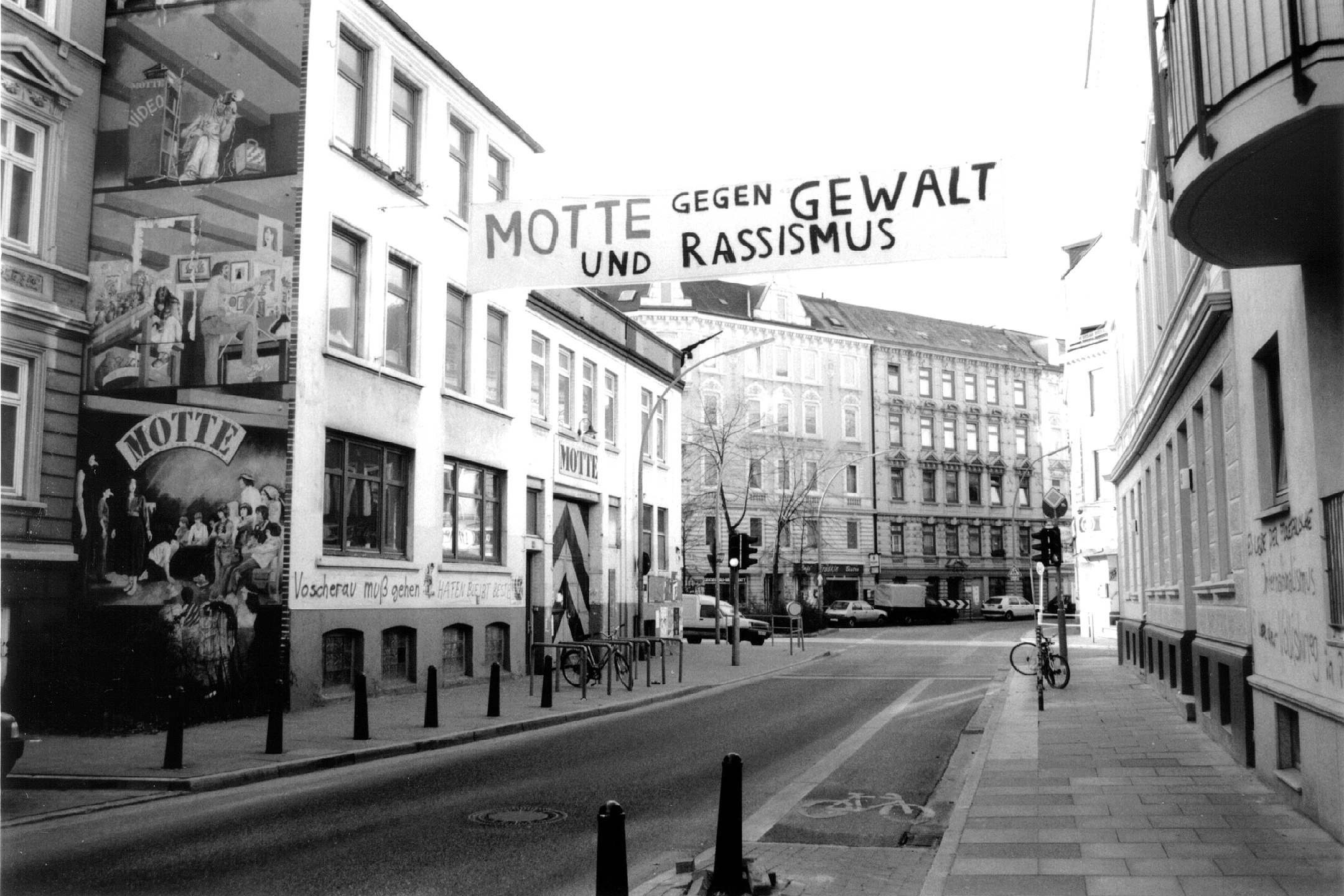
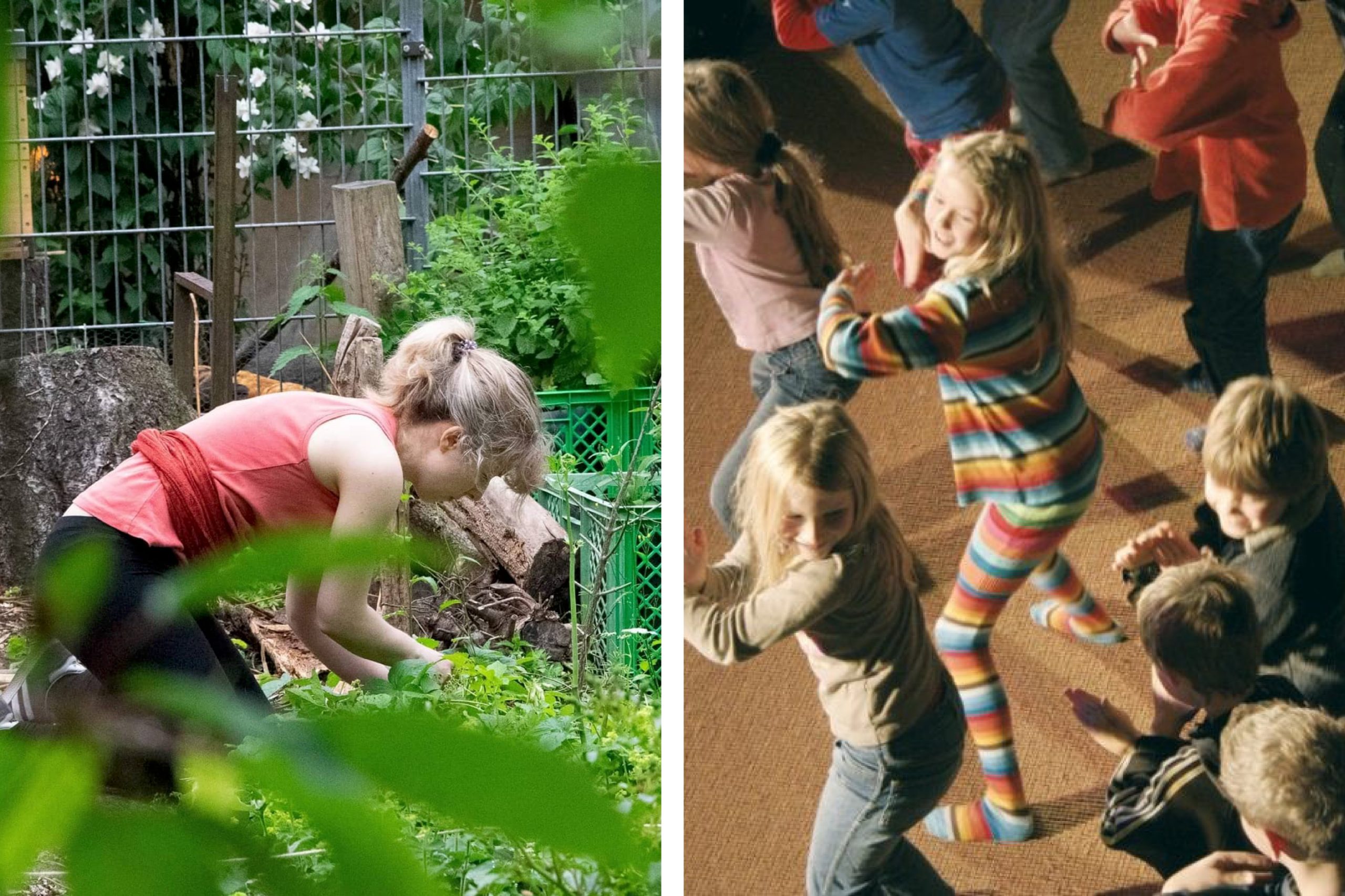
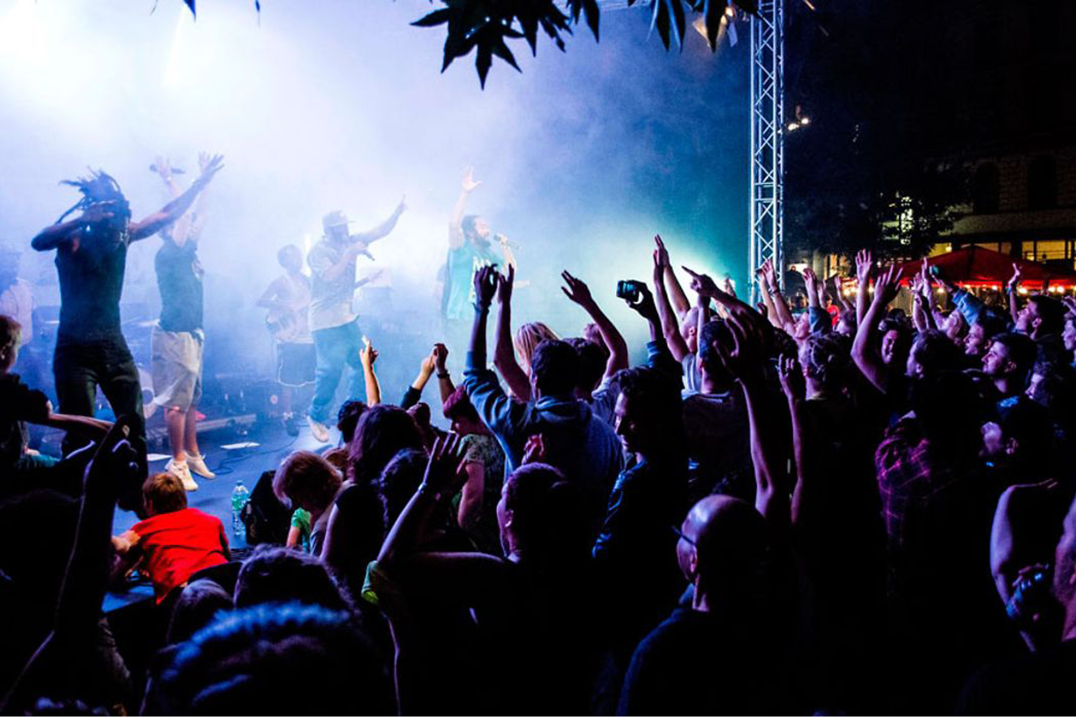
MOTTE is more than just a cultural center in the district of Hamburg-Ottensen. It is a lively place of togetherness, participation and creative development.
MOTTE e.V.Attracted by the Spotlight2024
For almost 50 years, MOTTE, in the heart of Hamburg’s Ottensen district, has been bringing people of different generations, cultures and backgrounds together and strengthening social cohesion.
After the new management took over in 2023, it was time for an update of the corporate design. The creation process for the new corporate design was based on a target group analysis. A survey of internal and external users and stakeholders gave us the necessary starting points for the redesign.
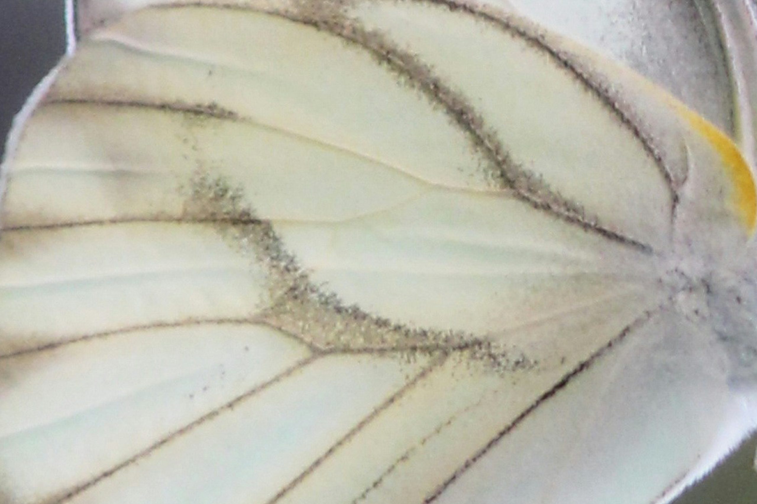
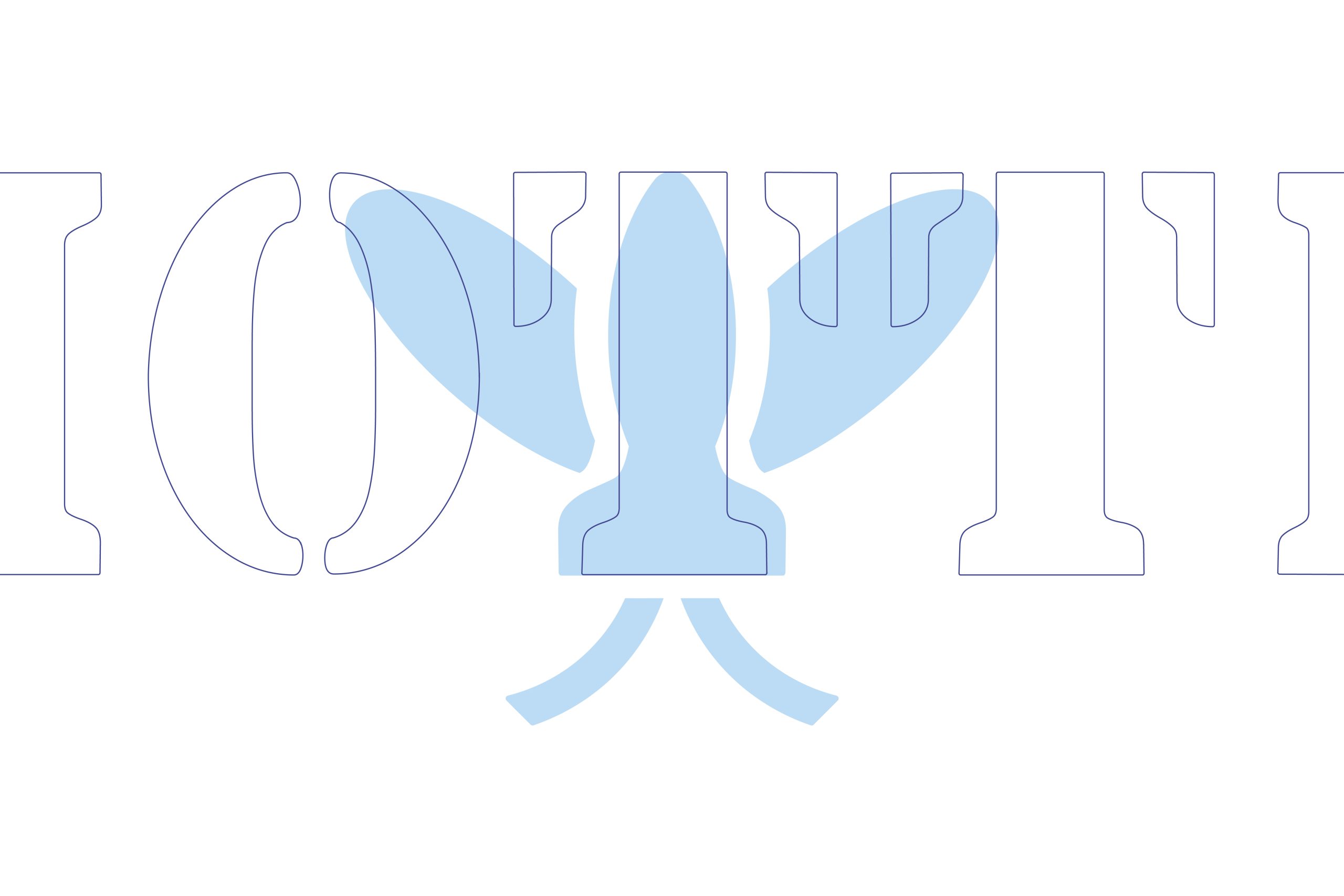
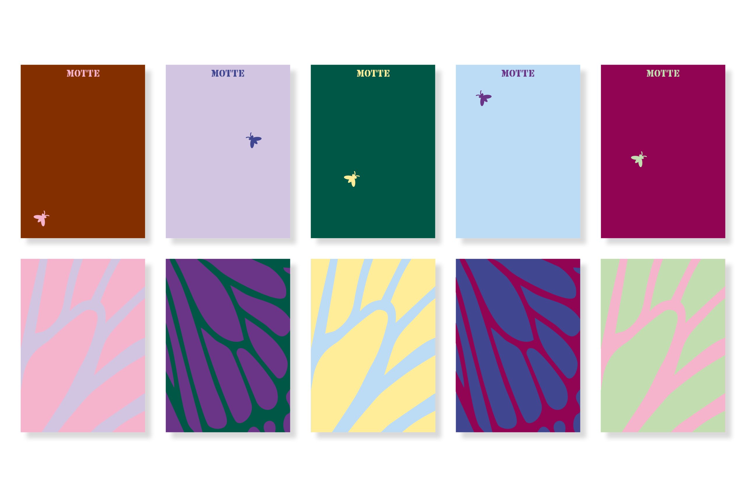
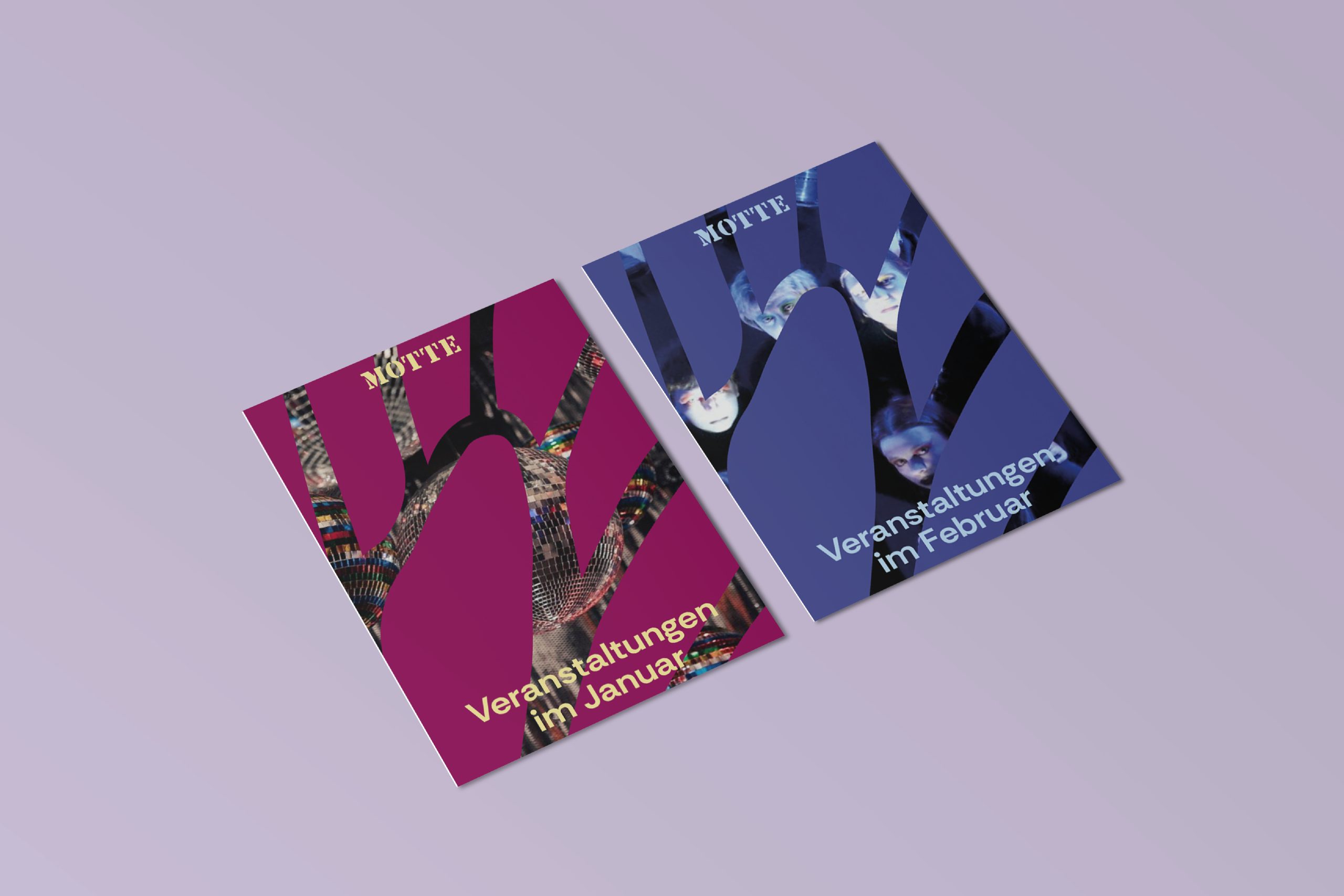
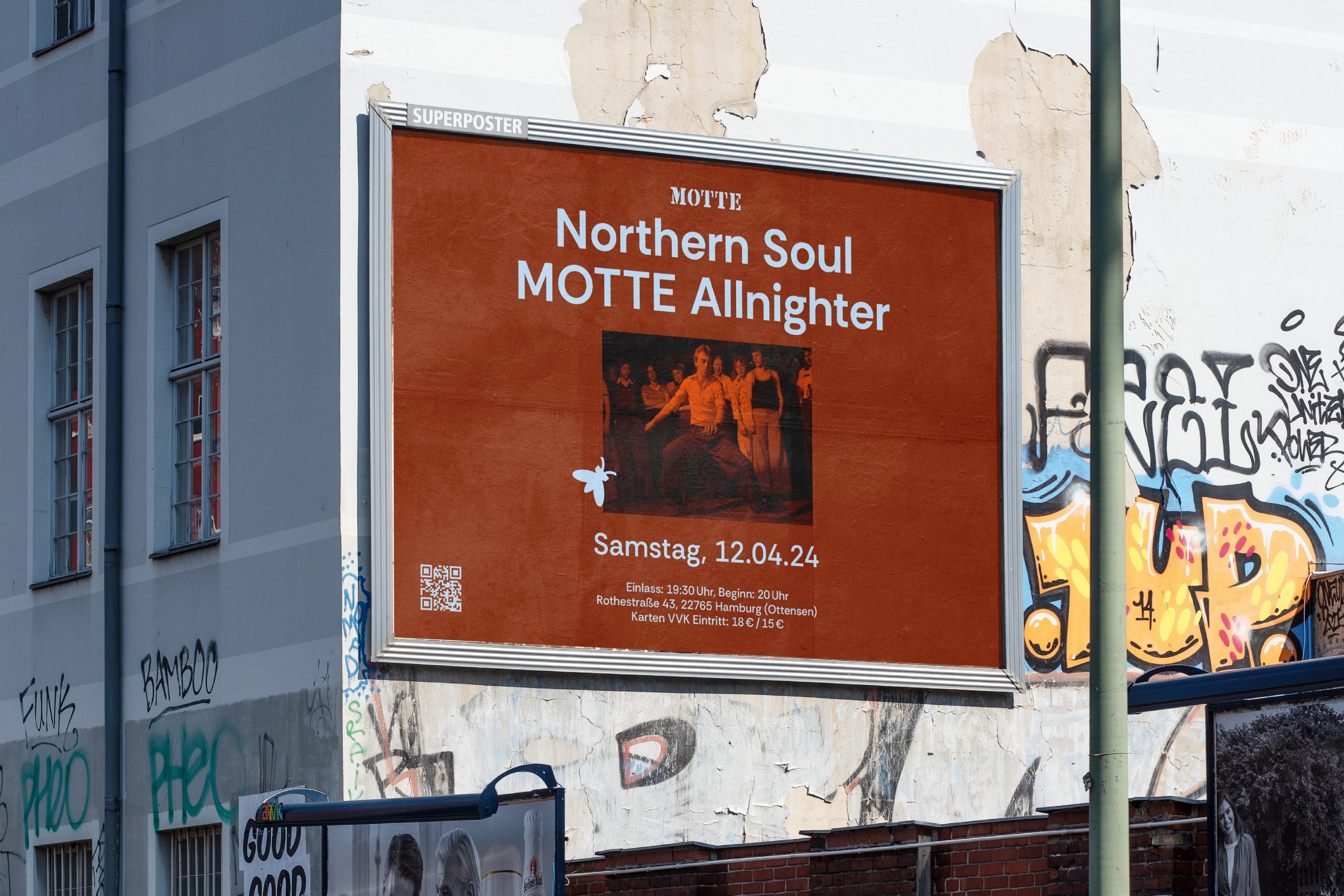
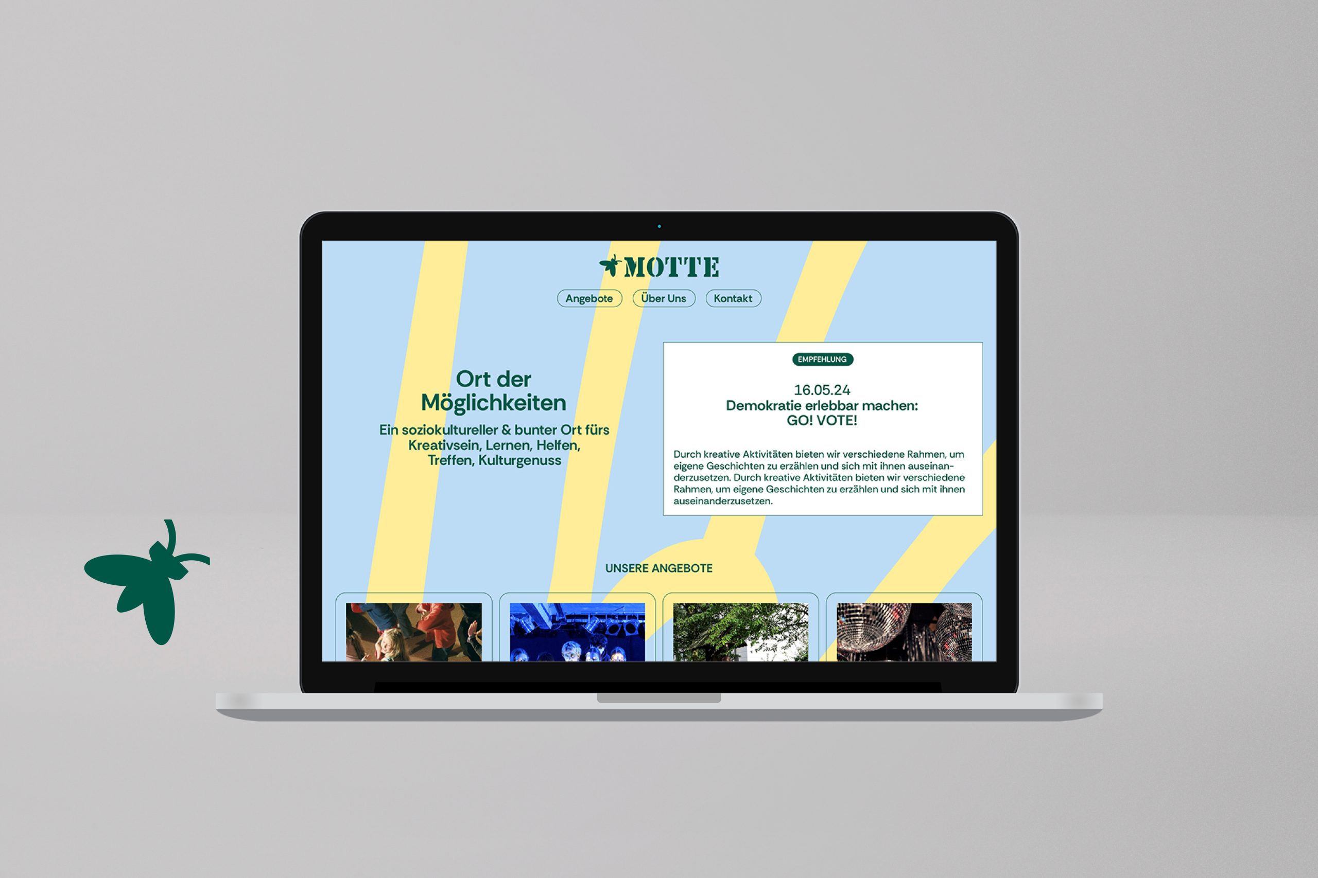
The key visual is reminiscent of the varied wing structure of the moth.
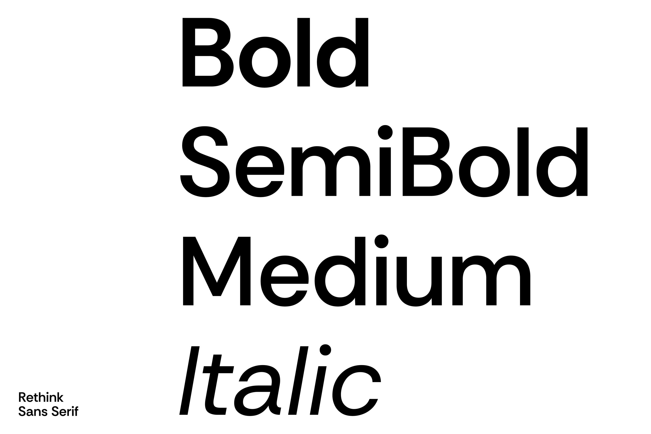
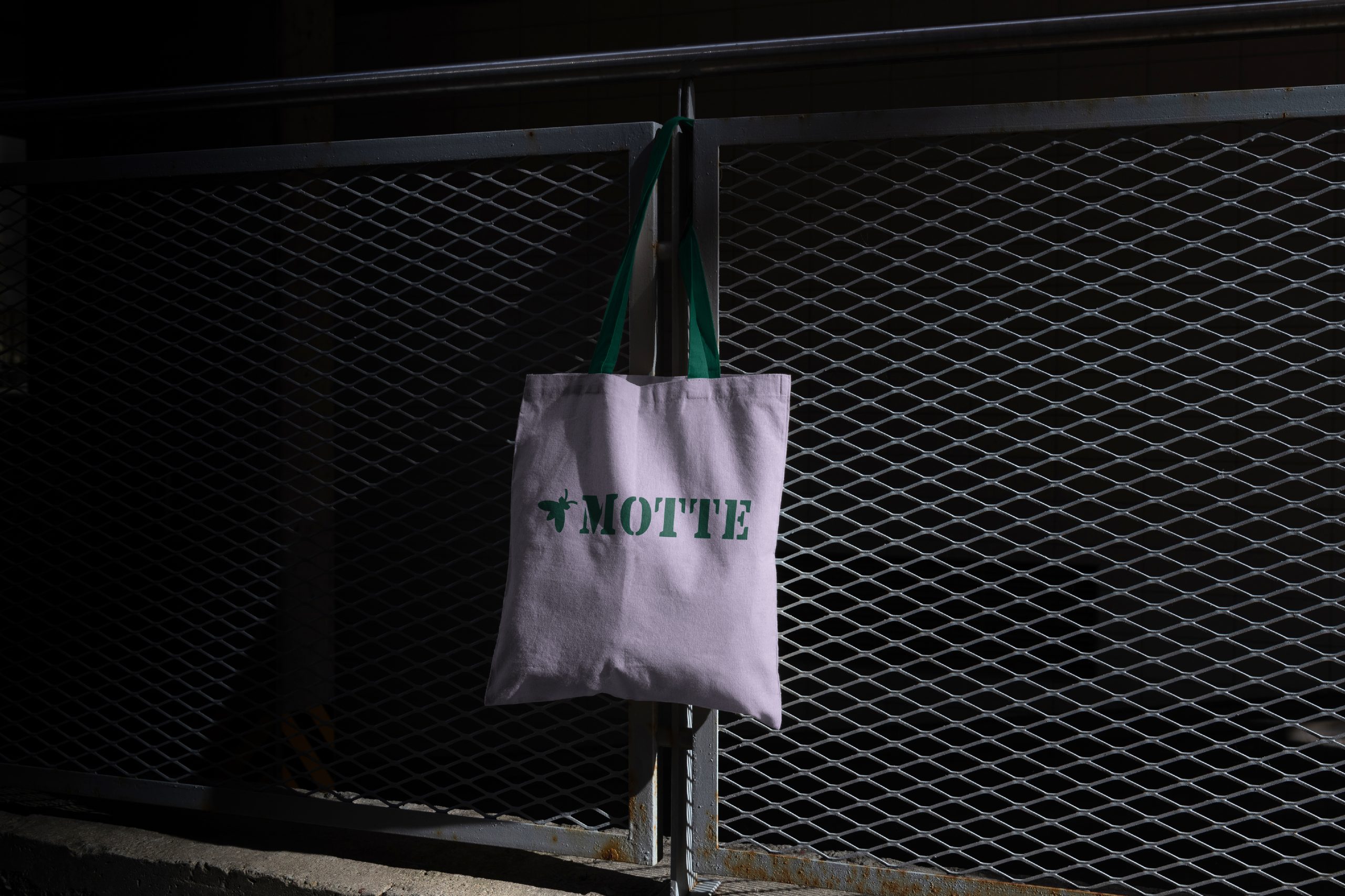
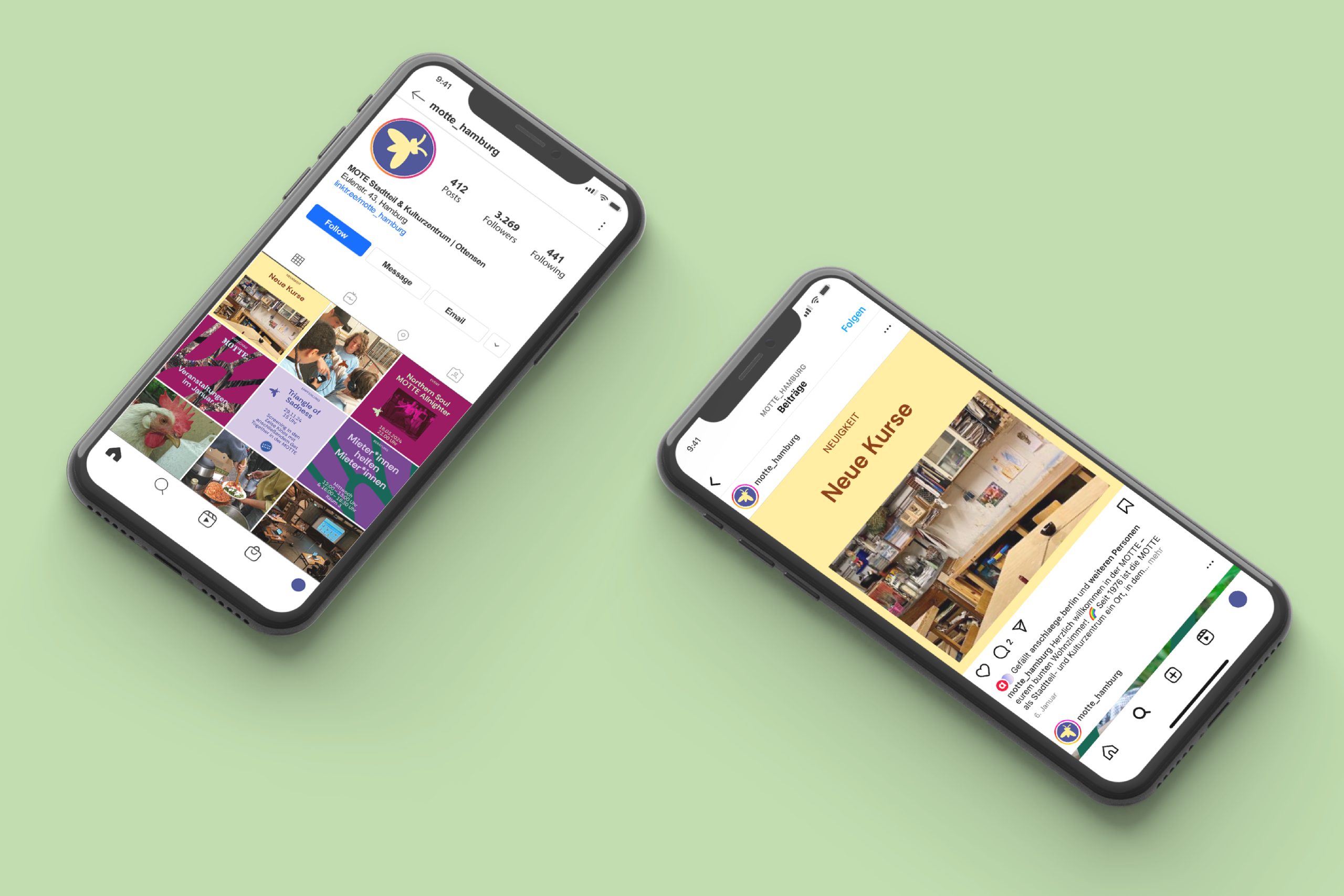
At the request of the team, the existing word mark was retained as a link to the roots of the association. We supplemented it with a flexible design element. The moth moves freely across the system. Formally, it combines the stencil font of the logo with the new house font Rethink Sans.
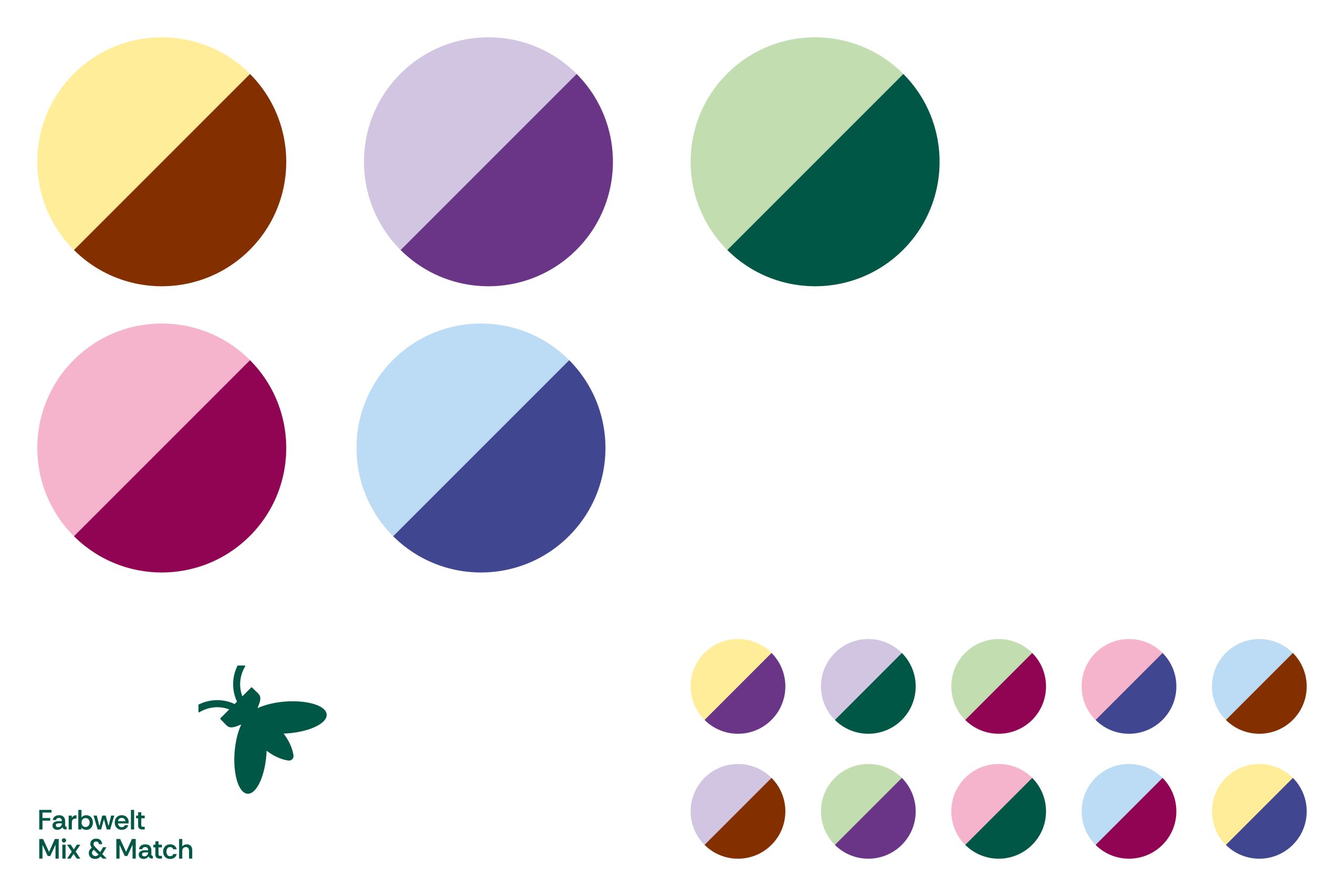
The fact that all areas of the MOTTE are important is also reflected in the color spectrum. There is no primary color. Any dark color can be combined with any light color. The result is a dynamic, varied system that nevertheless remains barrier-free.