Mess Things Up!
We began working for Hamburg’s Kampnagel performing arts center in 2007, when Amelie Deuflhard became its artistic director. After five years of productive partnership, we were definitely excited to be given the opportunity to reshape the theater’s corporate design in 2012.
Kampnagel Internationale Kulturfabrik GmbH Mess Things Up! 2007–20
Our past design experiences with Kampnagel had taught us that when decision-makers come together, things happen. So our team set up camp on a rehearsal stage and hosted a daily »performance«. We started by taking stock, conducting audience surveys and defining our assignment.
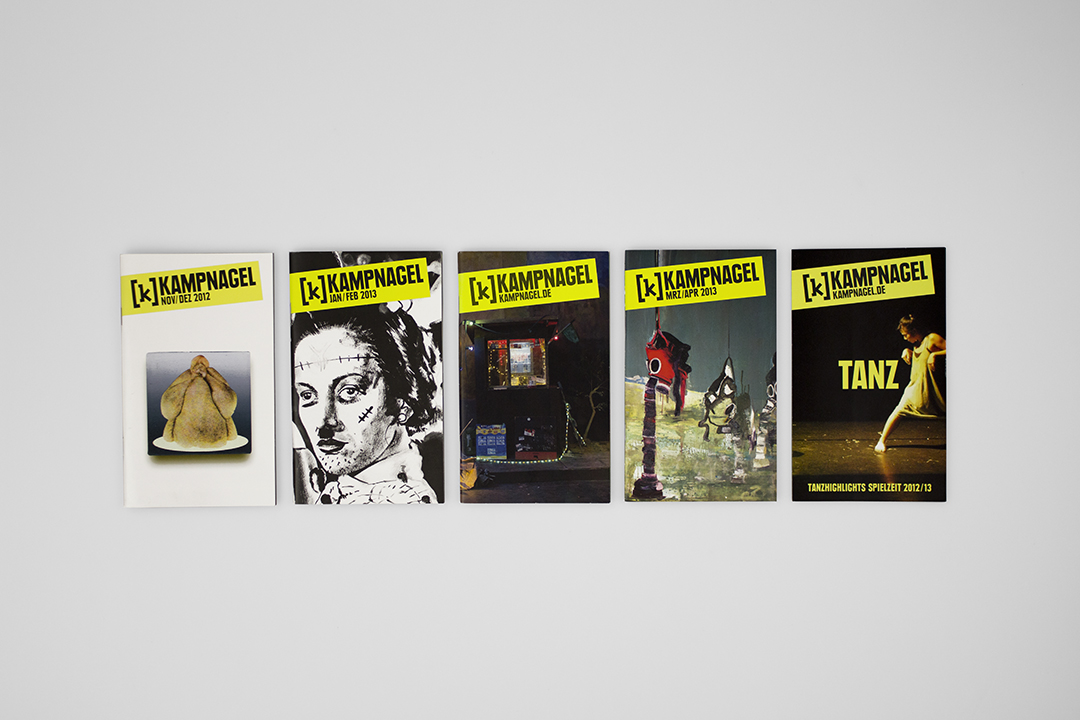
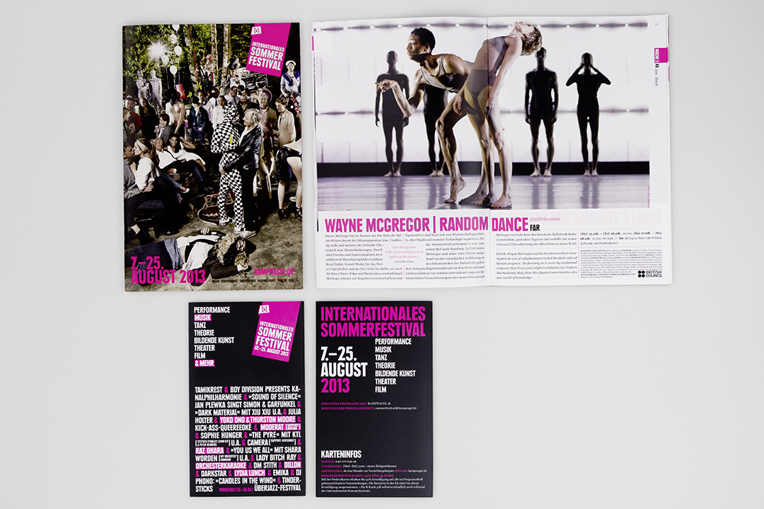
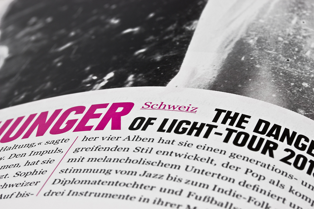
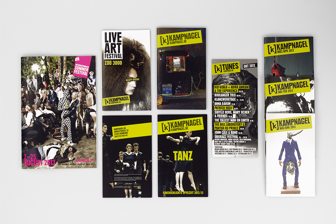
We developed a brand architecture that focused on Kampnagel as a venue for touring performances and festivals while still offering room for a variety of target audiences. The shift in Kampnagel’s artistic direction was reflected in our new communications concept and media strategy. Our designs were applied to the theater’s visual identity and implemented in all of its media.
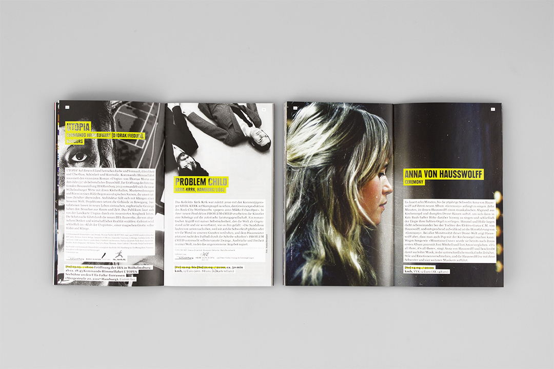
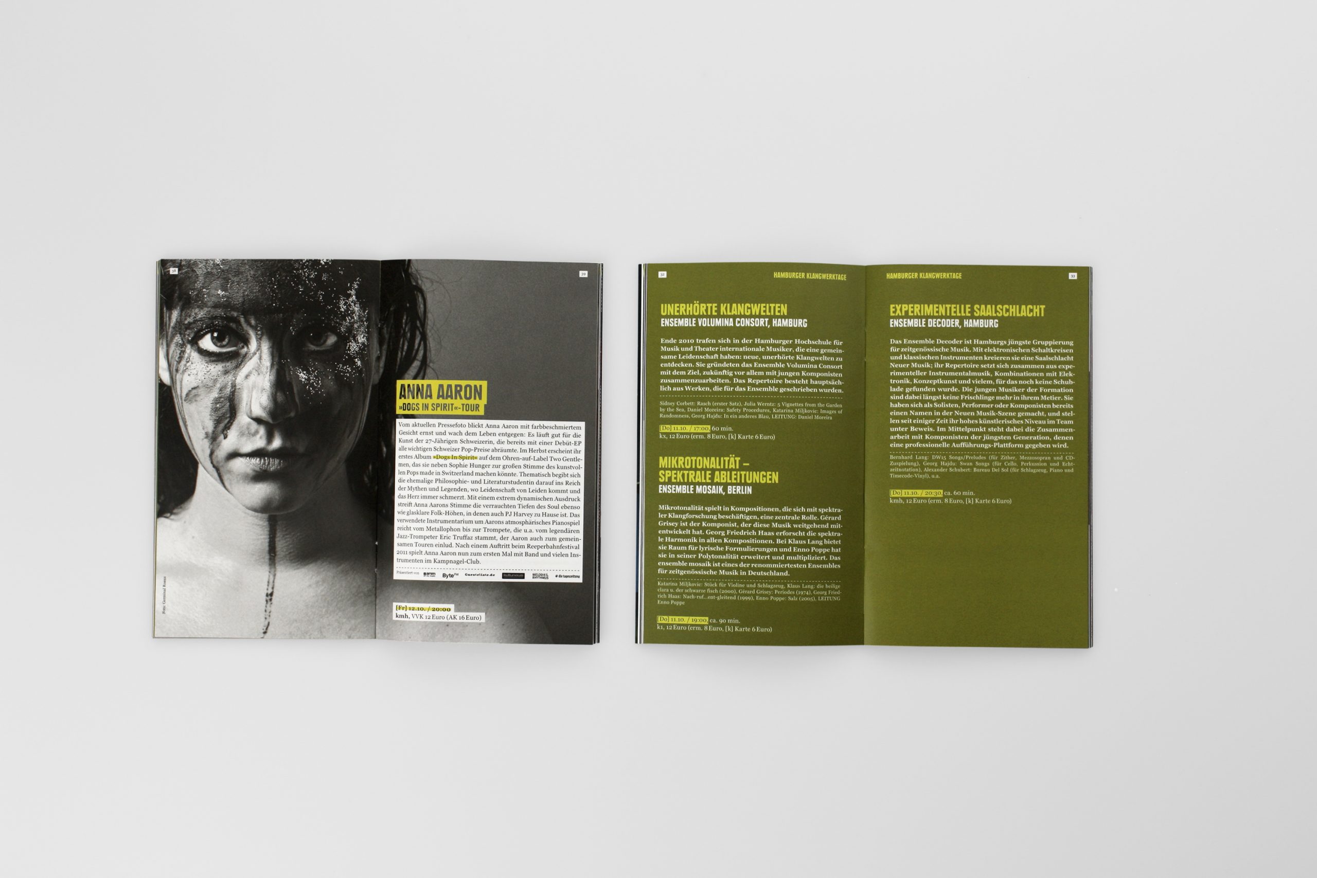
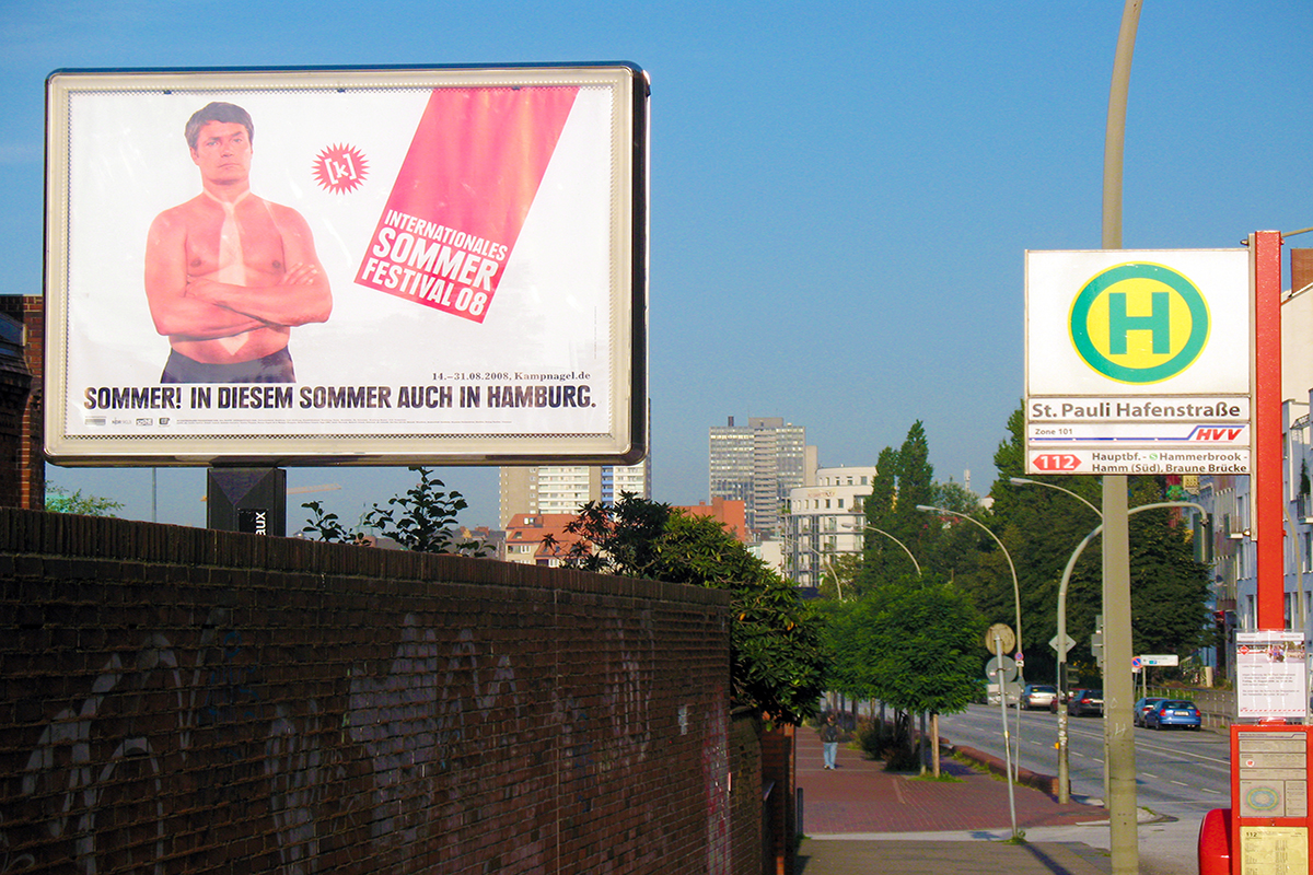
In the same spirit, we developed a fresh marketing strategy that explored new distribution channels, ranging from billboards and web ads to guerrilla marketing. The Barmbek neighborhood, where Kampnagel is located, played a central role in these efforts. The 2012 redesign was primarily conceived as a return to original design styles – but while Kampnagel had held back somewhat in 2007, the goal for 2012 was to stake out a bold position in the German cultural landscape.
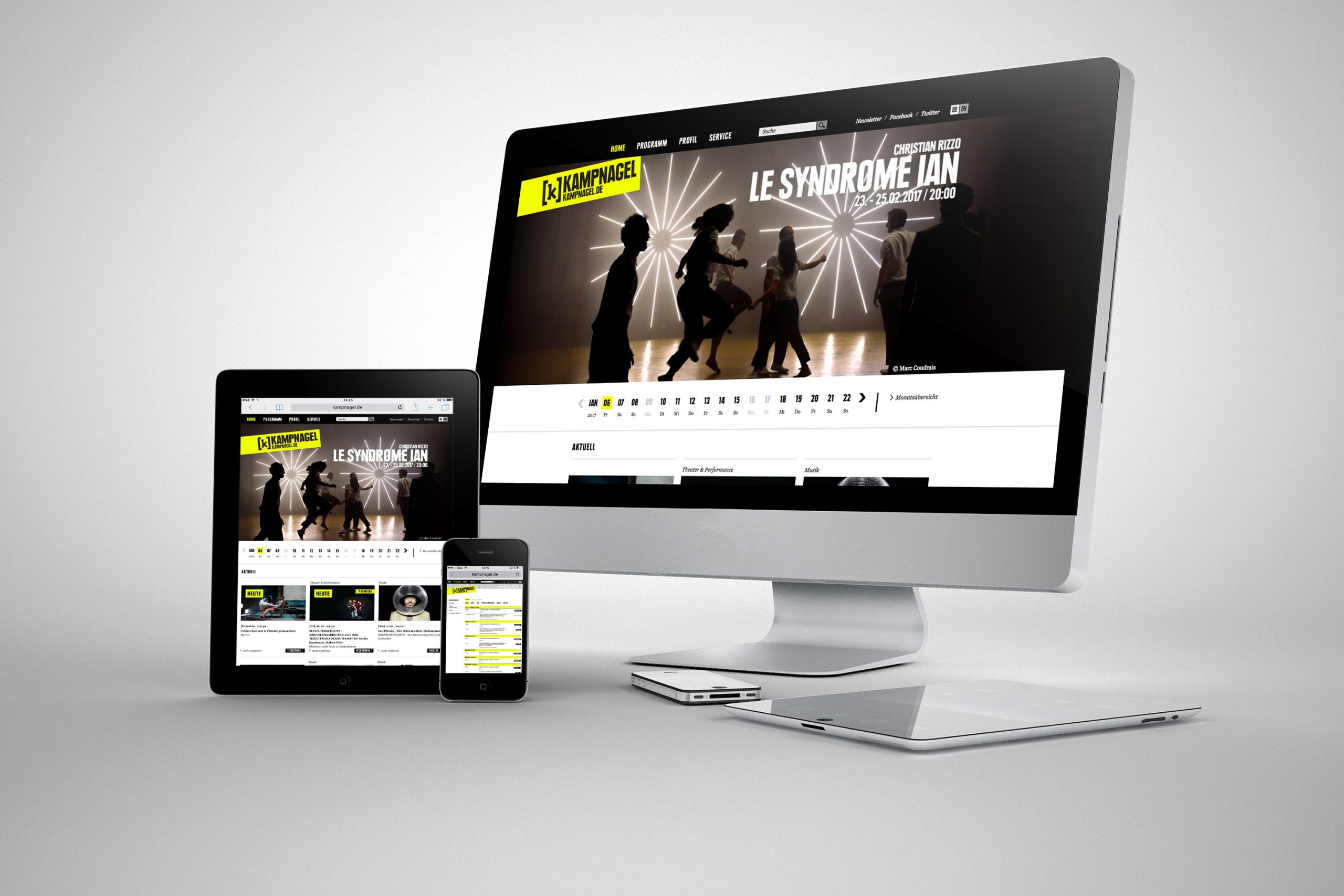
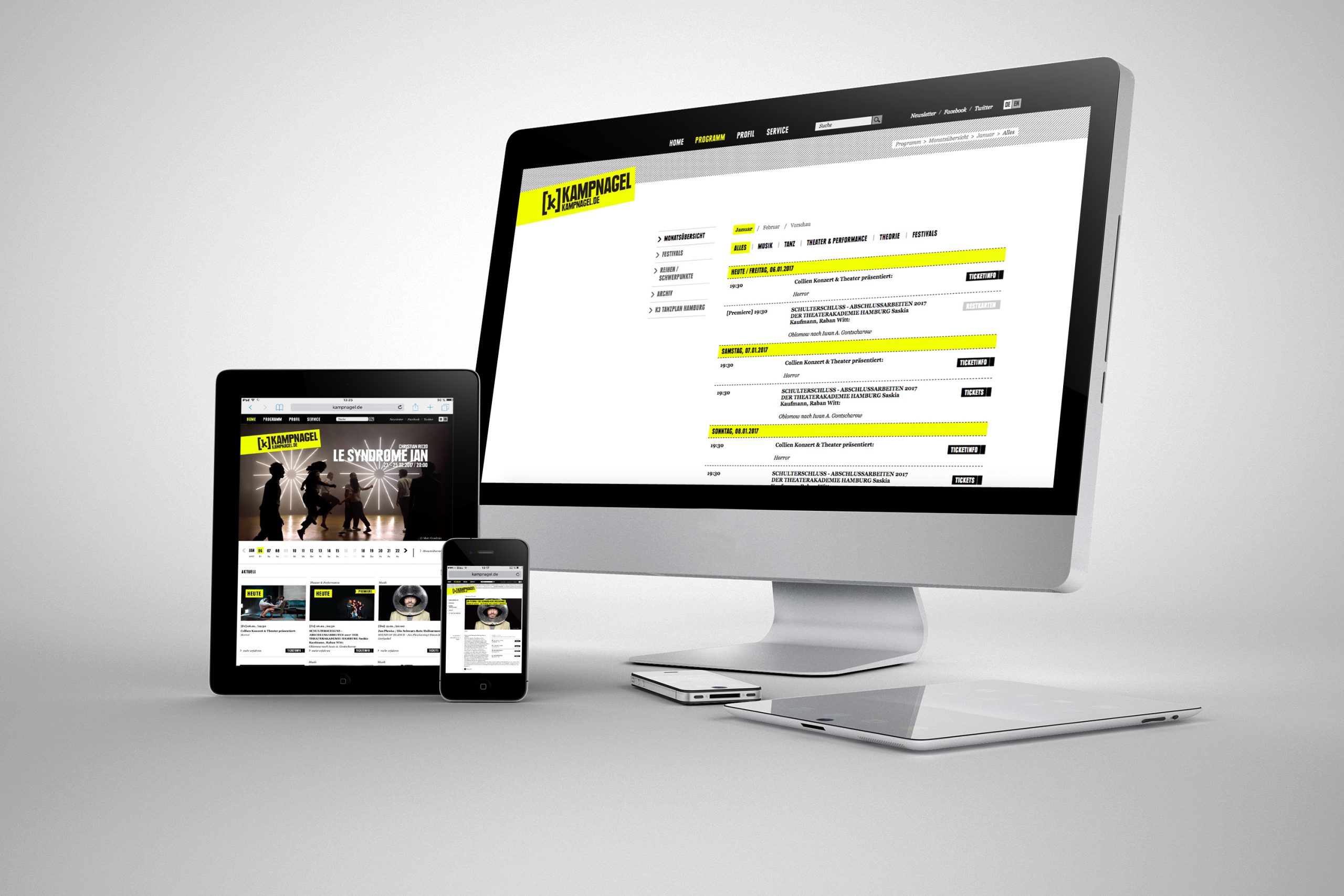
We changed the corporate typeface, gave images more space and blended a perfect shade of fluorescent yellow. Overgrown concepts from previous years were chopped back, making plenty of room for fresh greens and yellows to sprout.
