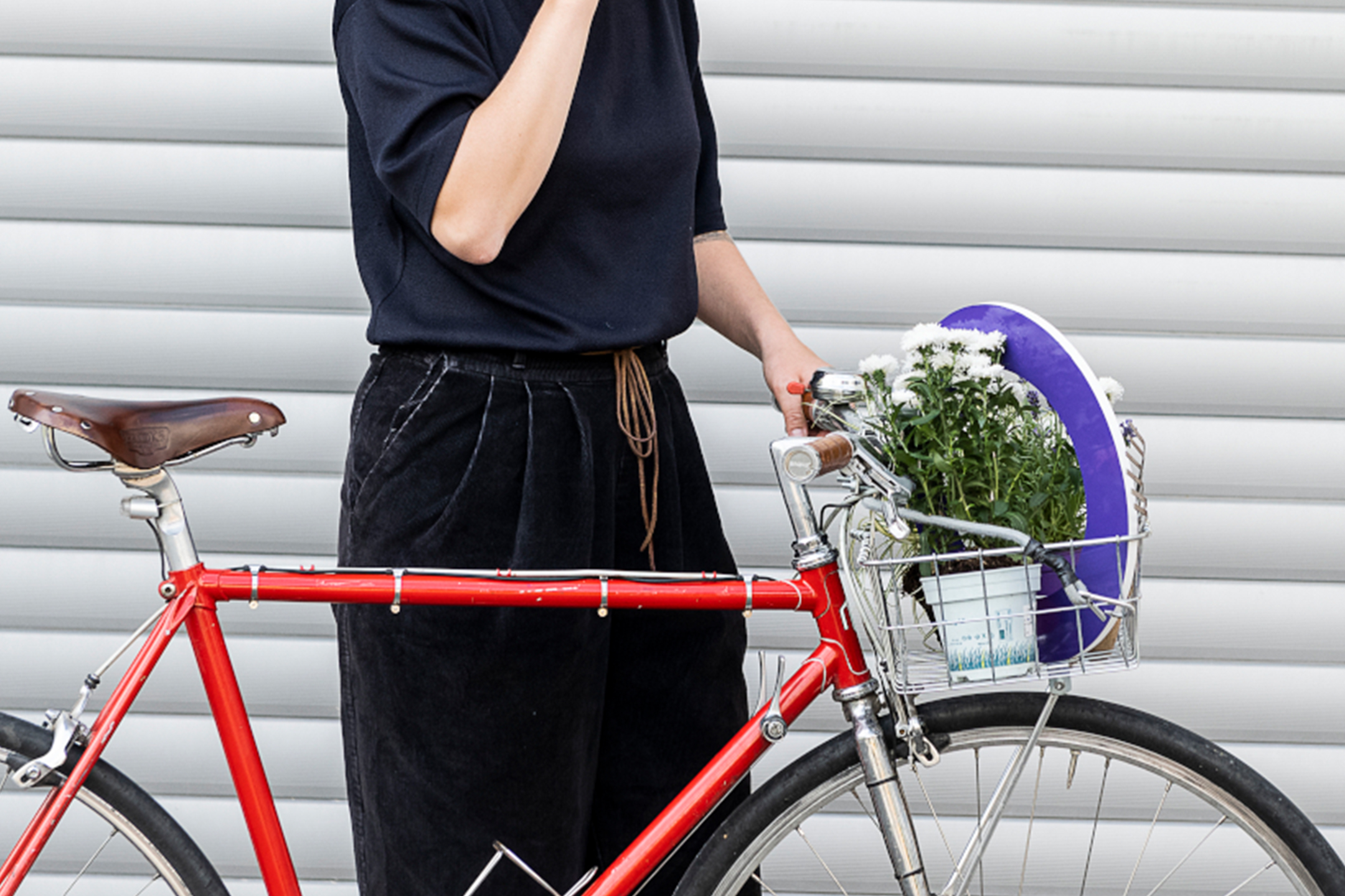
Here’s to Good Makers
In Nuremberg, cultural life revolves around a network of local institutions, the Nürnberger Kulturläden. They organize a wide range of courses, concerts, lectures and much more, all of which can be enjoyed for free. We developed a hybrid brand for the Kulturläden: half city department, half cultural institution.
City of Nuremberg Here’s to Good Makers 2021
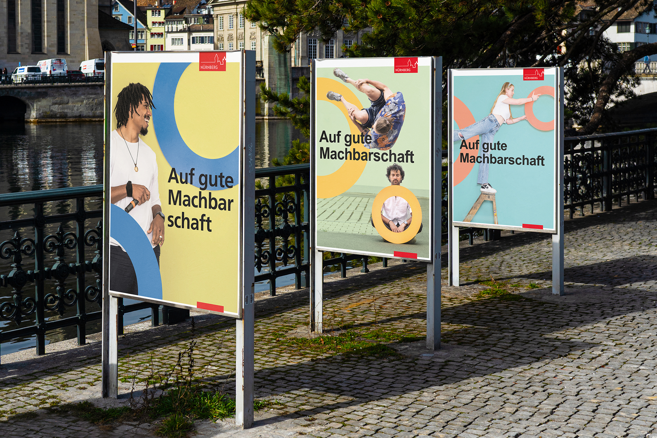
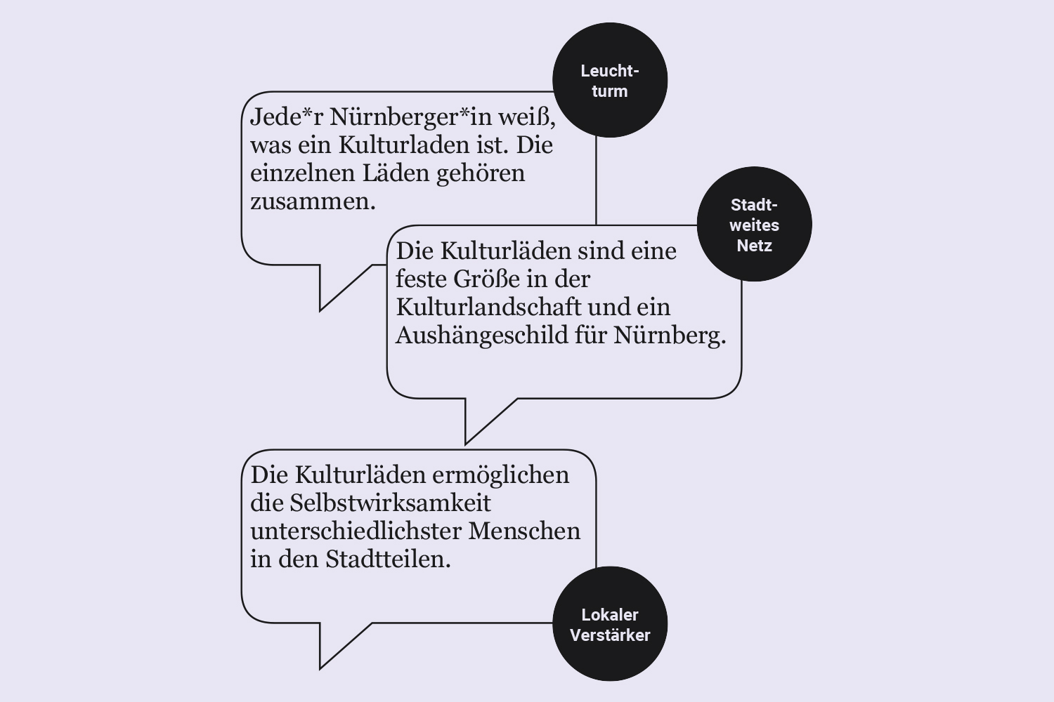
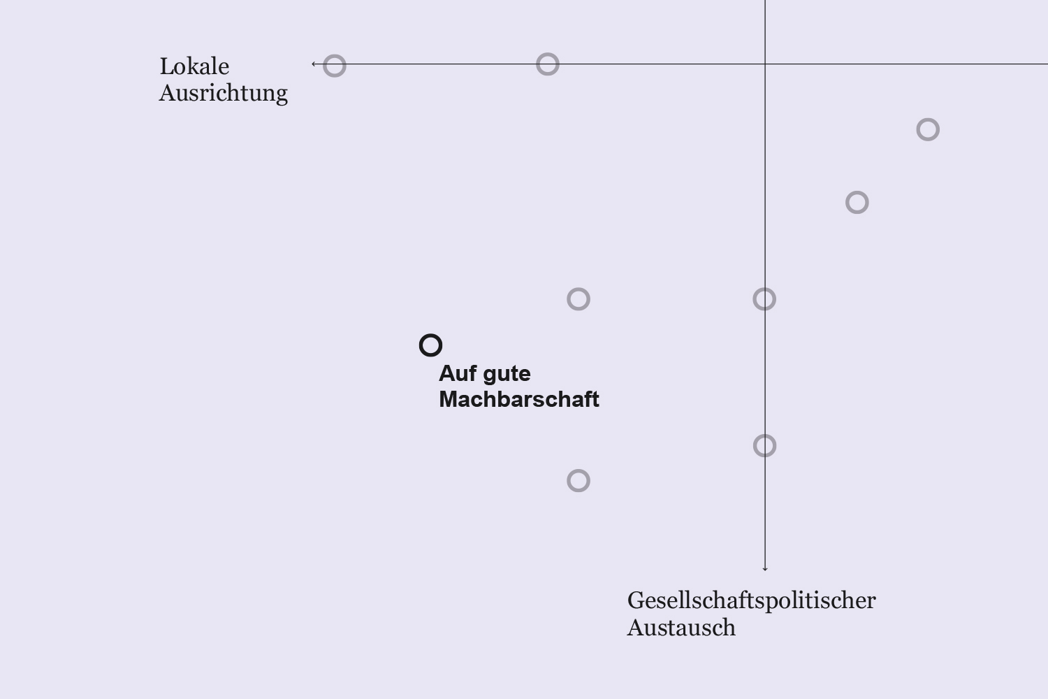
The eleven cultural centers needed an easy-to-apply modular key visual. The first element was a system typeface so ubiquitous that even the Bauhaus uses it: Arial. And for even more simplicity, we combined it with the most humanistic shape in the world: the ring. Since the target audience was »everybody«, and we weren’t talking about Coca-Cola, we needed a shape that would include all these diverse individuals. We we were also thinking about connections: different media formats fitting together, connected by the rings.
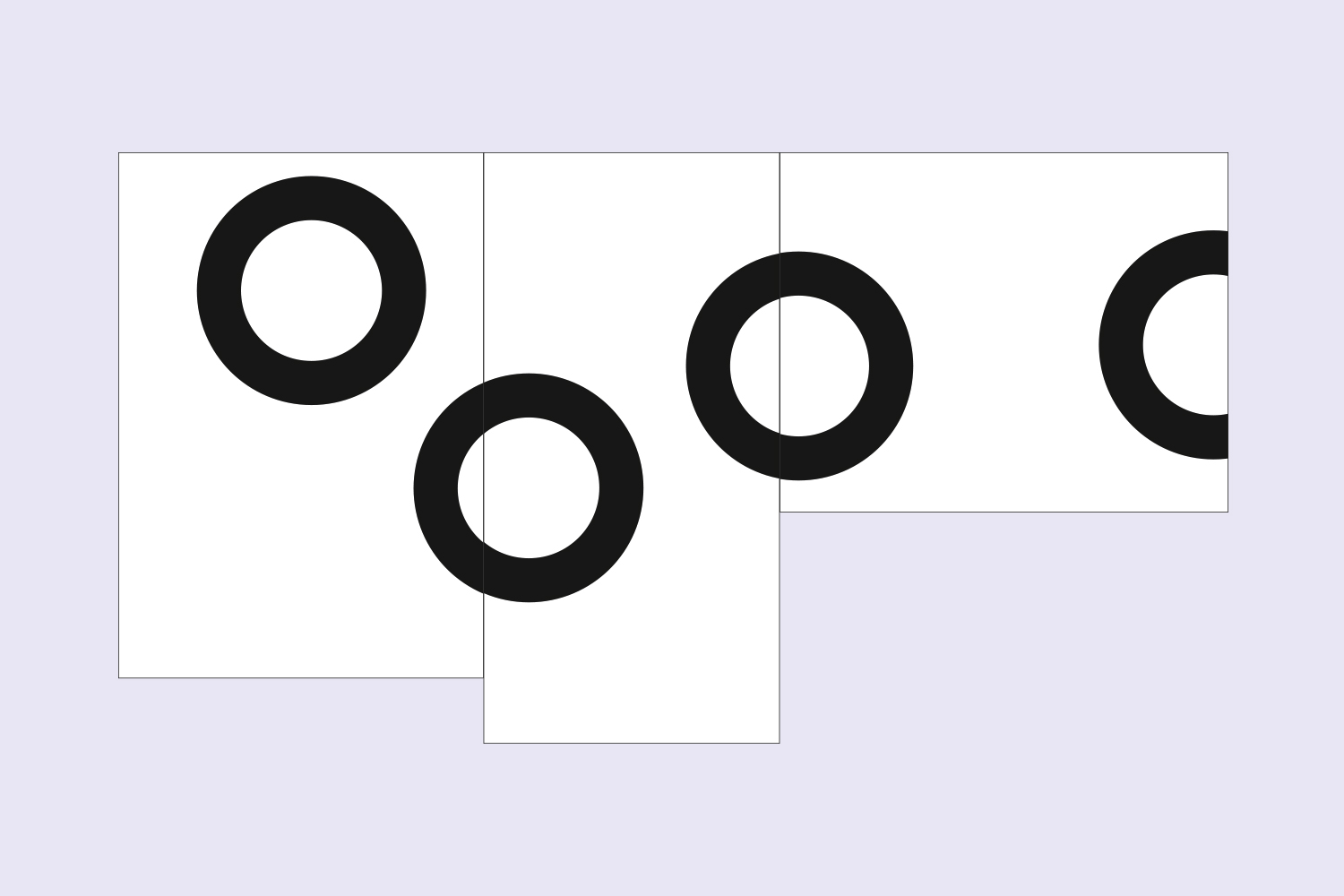
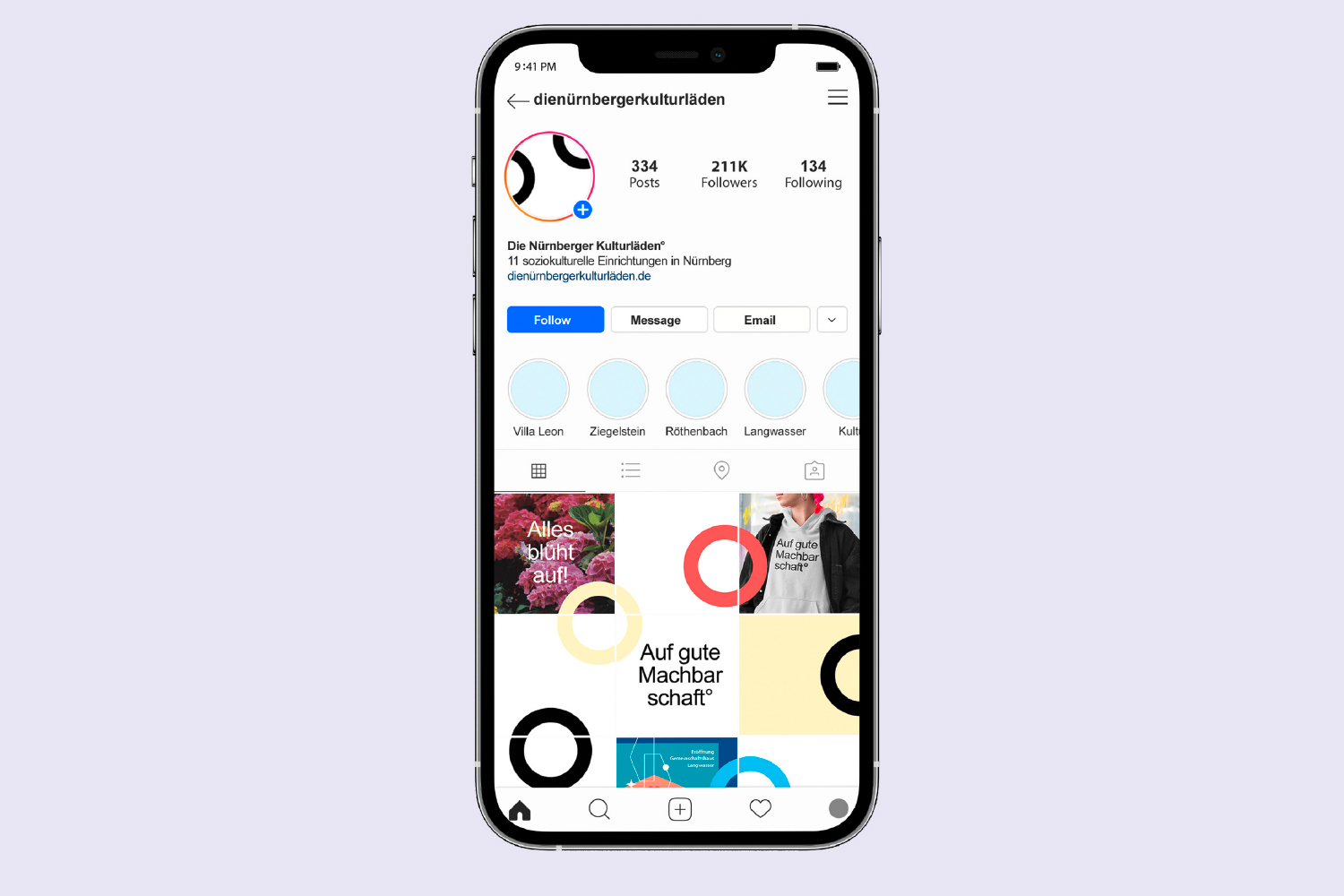
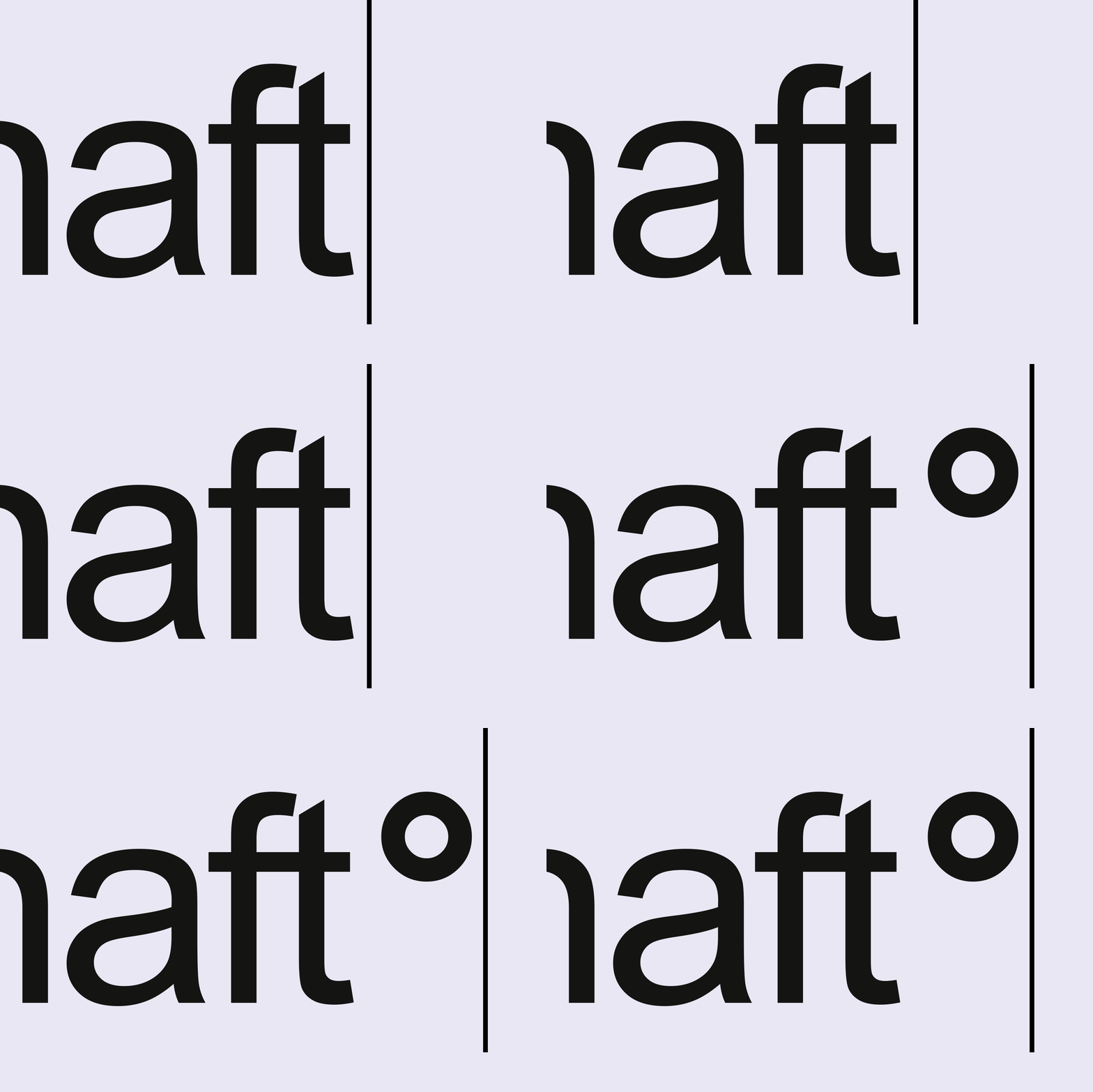
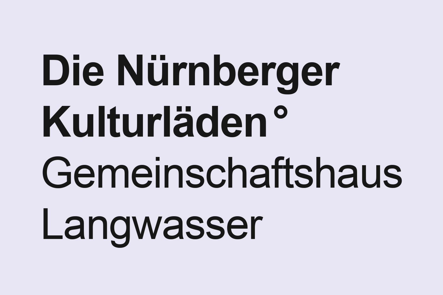
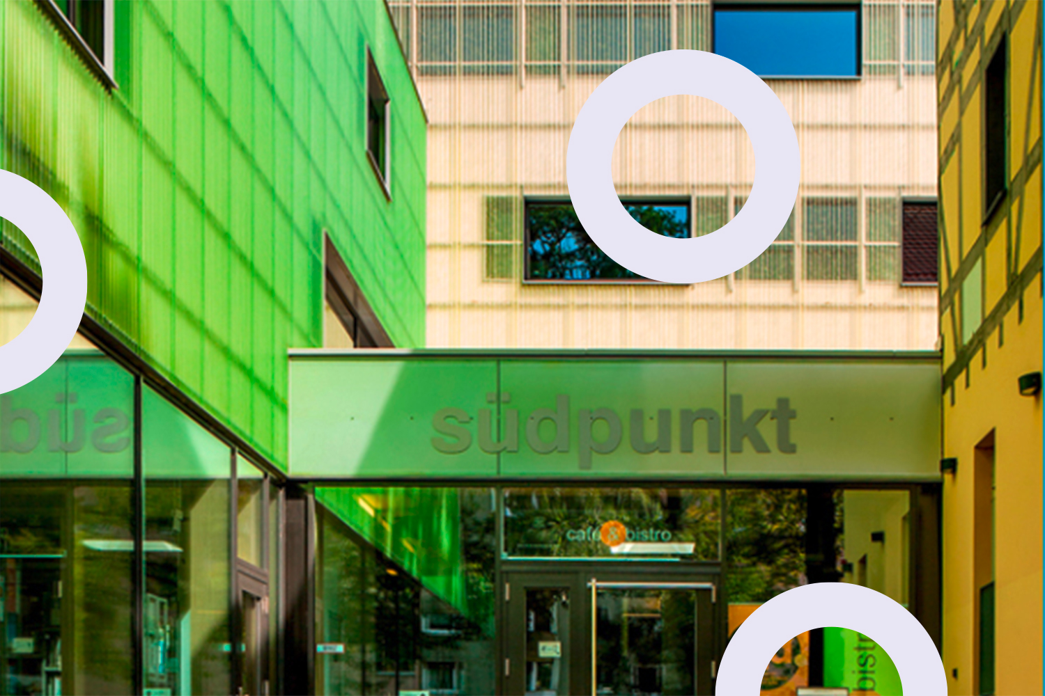
The brand strategy, communication concept and campaign were all developed in digital co-creation workshops conducted via video conferencing and whiteboard tools. A special brand development challenge was to create a logo that was not a logo at all, since there was not supposed to be any logo beyond the city’s existing corporate design. We solved that by adding a little ring symbol – ° – at the end of the slogan. The ring symbolizes the diversity of all the different groups associated with the Kulturläden. It can be written next to their name or slogan in any font, size or medium. You could even draw it in the sand of Nuremberg’s river beaches, using nothing more than your big toe.
Photos: Brigitte Sauer | Graphic design, city of Nuremberg: Elisaweta Smuschkevic