kultur_formen
The Berlin Project Fund for Arts Education promotes cultural projects by and with young people. It is overseen by the Foundation for Cultural Education and Cultural Consulting, which is affiliated with the Berlin Senate. Shaping culture is a long-term project, with plenty of hurdles along the way – can’t we find an easier way to fund innovative projects?
Foundation for Cultural Education and Cultural Consulting kultur_formen 2021
Working together with the Arts Education team, we used digital cocreation tools to develop a new brand concept and communication strategy. The more people can put down roots in a more diverse cultural landscape, the more society will change in the near future. The kultur_formen project seeks to promote this dynamic and connect everyone involved in the process with each other.
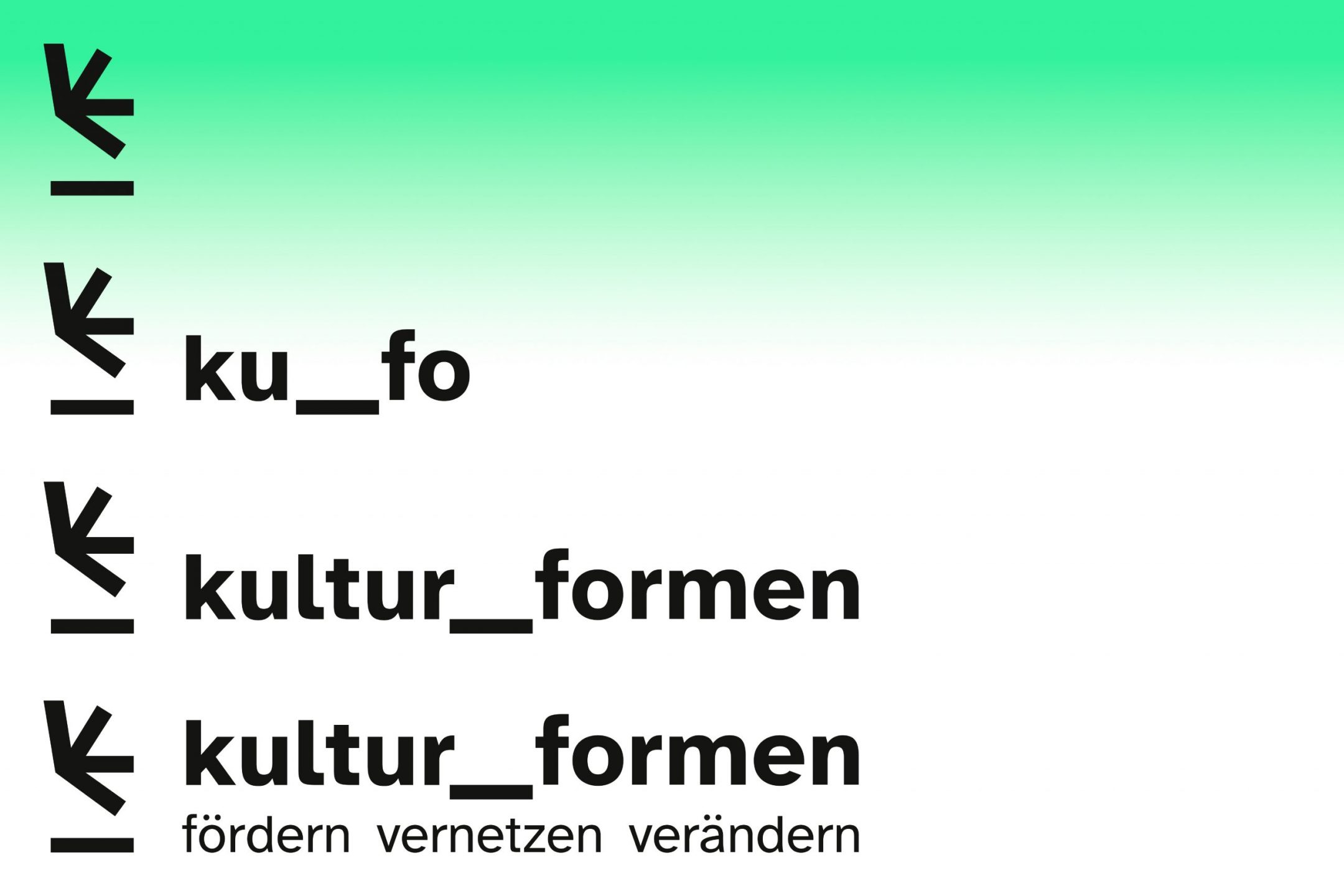
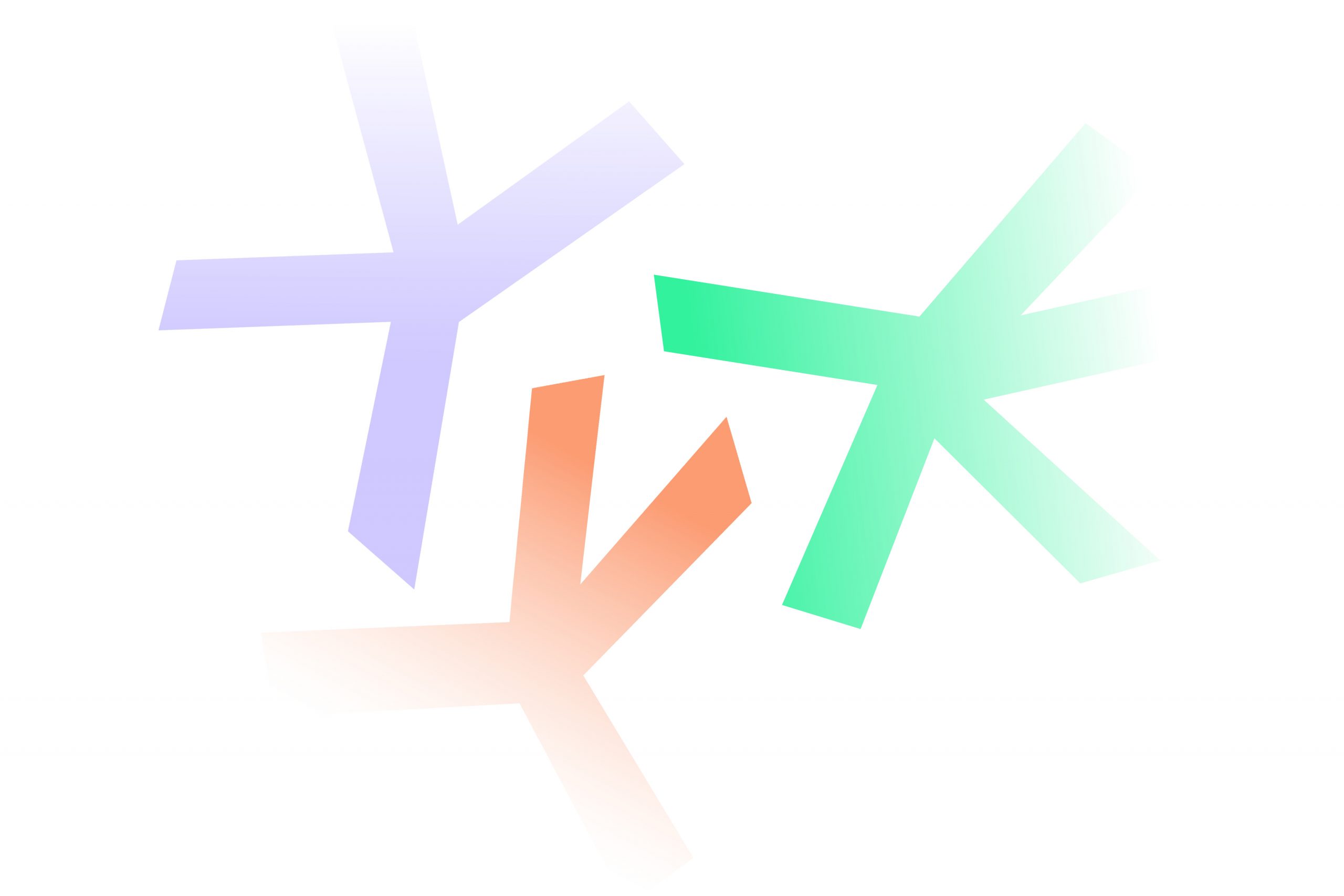
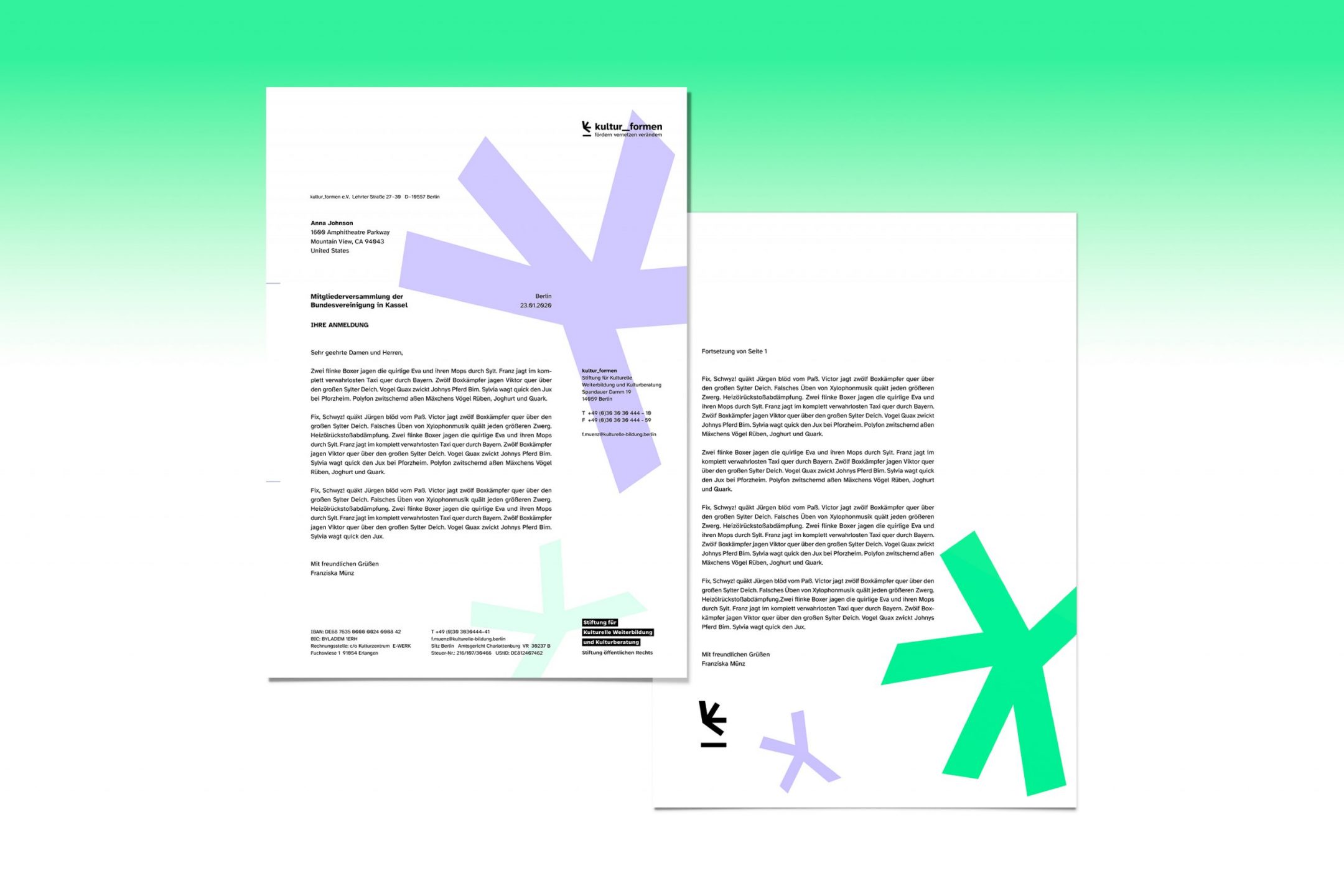
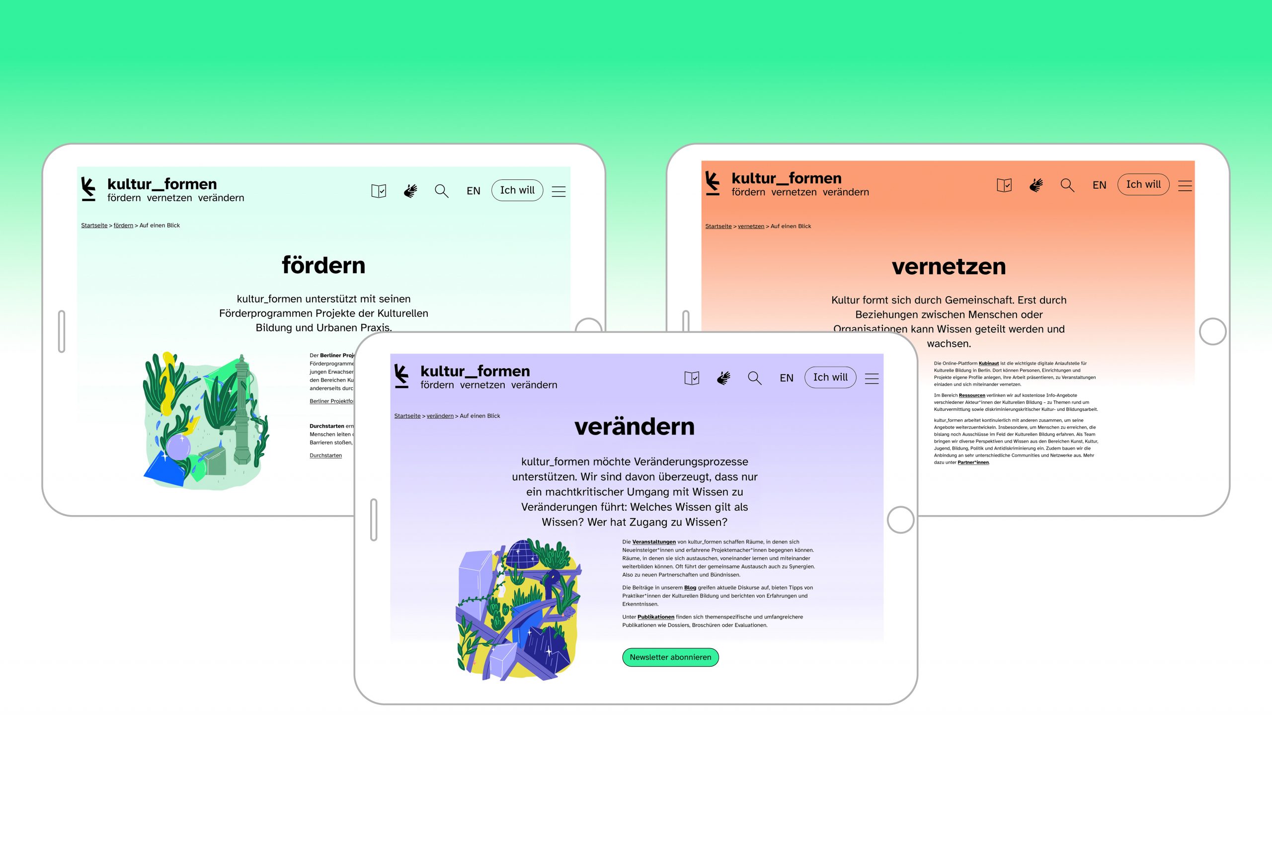
The gap in the middle of the wordmark stands for opening doors, linking concepts and breaking with convention: »fördern, vernetzen, verändern«. Together with the artist Vikunia (Viktoria Cichoń), the ku_fo team developed characteristic illustrations for these three principles. The ku_fo logo is a quarter asterisk, a broken K, a form that crashes the canon. The shape of the logo is deformed to the extreme. The color scheme radiates freshness, coolness and indomitable diversity. Elements are embedded on the surface in the foreground color like a chameleon.
The website was developed with an external consultant for accessibility and is designed and programmed to be BITV 2.0 and WCAG compliant. It also includes versions in easy-read German and German sign language.
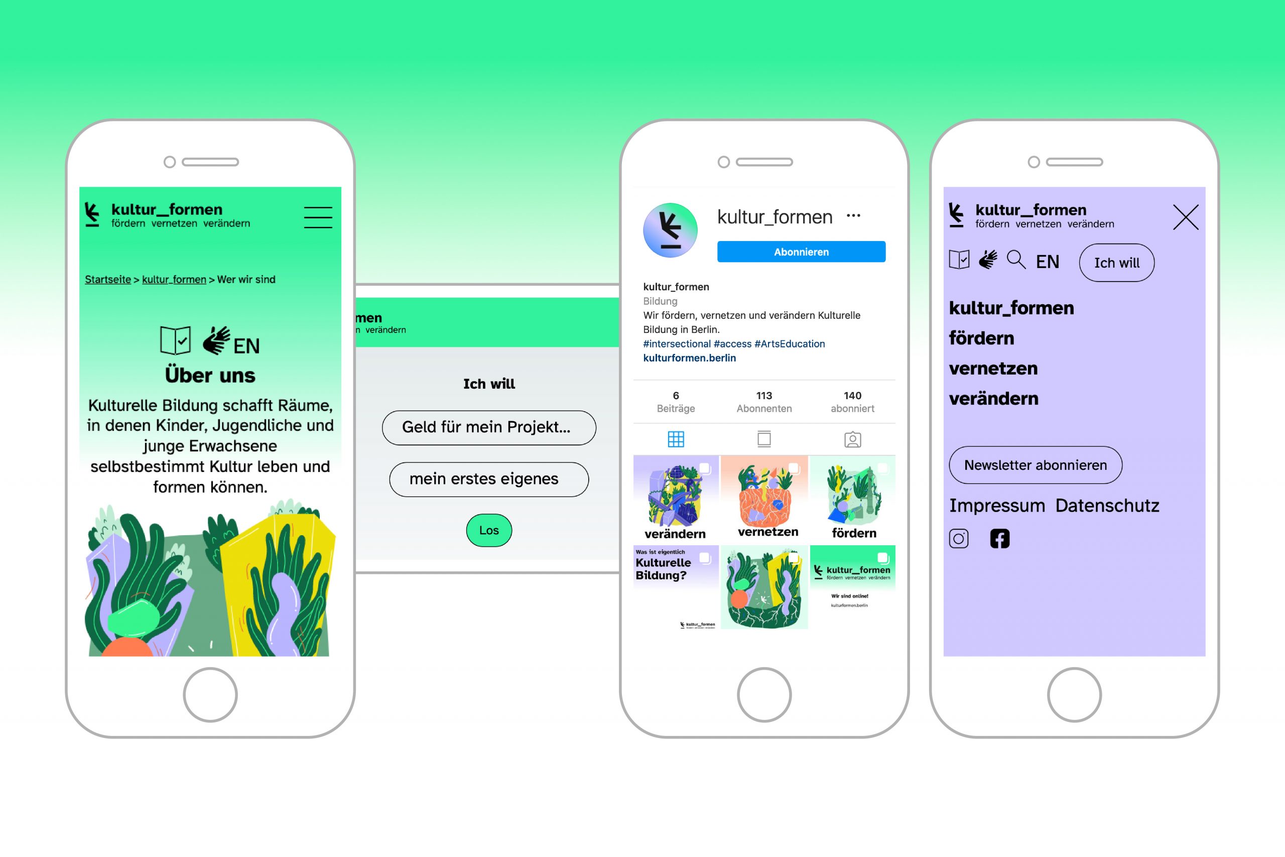
Technical features designed to simplify the website’s user experience include the »Ich will« (I want) button, which provides quick access to the program’s different offerings. The aim is to make it easy for people from all backgrounds to submit applications and get support for their own cultural projects.
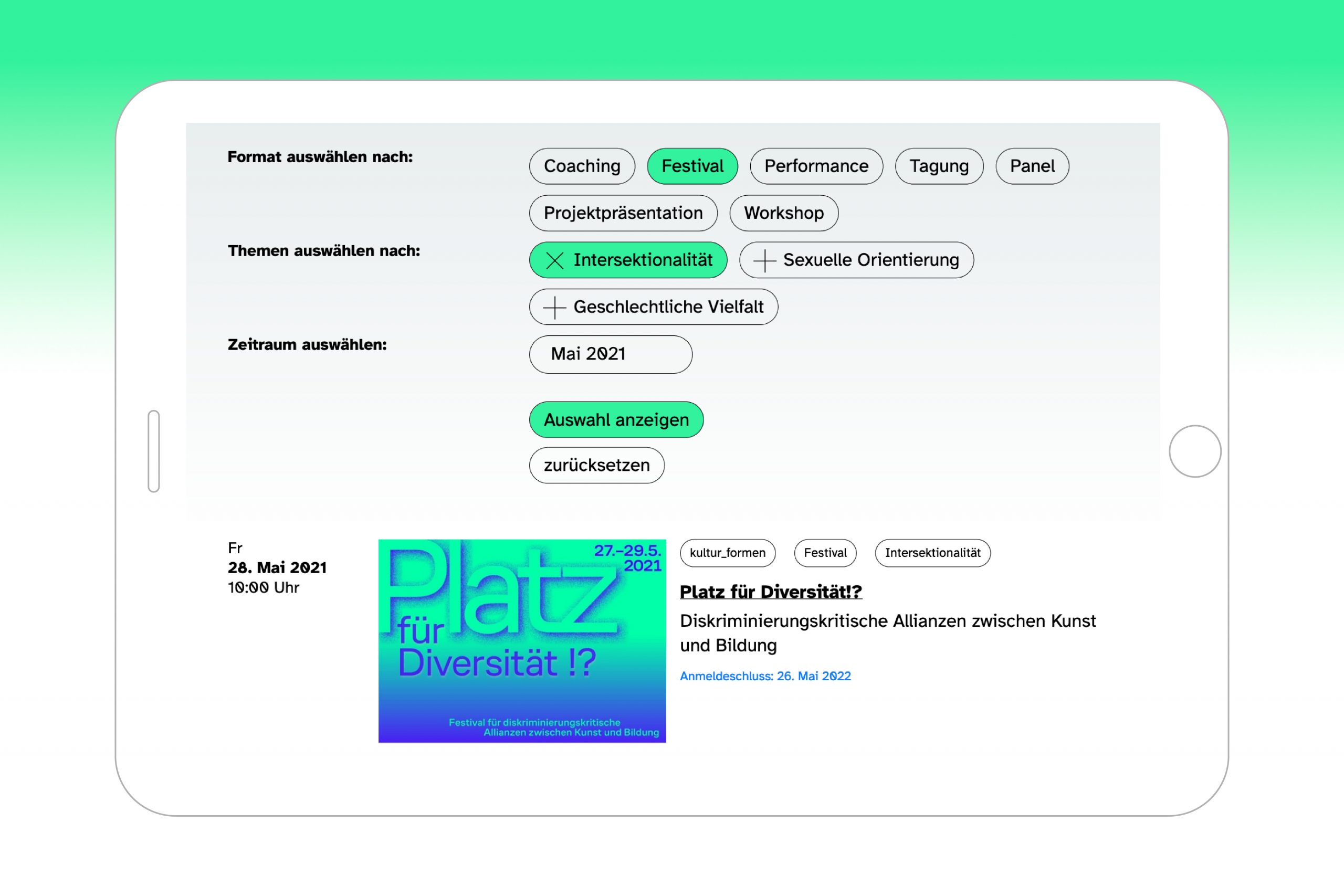
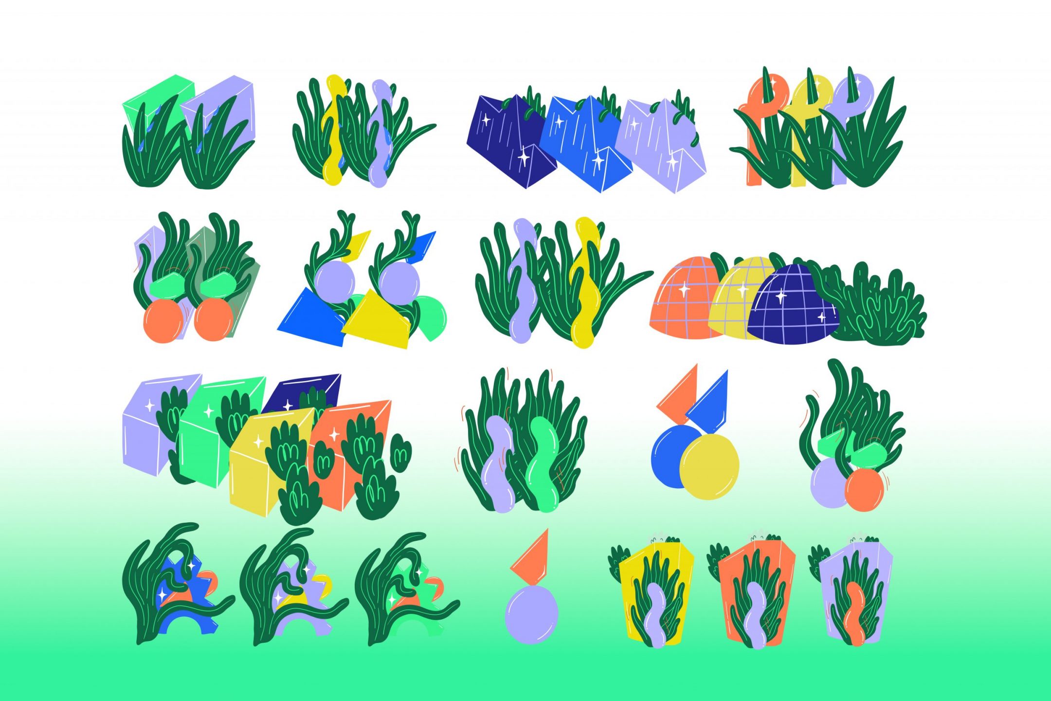
Illustration: Vikunia


