GRIPS for All
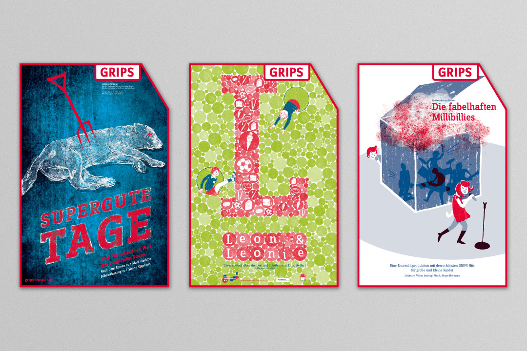
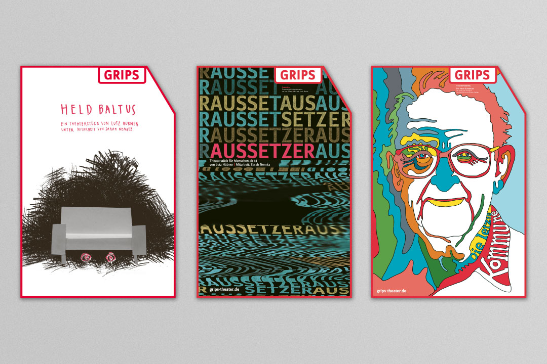
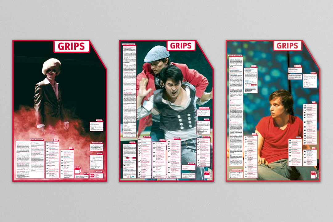
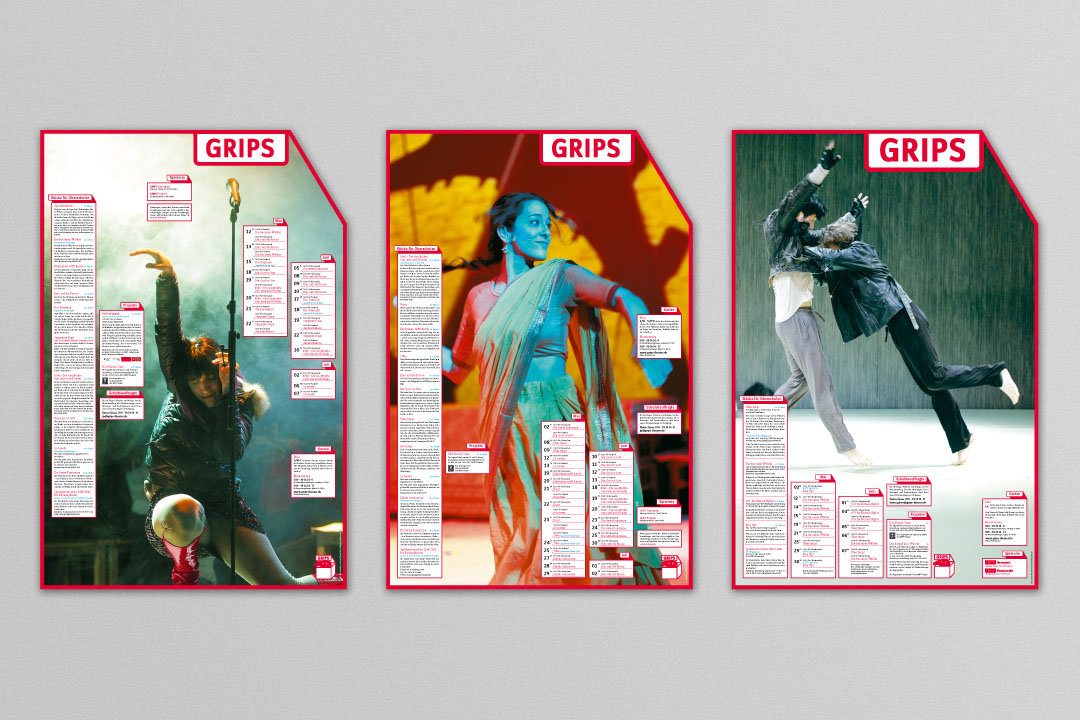
When Stefan Fischer-Fels took over as the new artistic director of Berlin’s GRIPS Theater, we took on the redesign of its visual identity. We mixed up a bright neon red for the legendary empowerment theater and focused its communications on the here and now while still maintaining its signature visual style.
GRIPS Theater GRIPS for All 2011
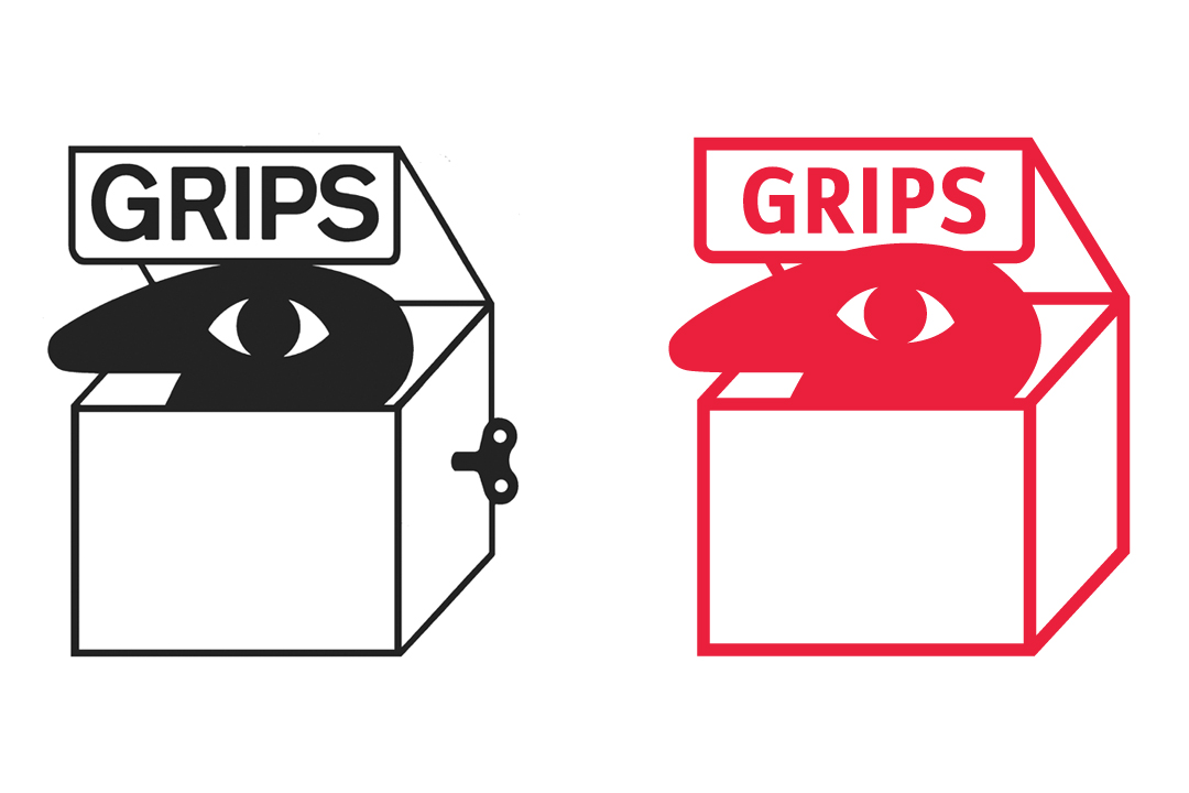
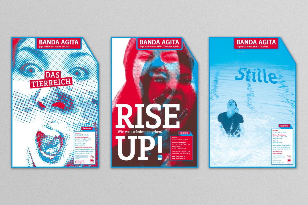
After 40 years at the helm of GRIPS, the theater’s founding father was handing over to a new director. The world-famous children’s theater was expanding its programming and positioning itself as a modern political theater for all generations. Reworking its corporate design would require courage, sensitivity to the past and new ways of reaching a more diverse target audience.
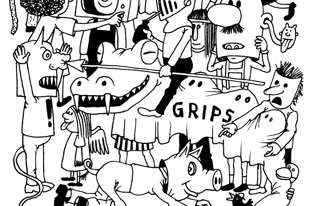
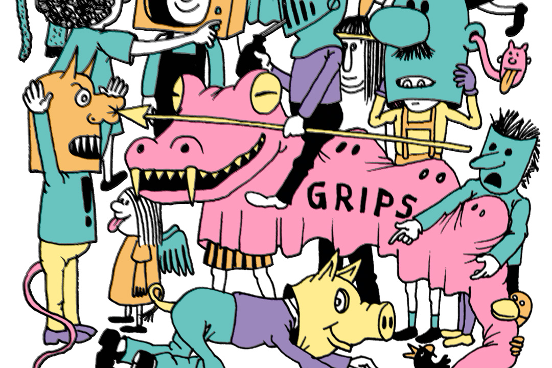
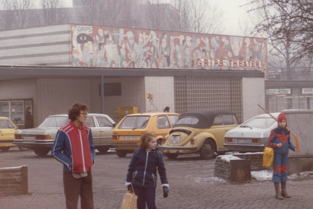
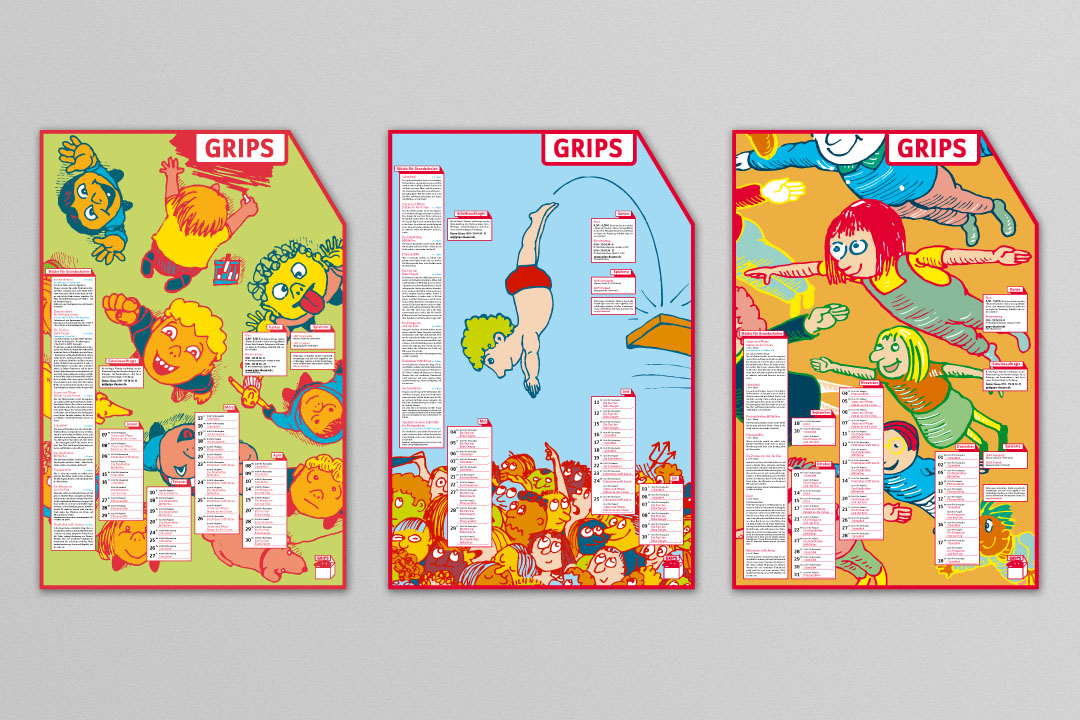
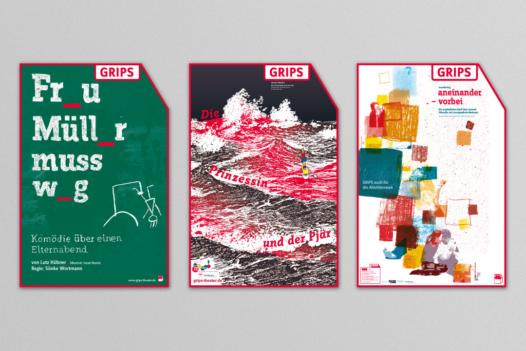
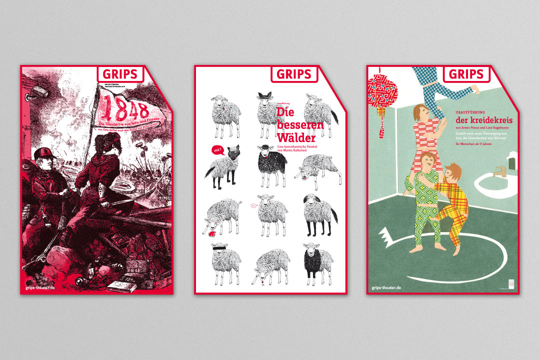
To strengthen the brand, we reached back to GRIPS illustrations from the 1970s. We digitized and recolored and changed the logo – but only minimally. We also designed specific media formats for three main target audiences: young children, teenagers and adults. We then developed unified standards for all print media, chose a typeface for all written communications, selected a paper to print on and dipped everything in our eye-catching new GRIPS red.
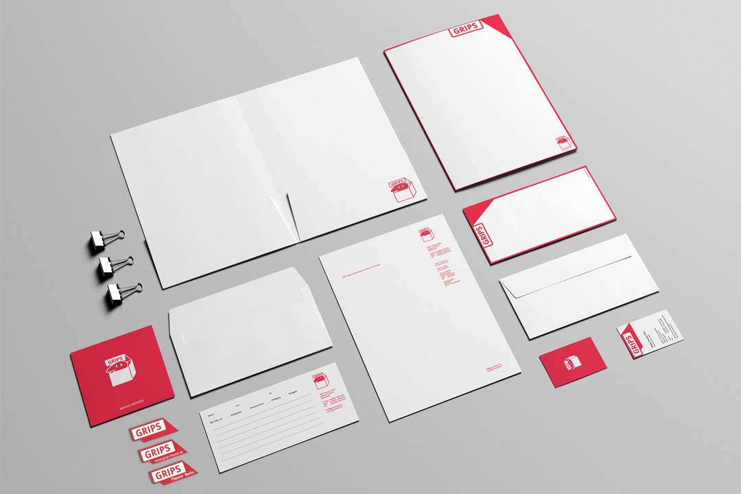
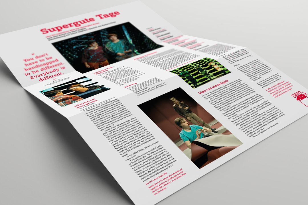

The theater would not be shutting down for our comprehensive redesign; we only had the summer break to get ready. Everything we published was a prototype, to be refined on the second try. And it worked! The GRIPS reconnected with Berlin’s demanding theatergoers. Print products we designed as games or collectibles were enthusiastically received. The new website went online in 2012, and the year after that we won an iF communication design award.
