The Future of Transformation
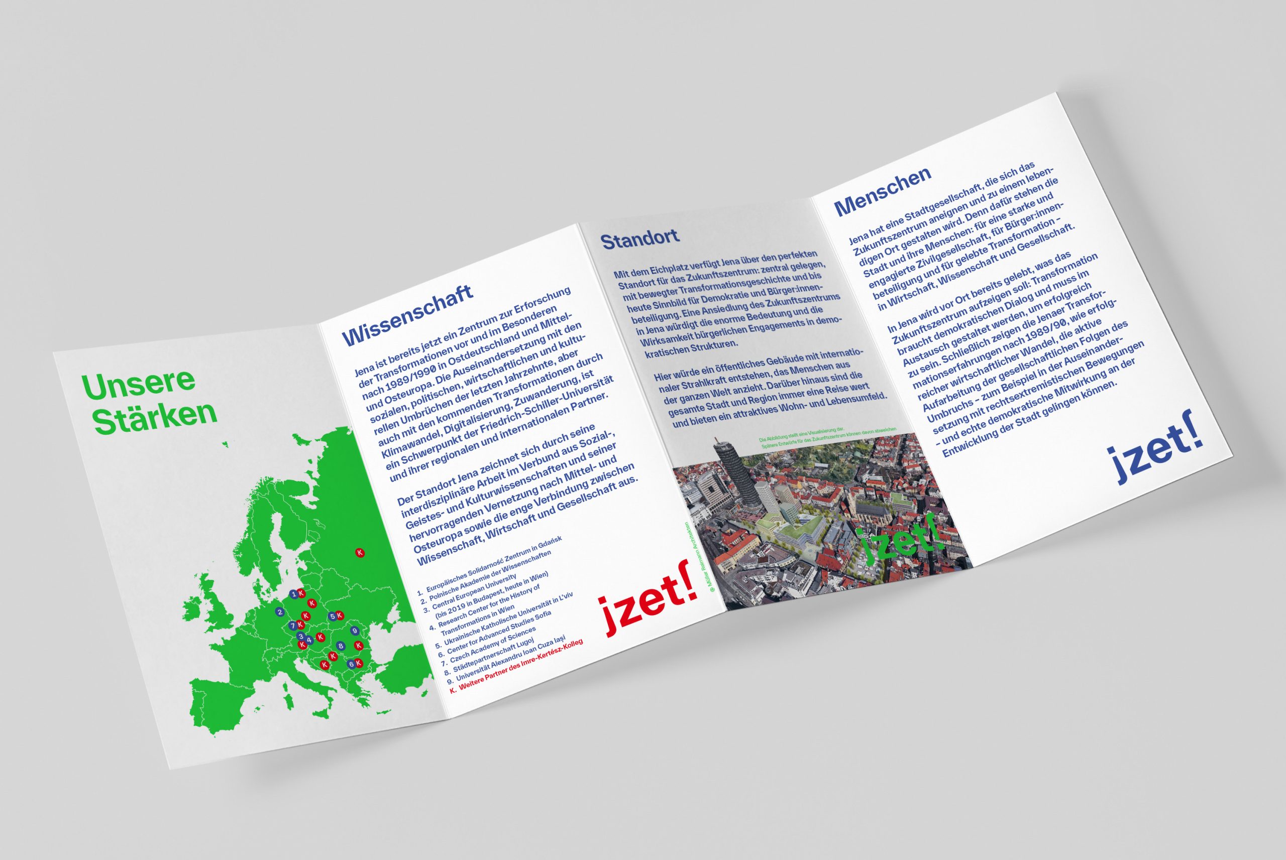
The city and university of Jena partner up to apply for the Future Center for German Unity and European Transformation (ZET). We developed the campaign jZET! – Die Zukunft bleibt anders with full service. The campaign images symbolize the change of perspective that is necessary to approach transformation. People are invited to tell their personal story of change. They can post these stories on the campaign website and at the live events. One thing is already clear: The future will be different and it starts jZET!
Stadt Jena The Future of Transformation 2022

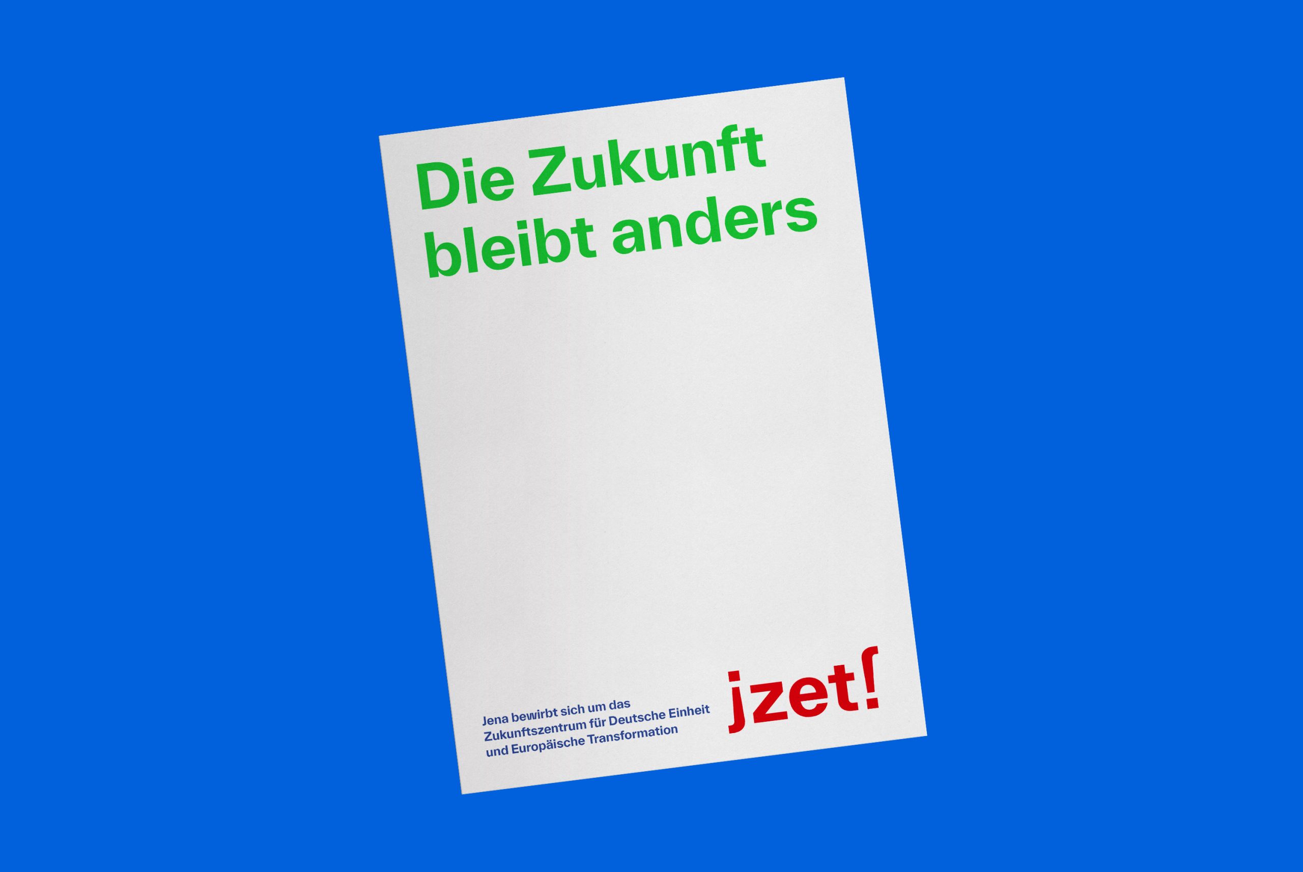
The campaign logo is characterized by clear, legible typography. The twisted „j“ creates deliberate visual irritation and turns the campaign logo into an independent, self-confident brand. The three colors red, green and blue form a reference to Jena as a city of the optical industry.
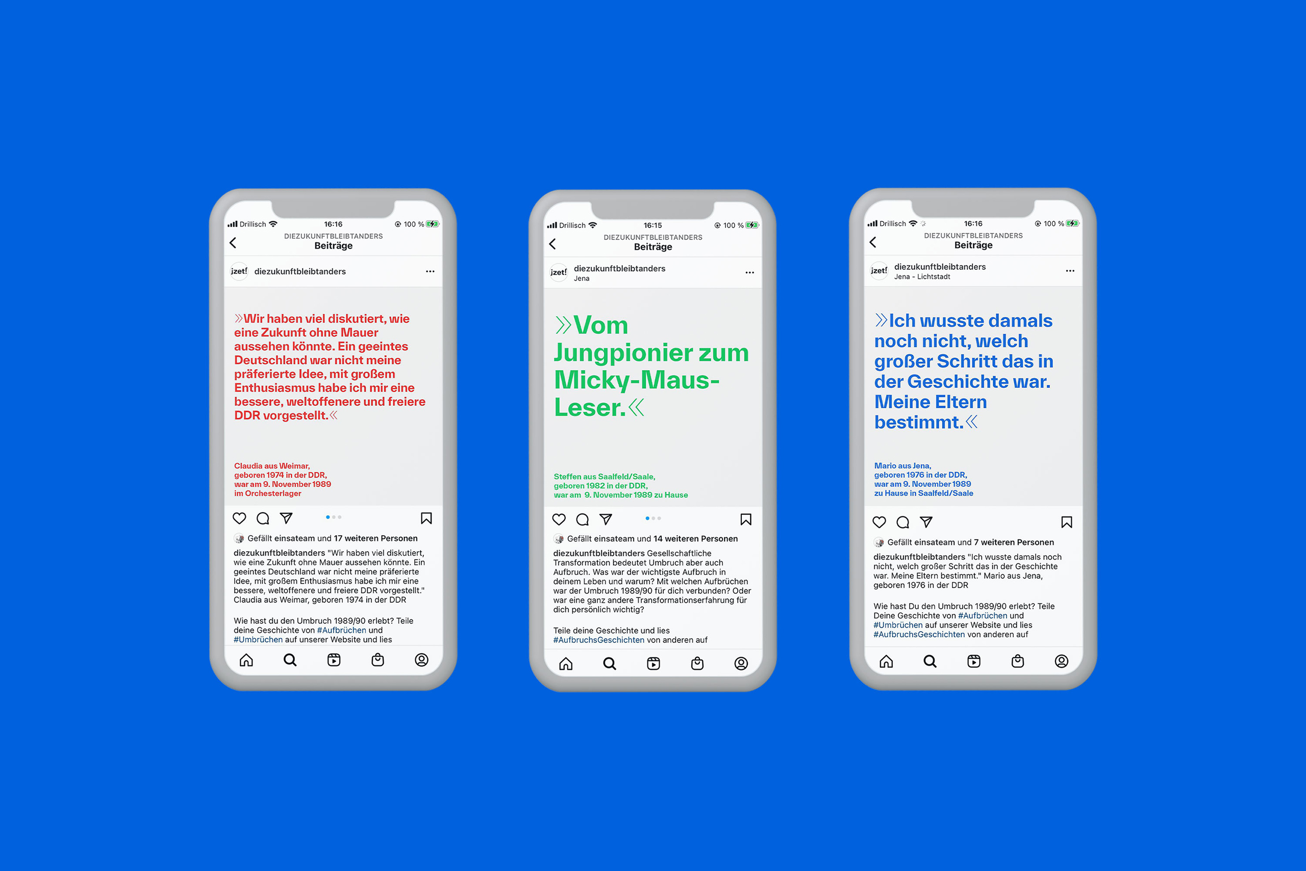
The key question »What was your moment of change?« formed the basis for personal stories from the public. The quotes formed central visuals for posters, social media and various other media.
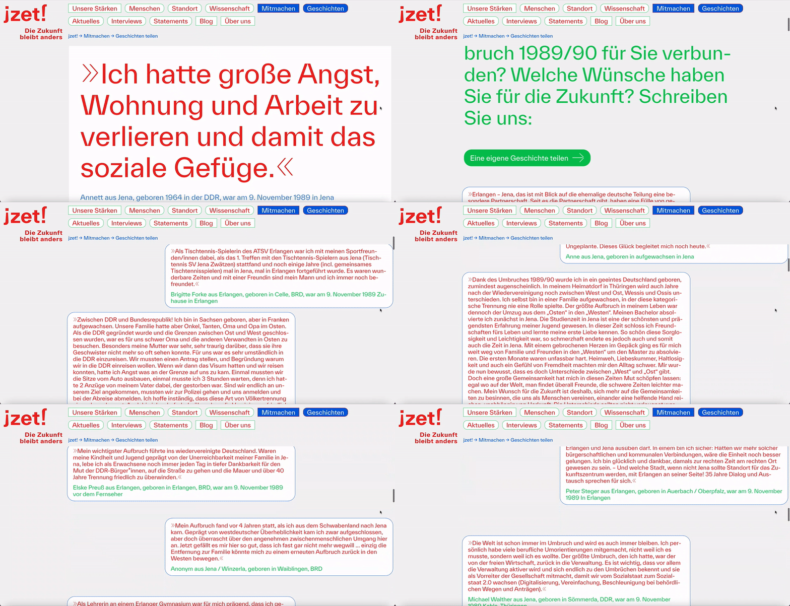
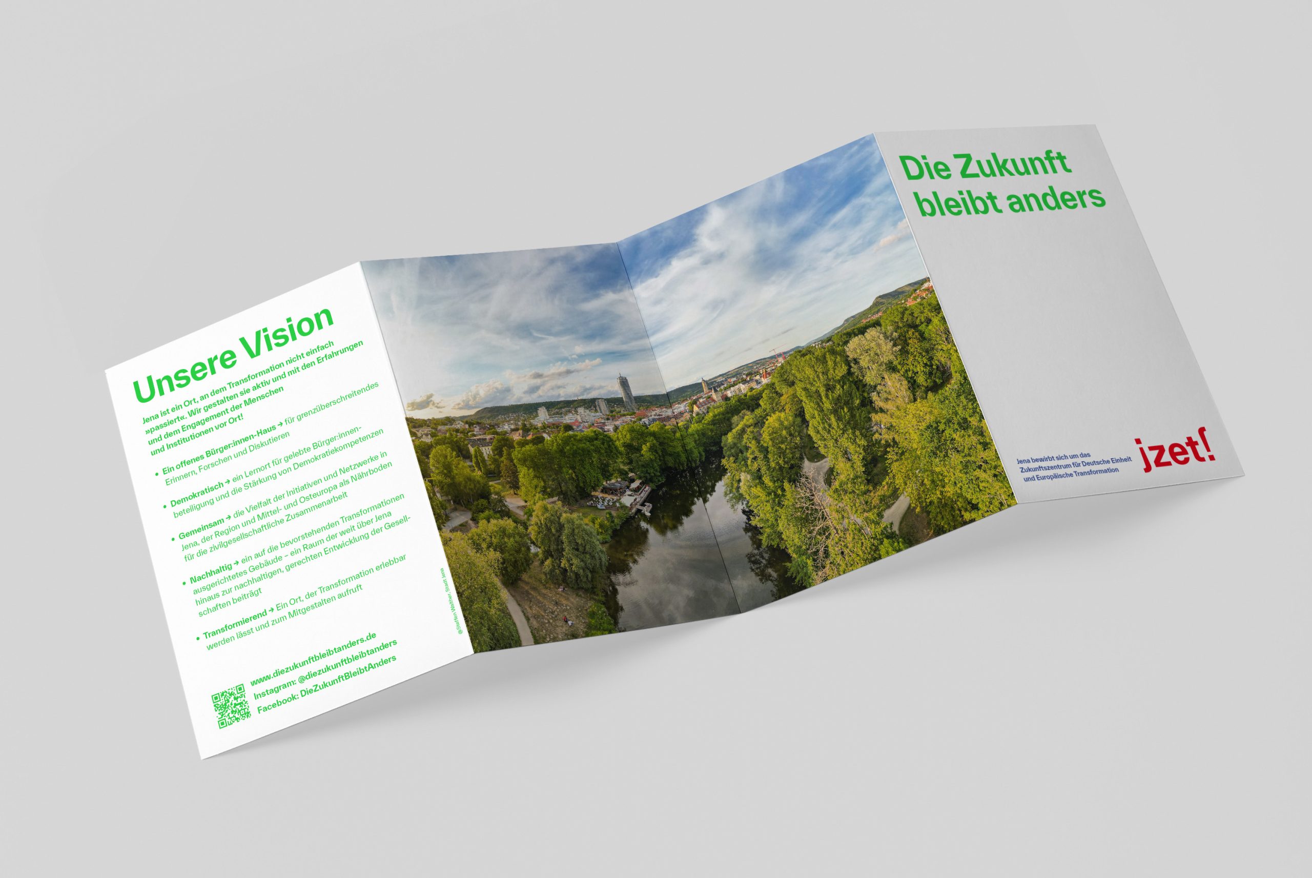
The show-all-navigation has nothing to hide. The poster-scale typography displays the content-driven focus of the campaign. Users can join the campaign by posting their personal story of change and form a common diverse perspective on German unity and European transformation.
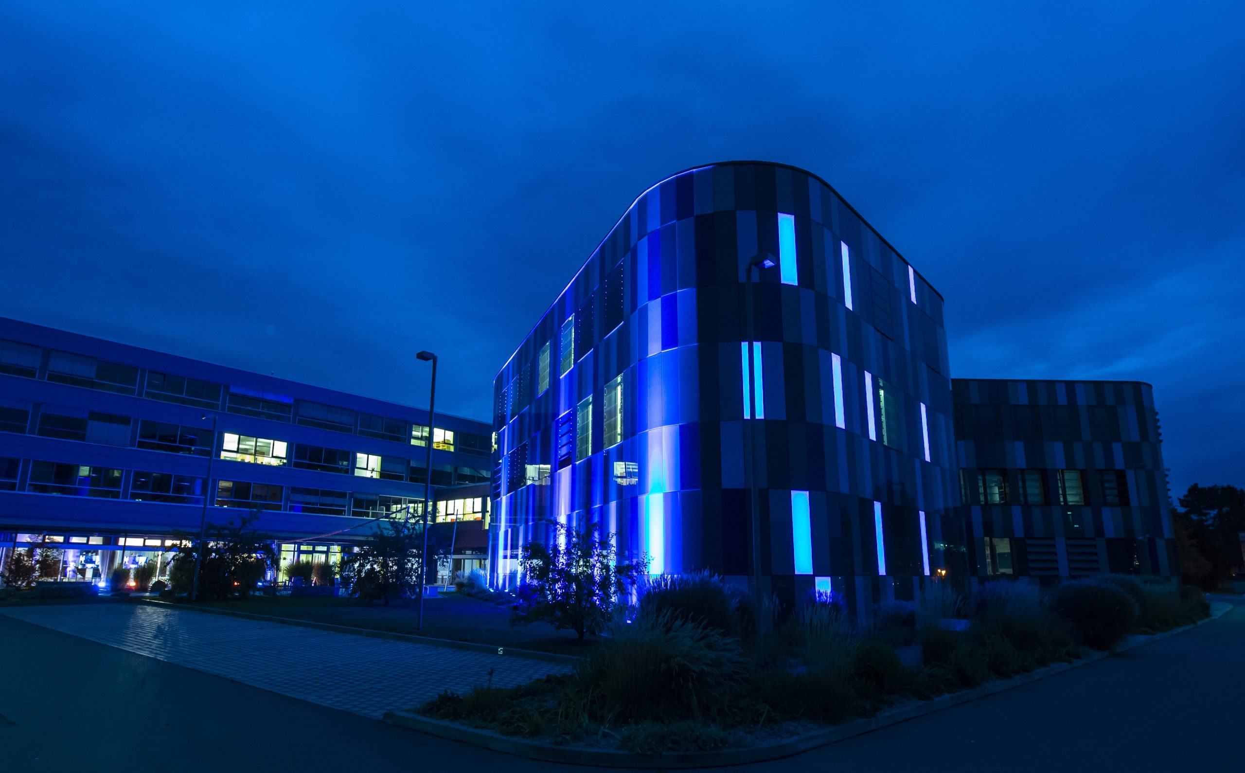
The illuminated Beutenberg Campus at night. It connects the university of Jena and non-university research. Here the Fraunhofer Institute for Applied Optics and Precision Engineering IOF in Jena.
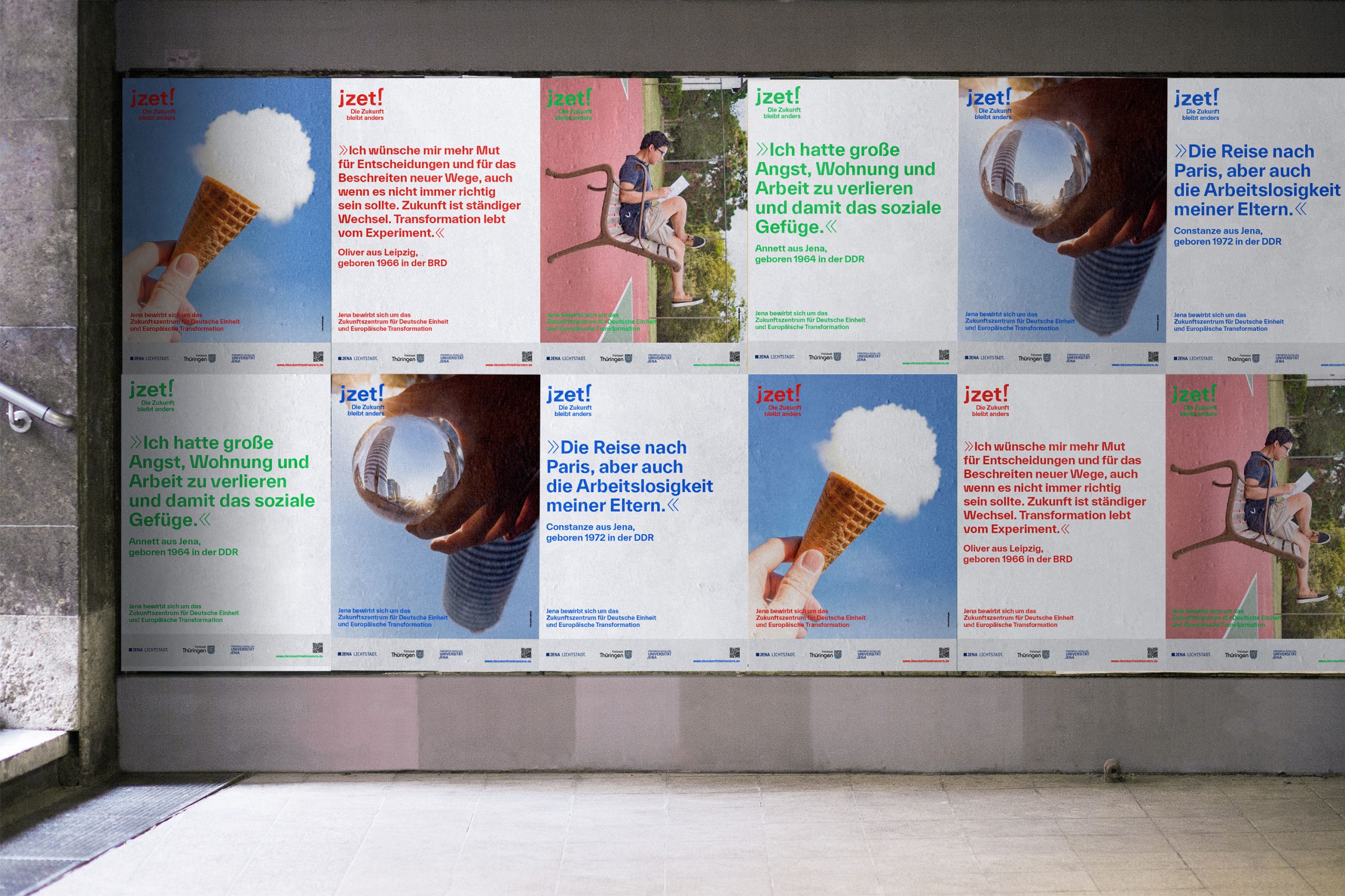
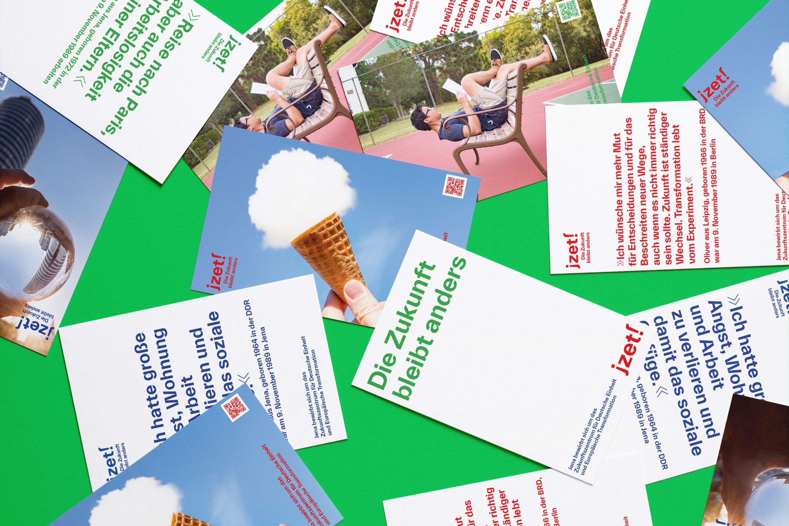
In addition to selected texts, three images form the main visuals of the campaign. Each image combines two opposites, which together create a new perspective: A cloud as an ice cream, reading in ninety degrees and the view through an optical lens on the flipped Eichplatz. The place, where the center could be build one day. The future remains different. And it starts »jZET!«

Check out the campaign website: jZET! – Die Zukunft bleibt anders
Or read about one of our other nation-wide campaigns: #20JahreKSB
Jena Photos by Stadt Jena, Steffen Walther and University of Jena, Jens Meyer.


