Heimathub
The City and Abbey Archive Aschaffenburg commissioned us with the conception, design and realisation of the online platform "Heimathub". This is a freely accessible citizens' archive where individual, family or even collective memories from the region can be shared. It forms the innovative hub between local history in the Bavarian Lower Main and digitisation.
Stadt- und Stiftsarchiv Aschaffenburg Heimathub 2023
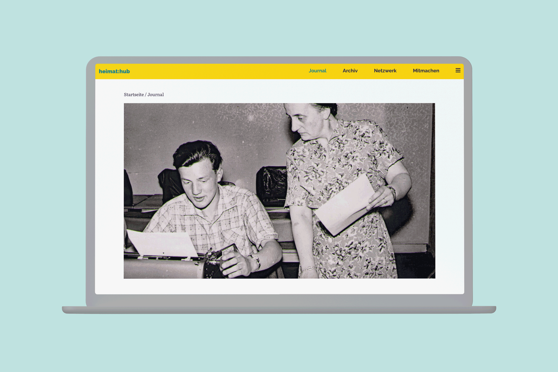
From private attic finds in the form of old photographs to video recordings of relevant local events, everything is conceivable – and can be made available to those interested in local history through the Heimathub.
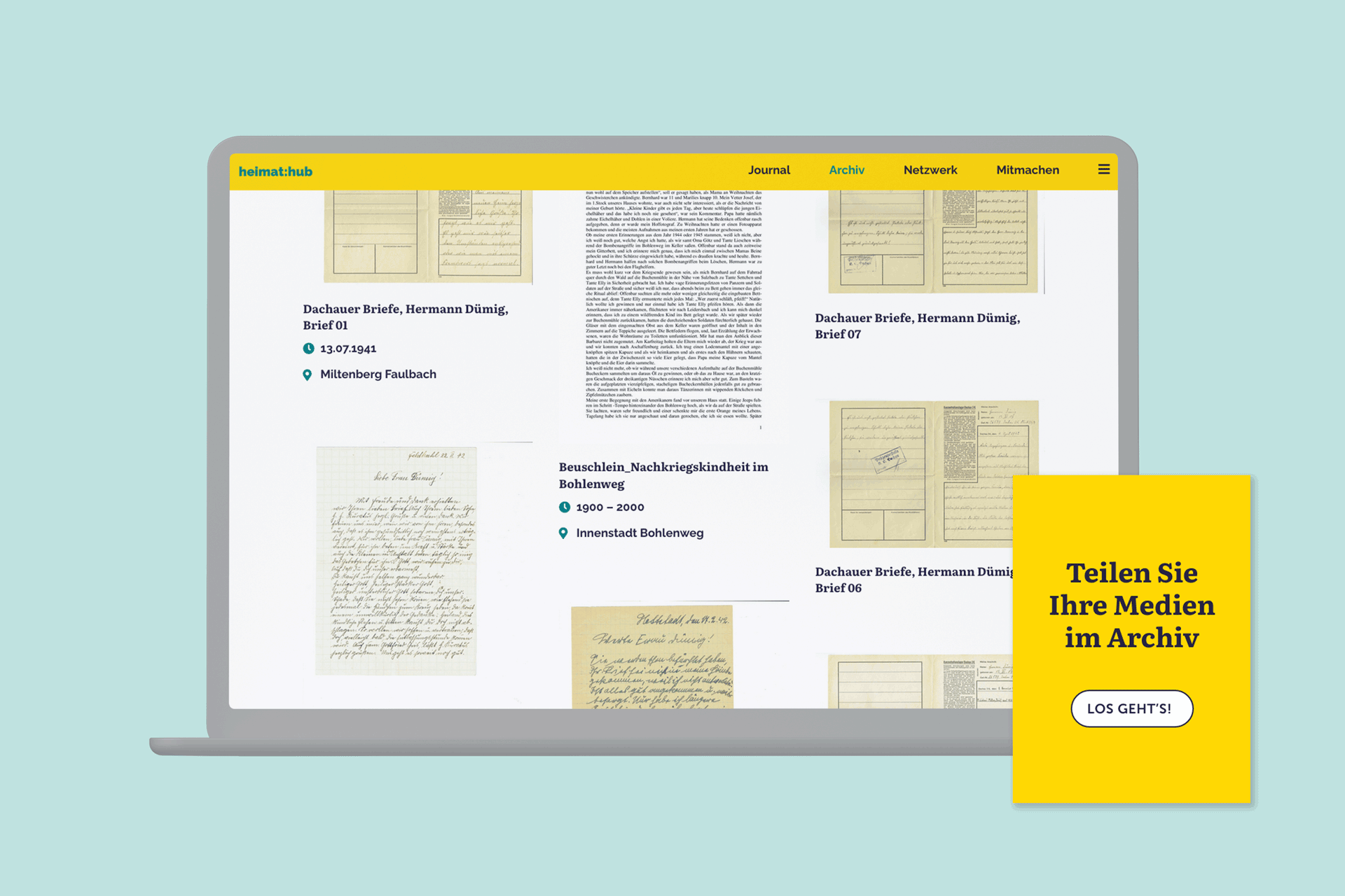
In addition to making historical material accessible, the networking of people interested in history also plays a role in Heimathub. The users of the platform can present themselves with a personal profile, their uploads and written articles and thus make their work visible beyond the region.
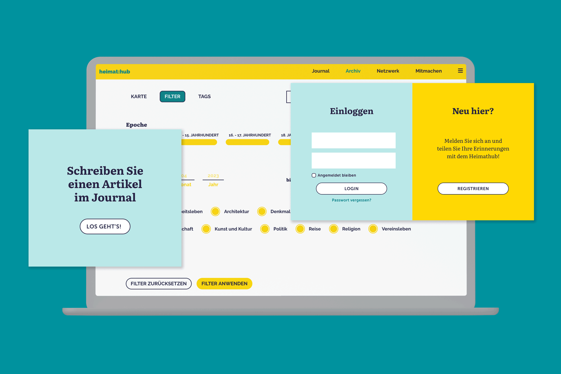
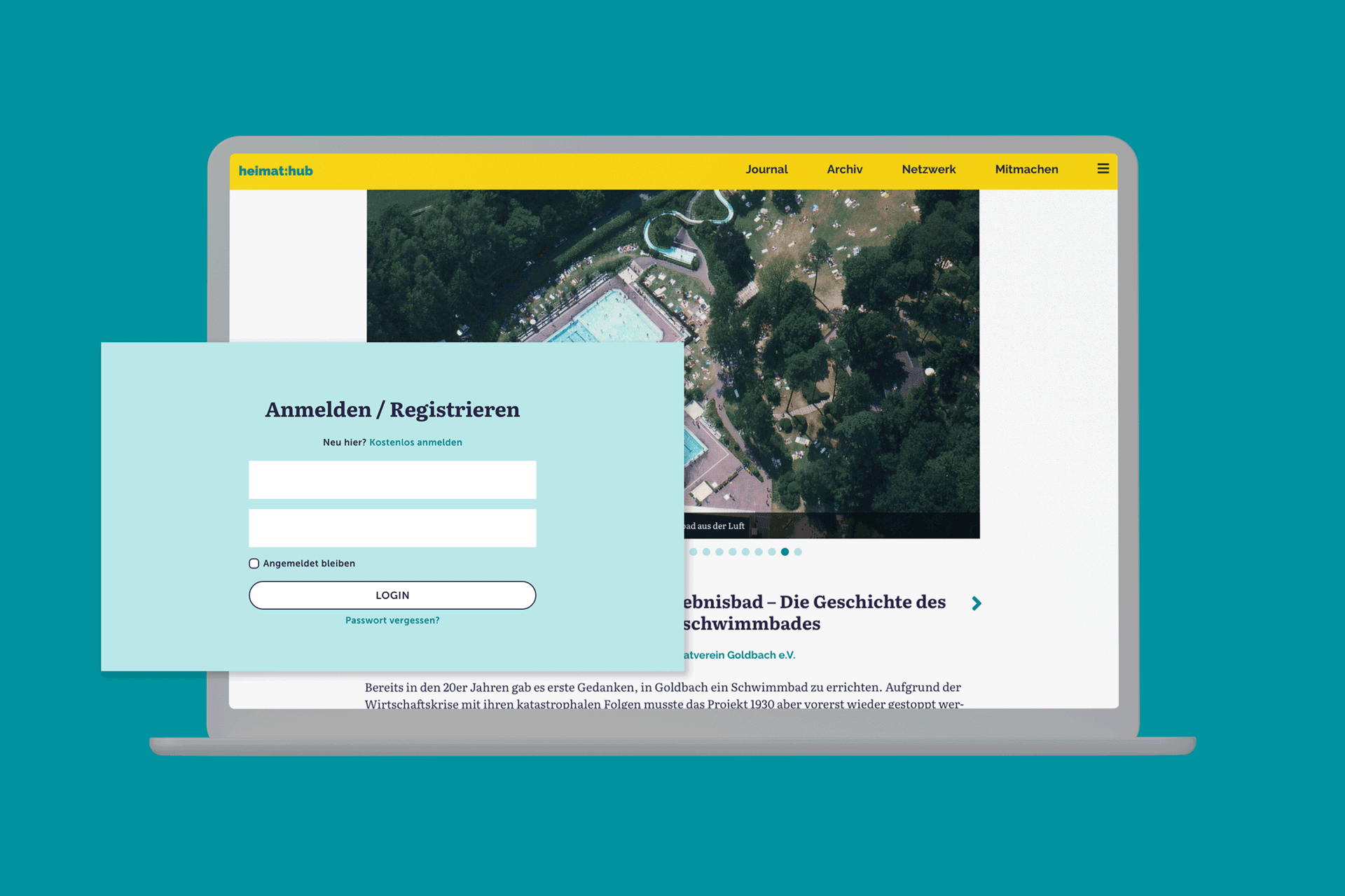
In developing the corporate design, the aim was to do justice to the combination of digitality, tradition and regional identity as well as the networking of different actors in the region.
This contrasting combination – digital and analogue – is united in the typography: the typeface “Literata” appears traditional, warm and human with its round serifs and is at the same time clear in its forms and very easy to read digitally.
The colour scheme is kept fresh and is intended to be friendly and inviting with its bright colours.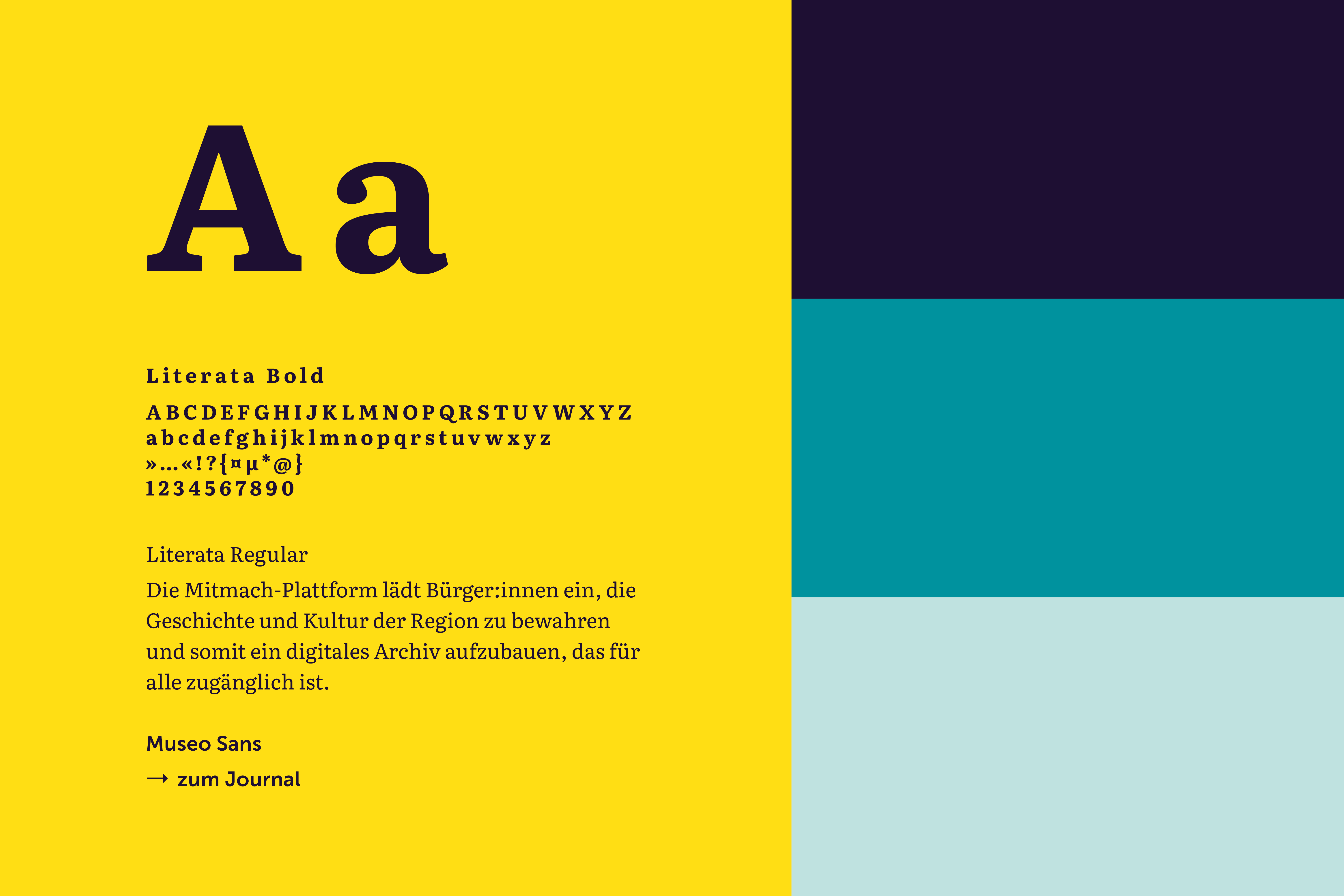
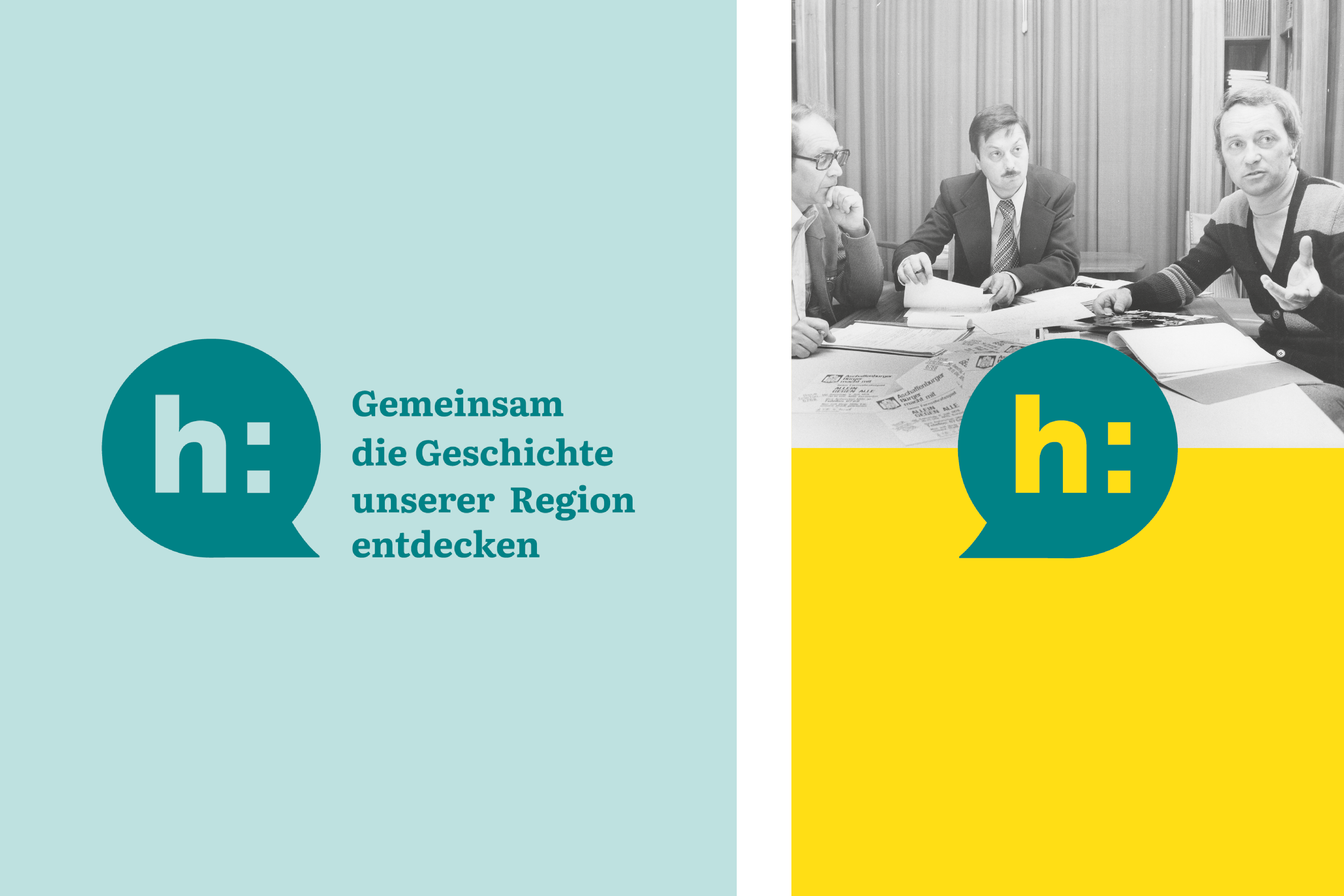
The figurative mark of the corporate design is the speech bubble, which is derived from the forms of the word mark and extended by its typographic elements.
Try it yourself:


