Progressive education
The August Bebel Institute offers a wide range of advanced educational programs for those interested in history who are not afraid to deal with current problems such as racism, classism, colonialism or sexism. Their annual program is based on the exhibitions in the ABI gallery. The core users are divided into politically interested young adults and loyal visitors who have been following the work of ABI for ages. We conected both user groups with an easy navigation and fresh look.
August Bebel Institut Progressive education 2023

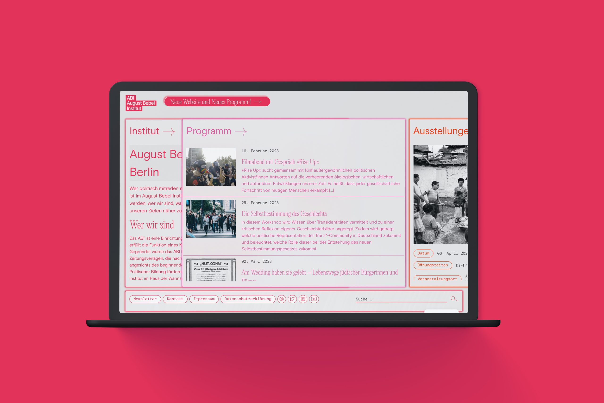
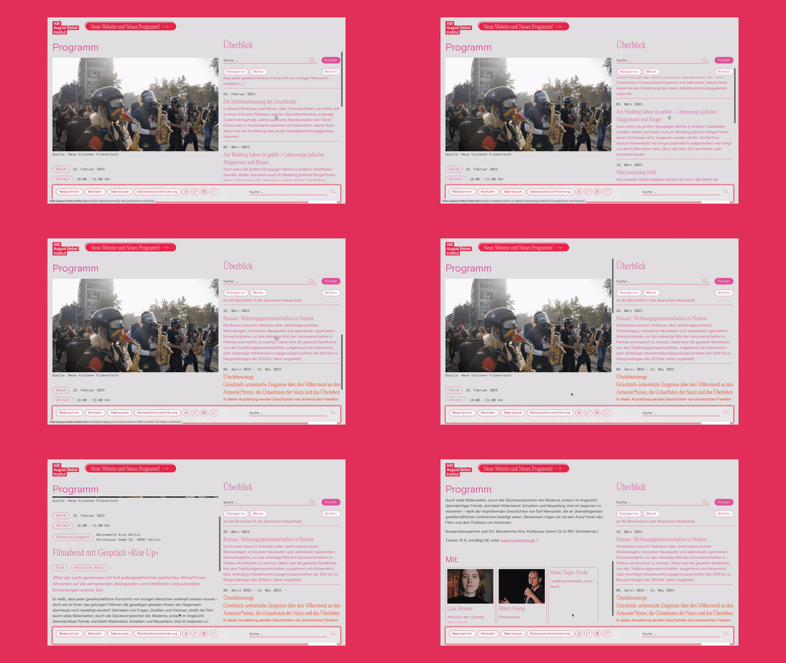
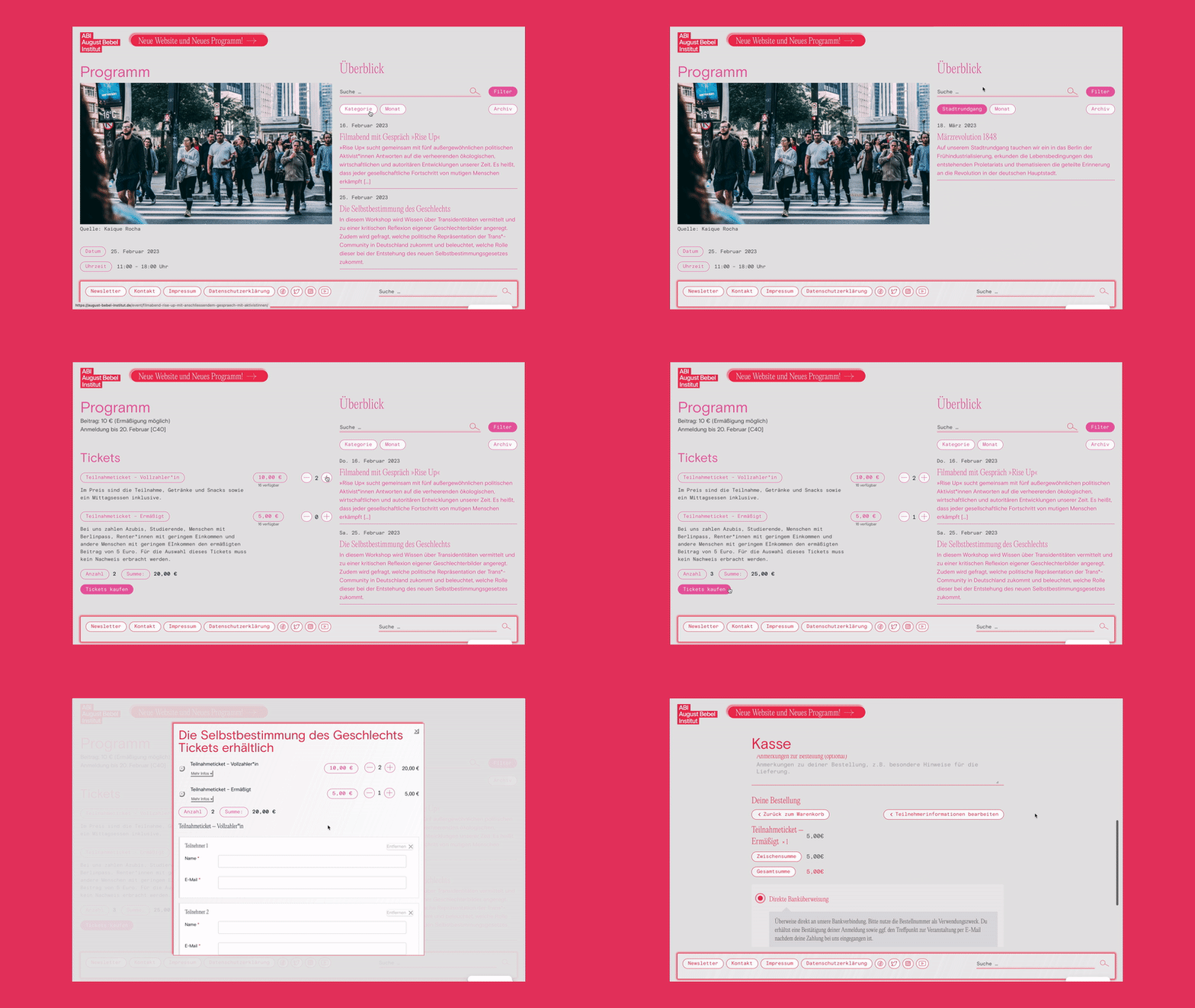
We presented the various formats of the ABI more accessible on their new website by an extremely reduced navigation and clear filtering of the archive. We have replaced the registration from manual e-mail administration with a ticket shop and thus streamlined and accelerated it.
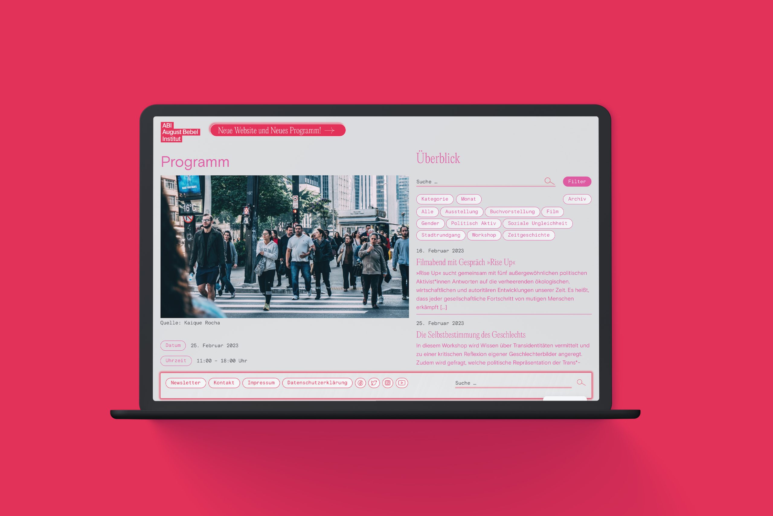
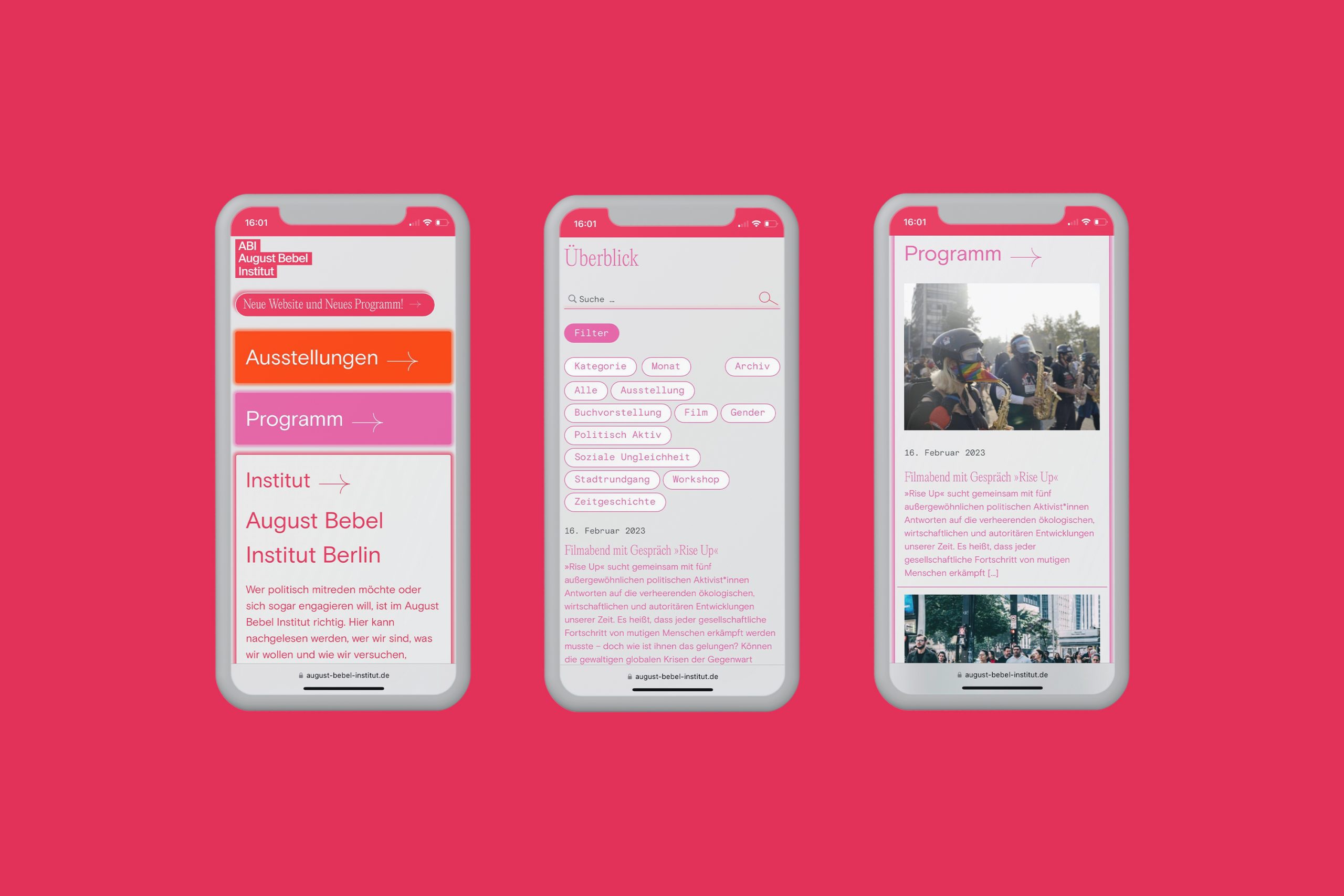
We designed the website as easy as a card game. Users navigate through the three main categories by click on one of the cards and dig deeper into the content. They always know, where they are. There is no button menu.
We chose a decisive, characterful typography: A modern take on classic with Editorial New and egalitarian, as well as democracy in Basis Grotesque. The shades of red we draw out of the existing corporate design bring a new approach to the origin of the association.
Try it yourself:
Or have a look at one of our outher works:


