A-to-B Futurism
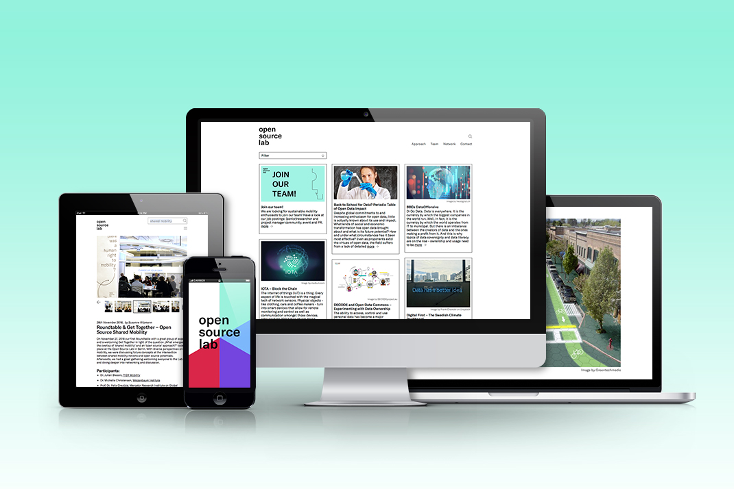
»How do we get from A to B in the future?« asks the website of the Open Source Mobility Lab. The correct answer is not »By car, of course!« As editorial consultants to the lab and creators of their corporate design, we are helping to build a dialogue in our city about sustainable mobility and the future.
German Research Center for Artificial Intelligence A-to-B Futurism 2018


The lab’s priority was to communicate ideas about movement and nonlinear research. We therefore developed a visual identity free from visual references, giving our client the freedom to roll out new creative elements in the future.


The communication strategy centered on editorial content, so we needed a typeface that wouldn’t upstage it. We chose GT America, a versatile font family that speaks a modern, international stylistic language, providing a solid frame for the lab’s visually dynamic messages. It goes to show that good design is more than just showing off your visual knowledge; you also have to know how to build a foundation for strong visual content without stealing the show.


